Users should be told when a list is empty. Especially when the given feature can take some time to generate results, the user should be informed when the results are in. A user should not be required to guess whether the area is blank because there is nothing to show or just because the app isn’t done yet.
WINDOWS® OPERATING SYSTEMS
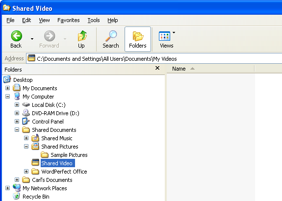
I was reminded recently of how inconsiderate it is to not tell users that a list is empty. I was using the Explorer® on a Windows® XP system to look manually through some folders that I hadn’t used for a couple of years, so I wasn’t sure exactly what I would find. The system is a little slow and some of the folders were very full, so I occasionally needed to wait for the results to appear. I became annoyed more than once when I realized that a particular folder was empty; I thought I was waiting for results, when in fact there was simply nothing to display. Figure 1 is a portion of a screen shot of an empty folder on Windows XP.
Note the blank area to the right of the file system display. The Shared Video folder is highlighted, but currently there is nothing in the folder, which explains the blank area. If these displays were always instantaneous, then that might be sufficient. But they are not.
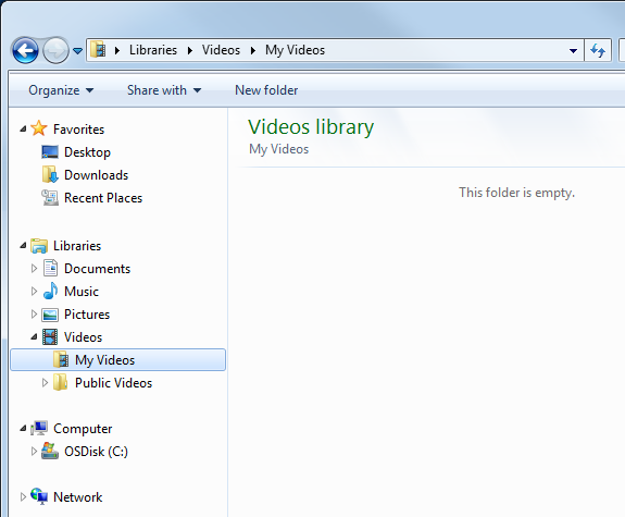
Gratefully, Windows 7 actually gives helpful information when a folder is empty. Figure 2 is a portion of a screen shot of an empty folder on Windows 7.
Note the helpful message This folder is empty which is displayed in the area where items in the folder would otherwise appear. This is much better than the previous operating system.
WINDOWS APPLICATIONS
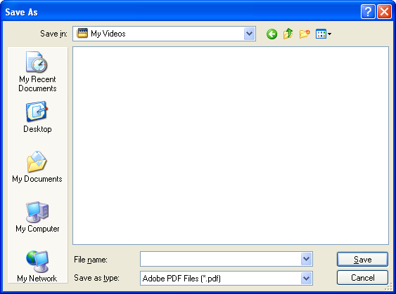
Windows provides the option for applications to use its Explorer feature for accessing the file system. That means that applications can have both the advantages and the flaws of the operating system. Figure 3 is a screen shot of the Adobe® Reader® X Save As dialog on Windows XP.
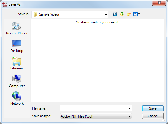
Adobe Reader X on Windows XP mimics the features of the operating system (see Figure 1). Note that the empty folder is displayed as a blank rectangle, with no other indication. This is true for the Open dialog and others that display information about the file system. Figure 4 is a screen shot of the Adobe® Reader® X Save As dialog on Windows 7.
Note that this dialog also matches the implementation of the operation system by displaying text (in the otherwise blank rectangle) which indicates that there is nothing to be displayed. Much more helpful than just the empty rectangle. This can be an issue not only with folders from the file system, but any time there is a list to be displayed.
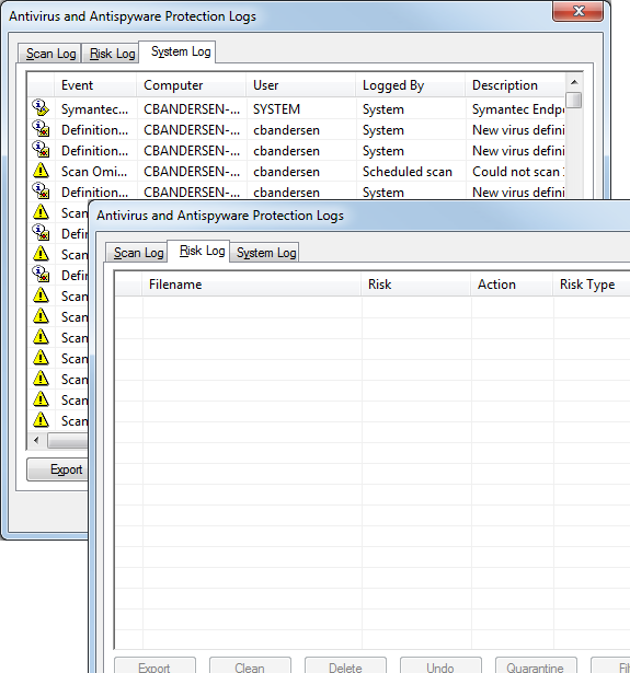
Figure 5 is a combination of screen shots of the Symantec® Endpoint Protection® Antivirus and Antispyware Protection Logs dialog on Windows 7.
When this dialog was first displayed I had selected the System Log which had a long list that did not display instantaneously. So when I changed to the Risk Log I naturally waited for a second or so until I realized that there was probably nothing to be displayed. Text could have been helpful here. This dialog would have benefitted from a message akin to This folder is empty in Figure 2 or No items match your search in Figure 4. In this case the message could read No logs are available.
WEB APPS
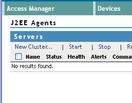
Web applications are not tied to the standards of an operating system when it comes to displaying lists. Figure 6 is a portion of a screen shot from Novell® Access Manager® which we began developing about 10 years ago. All lists that are empty include text for the user making clear the state of the list. This was especially important as extensive amounts of data were occasionally gathered from remote servers and could not always be displayed instantaneously.
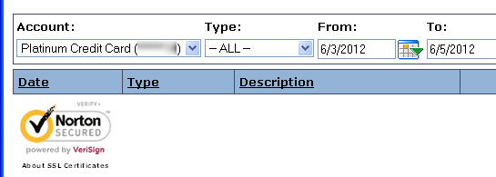
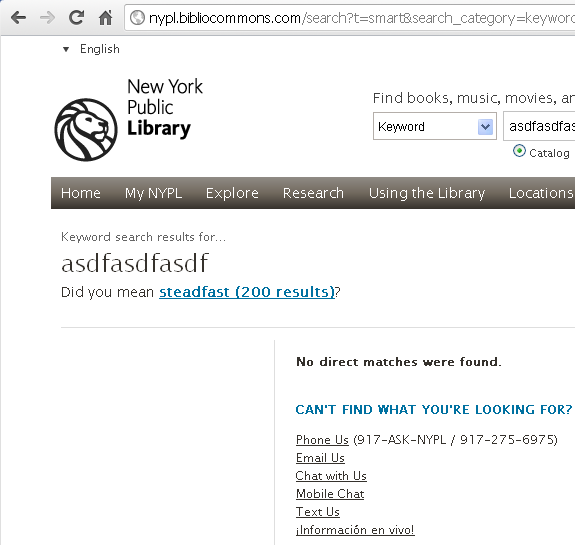
Figure 7 is a portion of a screen shot from a Credit Union web site that does not show any helpful text when no transactions appear in the list for the selected dates. It also moves the Norton SECURED™ logo up immediately under the column header of the table, making it difficult to detect that there is in fact currently no data in the table. Both text and spacing would be helpful here.
Figure 8 is a portion of a screen shot from the New York Public Library web site after a search has been performed.
with “No comments found.”
The search I performed produced no items, but note in the middle of the screen the text “No direct matches were found.” Not only is this helpful text provided, but there is also a list of options for getting help if needed. Like the previous example (Figure 7) some spacing could be helpful, but the designers are being considerate of the users in two ways: first displaying text that there are no results and second, listing options for obtaining help.
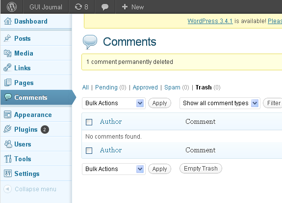
Figure 9 is a portion of a screen shot of the WordPress® Comments page with no comments for the current selection.
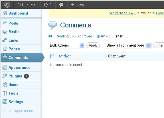
Note the text No comments found because the current selection (Trash) is an empty list. Unfortunately, like the example in Figure 7, the text is easily lost because this display duplicates the actions and the column header at the bottom of the list. Figure 9 is a proposed display that WordPress would benefit from when the list contains a small number (or zero!) items.
In this case, the text No comments found does not get lost with the unnecessary footer and duplicate actions displayed directly below it.
MOBILE APPS
Mobile apps are setting the standard in many ways with regard to feedback and presentation. Unfortunately, this is one area where they tend to fall short, especially on the smallest displays. (Most apps for larger tablets take advantage of the extra real estate and provide more helpful information.) But even with the small displays, most apps will (thankfully) use a spinner or some other indication when data are being gathered or a list is being compiled, but most also give no indication afterward when there are zero results.
Figure 11 is a combination of screen shots from three iOS apps (Reminders®, iBooks®, and Errands®) that display empty lists without any text indicating that there is nothing to display.
Two of the apps show empty rows in tables, while the third displays only a background image where a list would be.
Figure 12 is a combination of screen shots from three iOS apps that provide a helpful summary when there is nothing in a particular list.
The top two screen shots show the display when the data is being gathered and then the helpful text when nothing was found. The lower left screen shot is from an app for a certain bank. (It would have been better if the bank app did not require Ok from the user, but it is better than no indication that there are no items to display.) The lower right displays the result of a search. All of these examples provide helpful information to the user. Well done.
KEY DESIGN POINTS
- Mobile apps are especially good at showing a standard spinner or some other indication that data for a list are being gathered. Every GUI on every platform should do the same.
- Once the results are empty, a GUI should always display text indicating such, instead of assuming that the user is constantly watching and will notice when the spinner goes away. (But don’t make the user click or tap something; just display the information in place.)
- Even better than empty text is giving some idea of what can be done about it.