
I have reviewed Gmail® by Google® a couple of times before. Gmail is constantly being updated and (usually) improved. Though, I have noted specific instances in the past where updates were actually a step backwards for various reasons. Previous reviews that I will be referencing can be found at these links:
NAVIGATION
and Dropdown Display
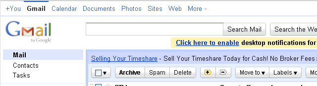
There were two areas of the Gmail navigation that I had problems with in my previous reviews. Figure 1 is a portion of a screen shot the way Google previously displayed options for navigating to its ever-growing list of applications. Note the options for You+, Gmail, Calendar, and so forth across the top. In my first review of Gmail, my very first comment was warning users not to be confused by these poorly placed items.
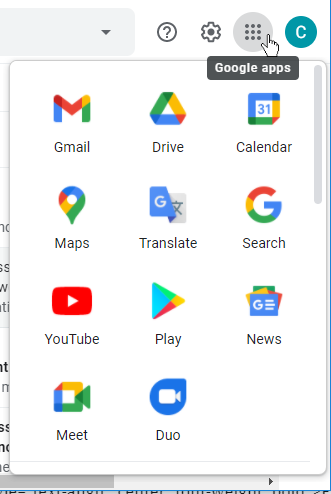
Figure 2 shows a portion of a screen shot with the fabulous Google apps icon now displayed at the right side of the Gmail header. This makes so much more sense! It removes the confusion of the previous incarnation and includes the very helpful “Google apps” tooltip to remove all doubt that this is where you go to find more Google options that are not part of Gmail.
The best part about the nine-grid icon is that it can now easily display the ever-changing list of available Google apps. When something new is added, Google can put it at a location in the display to promote its exposure. When certain apps are going away, their location can be adjusted to demote them, as Google has frequently done over the years with its previous menu organization. And of course, users can rearrange these icons as desired.
- Problem 1: Solved.
 The display is no longer cluttered with unrelated options across the top.
(First Review at top,
Second Review below)
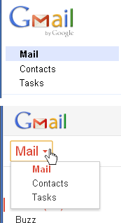
At the time of each of my previous reviews Google displayed the options for Mail, Contacts, and Tasks as though they were mutually exclusive. My first review showed them displayed as a floating tab control, while for my second review they were a dropdown. Neither variation is correct. While Mail and Contacts rewrite most of the screen to the right, they also rewrite portions of the menu options below, but not all; it was quite confusing. Additionally, selecting Tasks did not change the screen anything like either of the other two options did. Rather, selecting Tasks would leave the display on either Mail or Contacts and then popup a Tasks window in the lower right. Ugh.
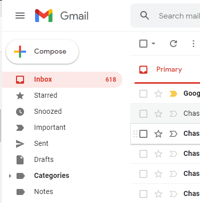
Figure 3 is a combination of portions of screen shots showing how it looked for my first Review (top) and for my second Review (bottom) navigation.
Figure 4 shows a portion of a screen shot of the current Mail display in the upper left of Gmail. The most important fact to note is that Mail is no longer an option to select, which is how it should have been all along. This is Gmail, this is Mail, this is where I want to be. The options for Contacts and Tasks are no longer in the upper left of the display.
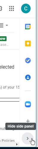
Figure 5 shows a portion of a screen shot of the current location of Contacts and Tasks at the far right. Ah! Like a breath of fresh air, Google finally got this one right! Gratefully, the options for Contacts and Tasks are now displayed where they can be seen in a narrow pane that is shown simultaneously with the Mail options. Google also added other logical options to the list at the right side, showing items that might reasonably want to be seen while the Mail options are still visible. These include:
 Calendar – Displays a single day at a time, due to the limited space
 Keep – For quick access to a a note or a list
 Tasks – Task list with due dates
 Contacts – List of contacts with email addresses, etc. for quick access
Note that if you still want the old method of the Contacts panel covering the entire display, it is available via the apps icon at the upper right.
- Problem 2: Solved. Mail is no longer treated as navigation and mixed with illogical options.
There’s another problem that has been solved in the current Gmail GUI. I noted in my first two reviews of Gmail that there were options listed in the left menu that had nothing to do with email. There was a feature called Buzz that was near the top, simply because Google was trying to promote it (see the bottom of Figure 3). Gratefully, the Google app icon has a place for anything like that. And gratefully, now all of the upper options in the left menu are actually for email, which is what the user wants. The options Inbox, Starred, Snoozed (one of my favorite features), Important, Sent, Drafts, Categories, and Notes (Figure 4) are all filters for email. Perfect. The lower portion includes Chat items, and that’s fine.
- Problem 3: Solved. The left side options no longer include items unrelated to email.
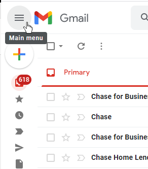
It feels great to say we’re 3 for 3 at this point. Unfortunately there is a definite problem with the current implementation. Note the  menu icon in the upper left of Figures 4 and 6, just to the left of the Gmail icon. I clicked this icon expecting to be shown some Gmail menu options. Is there anyone in the world who uses GUIs on computers or phones even occasionally who does not recognize this as a menu icon? That’s what it is. In fact the icon tooltip states “Main menu.” But that’s not what Gmail uses it for. They use it as a toggle to expand and contract the left side options. What? Figure 4 shows the default with the options expanded. Figure 6 shows how the display is changed after the menu icon is clicked. When collapsed the text for each option in the left side menu is removed, showing only the icons.
This is a great feature, to be sure, as often the user might have limited viewing space for whatever reason. Displaying only the icons (plus the hovering number of items in some cases) is an effective space saver. So why ruin it by using the wrong icon?
Google knows what the correct icon is for such a feature. Look at the lower portion of Figure 5. There the correct icon is used for expanding or contracting an area of the screen. Ugh. Sad. We were doing so well up till now!
- New Problem:
 Menu icon is used where expand/collapse icons should have been.
PREVIOUS PROBLEMS NOW FIXED
In my previous review I mentioned the confusion that many users experienced because of two left-side options that seemed to be the same thing, but they didn’t contain the same information. Those options were labeled Trash and [Gmail]Trash.
- Problem 4: Solved. Users now only see a single option for Trash.
Another GUI improvement is the fact that ads are no longer part of the display. The worst part of the previous implementation was the fact that the ads appeared in between related portions of Gmail and really causes confusion.
- Problem 5: Solved. Ads no longer appear in the Gmail display.
This is good! Google is moving in the right direction.
Unfortunately, there are still quite a few other problems that I noted in the first two reviews that remain unfixed. Please refer to those reviews for details.
OTHER GUI IMPROVEMENTS
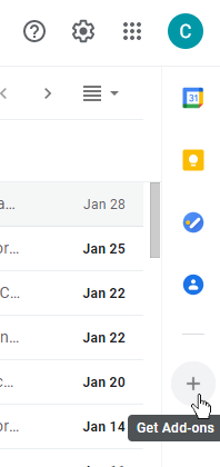
One of my favorite parts of the right side panel is the ability to Get Add-ons using the  icon. For this review, I used this feature to add the Zoom® app (visible in Figure 5). This icon is a quick and easy way to enhance the GUI, but done in a way that is really out of the face of what most users are interested in. That’s how it should be. It’s great that Google is being far less intrusive and annoying as they introduce new functionality and new apps for users.
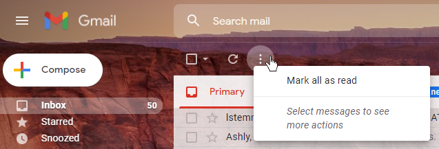
Some improvements are simple, but really add a lot of polish. Figure 8 is a portion of a screen shot showing the tooltip that is displayed with the vertical ellipsis menu. In this case no messages in the list are selected. I have written before about how tooltips should be used to help the user under certain conditions. (See Tooltips — GUI Design.) This is a great example of that principle. Note how only one option is available because nothing is selected. However, the tooltip includes the very helpful message “Select messages to see more actions.” Fabulous! This is the type of implementation that users really appreciate and which helps them to quickly be able to learn what is available to them. Well done.
CONCLUSION
 This GUI was good before, but really had some serious problems. I’m happy to report that I now give Gmail 4 out of 5 GNs. The improvements have been gradual, but exactly what was needed.