
The GUI for Gmail® by Google® was recently reviewed just as a new GUI display was introduced. This article revisits some of the problems identified in the review and also looks at other GUI items that are new to this release. For the original review refer to Gmail® by Google® — GUI Review. (That review resulted in a rating of 2 out of 5.)
All images and icons below are trademarked by Google or their respective trademark holders.
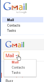
(Old above New)
PROBLEMS WITH PREVIOUS GUI
Here is a brief summary of some 20 of the problems identified in the previous GUI, along with explanations of any changes.
Previous Problem 1 — Main Navigation Options Unclear.
- DESCRIPTION: The display did not make it obvious that Mail and Contacts are the main navigation options with “floating selections” not connected to the rest of the display.
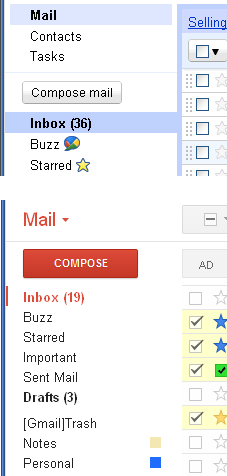
- CHANGE: Mail and Contacts are now displayed as a drop-down select control in a much larger font with red text. Figure 1 is a combination of portions of screen shots showing the old (top) and new (bottom) navigation.
- RESULT:
 Improved, but not solved. (See problem 2.)
Previous Problem 2 — Tasks Option Combined with Mail and Contacts.
- DESCRIPTION: Tasks is not a navigation option. It does not update any part of the current panel, nor remain in a selected state after being selected, but rather pops up an independent window regardless of whether the current navigation state is Mail or Contacts.
- CHANGE: None.
- RESULT:
 Problem remains.
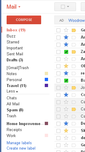
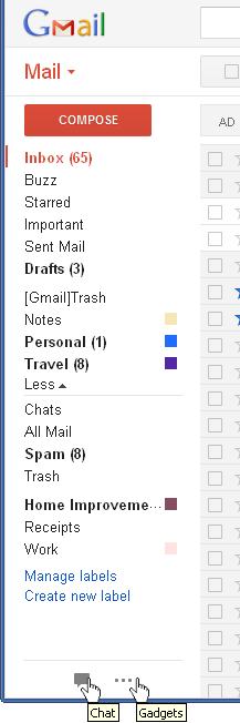
Previous Problem 3 — Mail Secondary Options Intertwined with Unrelated Options.
- DESCRIPTION: The left column contains secondary options for the Mail navigation selection, but they are interspersed with the unrelated items Buzz and Chats (for Chat History). Figure 2 is a portion of a screen shot showing the left portion of the Gmail Mail panel.
- CHANGE: None.
- RESULT: Problem remains.
Previous Problem 4 — Important and Starred are similar/redundant, yet separated.
- DESCRIPTION: The Important categorization is not distinct from the Starred categorization. If Important is not eliminated completely, then it should at least be located near Starred.
- CHANGE: The Important column is now directly adjacent to the Starred column. See Figure 2.
- RESULT: Improved. (Though it is still redundant.)
Previous Problem 5 — Important and Starred values not displayed in the same way
- DESCRIPTION: In the previous implementation, the Important icon was only visible in the column when it was set, while Starred had an empty icon when it was not set.
- CHANGE: Important now shows an empty icon when it is not set—the same as with Starred. (See Figure 2.)
- RESULT: Solved.
Previous Problem 6 — Important and Starred values not edited in the same way.
- DESCRIPTION: In the previous implementation, the Important value was changed using the
 control at the top of the table, while the Starred value was changed by clicking the icon itself.
 - CHANGE: Important is now edited (toggled) by clicking the icon—the same as with Starred. (See Figure 2.)
- RESULT: Solved.
(Old above New)
Previous Problem 7 — Header checkbox tri-state display.
- DESCRIPTION: When some (but not all) items are selected, the header checkbox had a tri-state display that looked more like it is disabled.
- CHANGE: The tri-state display now uses a more standard dash. Figure 3 is a portion of two screen shots showing old (top) and new (bottom) header checkbox in the tri-state.
- RESULT: Solved.
Previous Problem 8 — Three methods of categorization.
- DESCRIPTION: Important, Starred, and Labels provide too many unnecessary options for categorizing conversations.
- CHANGE: None.
- RESULT: Problem remains.
Previous Problem 9 — Terminology vs. industry standards.
- DESCRIPTION: Gmail Labels act as industry-standard Filters, and Gmail Filters act as industry-standard Rules.
- CHANGE: None.
- RESULT: Problem remains.
Previous Problem 10 — Left column too narrow.
- DESCRIPTION: Labels can be defined with names that are too long for the left column width—and the width is unchangeable.
- CHANGE: None.
- RESULT: Problem remains.
Previous Problem 11 — Keyboard access.
- DESCRIPTION: Many items throughout the GUI are not accessible via the keyboard.
- CHANGE: Tab stops do now exist for Mail and Contacts secondary options, as well as each Label options menu. However, the secondary options for Mail and Contacts are still not keyboard accessible using Safari® on the Mac®.
- RESULT: Improved, but not solved.
Previous Problem 12 — [Gmail]Trash vs. Trash.
- DESCRIPTION: The meaning and difference between the “[Gmail]Trash” Label and the “Trash” Label have confused users for years and need a better display and/or documentation.
- CHANGE: None.
- RESULT: Problem remains.
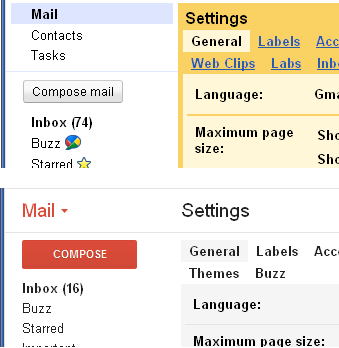
Previous Problem 13 — Chat history misplaced.
- DESCRIPTION: The Chat history (Chats) is only available under the Mail navigation More
 menu and not with the rest of the Chat options. (The new GUI actually leaves the menu expanded and changes it to Less
 . See Improvement 3, below.) Figure 4 is a portion of a screen shot showing the Chats option as the first item under the Less menu, but not part of the Chat area at the bottom.
 - CHANGE: None.
- RESULT: Problem remains.
Previous Problem 14 — New mail message in drafts.
- DESCRIPTION: Selecting Compose mail creates a new draft, but does not immediately place it in the Drafts folder and never shows Drafts as selected (as it would if the draft was actually selected after navigating to the Drafts folder).
- CHANGE: None.
- RESULT: Problem remains.
Previous Problem 15 — Mail secondary options display.
- DESCRIPTION: The secondary options for Mail showed a nice tabbed display when selected, unless a Label under the more menu was selected for which there was no indication.
- CHANGE: Still cannot tell if an item under the more menu is selected. (See New Problem 3 below for a related change to the formerly “nice tabbed display.”)
- RESULT: Problem remains.
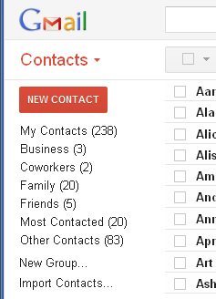
Previous Problem 16 — Contacts default selection display.
- DESCRIPTION: Selecting Contacts navigation selects My Contacts by default and displays that selection the first time, but subsequently selecting Mail and then Contacts again does not show that My Contacts is the secondary selection. Figure 5 is a portion of a screen shot of the Contacts secondary options with no indication that My Contacts (238) is currently selected and displayed to the right.
- CHANGE: None.
- RESULT: Problem remains.
Previous Problem 17 — Mail settings.
- DESCRIPTION: The Mail settings panel displays the current selection as a floating tab when the window is too narrow for all the tabs to fit on a single line.
- CHANGE: None, except the colors. The previous yellow/orange is now a light grey, which actually makes the connection between the selected “tab” and its options harder to detect. Figure 6 shows portions of two screen shots of the old and new Settings panel with General as the current selection. The previous bright yellow was not my favorite, but it made it obvious that it was the Settings panel instead of a normal panel and—more importantly—it made the floating General selection much more apparent.
- RESULT:
 Problem is worse.
Previous Problem 18 — Mail settings options for Save Changes and Cancel.
- DESCRIPTION: Some Mail settings tabs save changes immediately, while others act as a tab control with Save Changes and Cancel buttons that display inconsistently either at the bottom left or bottom center. Also, the save/cancel actions affect every panel with those buttons, though they are not displayed as such.
- CHANGE: None.
- RESULT: Problem remains.
Previous Problem 19 — Chat and Task popup windows.
- DESCRIPTION: On the popup windows for Chat and Tasks, not all icons have tooltips and their various popup menus have different displays both within themselves and between each other.
- CHANGE: None.
- RESULT: Problem remains.
Previous Problem 20 — Dragging to Labels.
- DESCRIPTION: Marking a conversation in the Inbox list with a certain Label via the menu will keep displaying the conversation both in the Inbox list as well as the Label list, but dragging the conversation will remove it from the source and show it only at the destination. This is an inconsistent combination of folders vs. filters.
- CHANGE: None.
- RESULT: Problem remains.
BETTER WITH NEW GUI
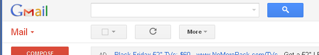
Improvement 1 — Background for title bar.
- CHANGE: The new background for the title bar delineates the area and gives a cleaner look, making the elements look less like they are just randomly positioned. Figure 7 is a portion of a screen shot of the new Gmail title bar area.
- RESULT: Better.
Improvement 2 — Chat and Invite a friend display.
- CHANGE: Chat and Invite a friend are now 1) mutually exclusive, and 2) completely minimizable to the bottom of the left column, leaving more room above for Mail or Contacts secondary options. Figure 8 is a combination of portions of screen shots showing the new icons at the bottom for Chat
 and Gadgets
  with tooltips. Currently Gadgets only includes the previous Invite a friend option, but with this name and an ellipsis for an icon, it can obviously be used for other things in the future. Also, when expanded, Chat and Gadgets can still be adjusted to allow more or less room for the main navigation and secondary options, as shown by the change in the mouse cursor
  in Figure 4.
 - RESULT: Much better.
Improvement 3 — Mail secondary More menu.
- CHANGE: The More menu under Mail navigation can now be left in the expanded state (showing Less) so that it is always visible even when switching back and forth between Mail and Contacts. See Figure 8.
- RESULT: Much better.
Improvement 4 — Conversations display.
- CHANGE: Conversations are now displayed in a much more readable format with alternating messages and Contact display icons as available.
- RESULT: Better.
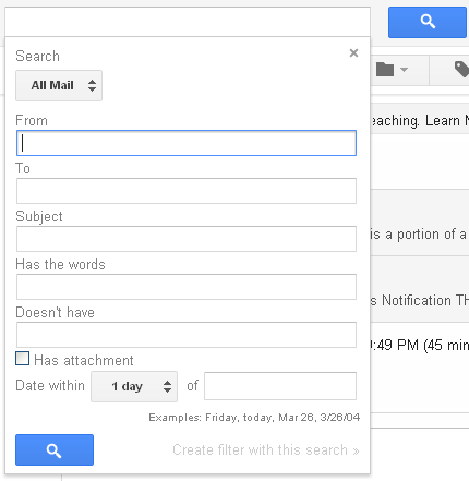
Improvement 5 — Search options.
- CHANGE: The new Mail search capabilities provide many more options and better search control than the previous version. Figure 9 is a portion of a screen shot showing the Search options for the Mail panel. (Note that the Contacts search control is unchanged from the previous version.)
- RESULT: Very nice.
WORSE WITH NEW GUI
New Problem 1 — Ad bar and message bar location.
- CHANGE: The Ad bar has been moved in between the table options and the table data. Google’s need for Ads is obvious, but this move really hinders usability. Are they charging more for the enhanced Ad location? Also, the Message bar (which is shown as a result of certain user actions) is no longer above the Ad bar, but is also between the header checkbox and the data. Figure 10 shows portions of screen shots for the old and the new GUI with now two lines of separation in the new implementation.
- RESULT: Poorly done.
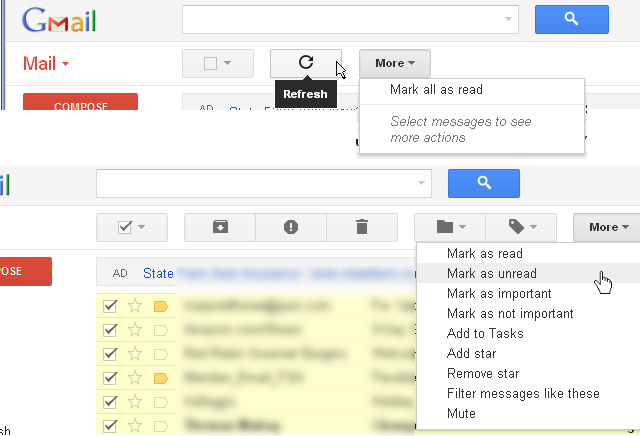
New Problem 2 — Header checkbox control.
- CHANGE: Header checkbox control no longer lines up vertically with the checkbox column (in addition to be separated by the Ad bar and Message bar). It can be further confused by the type of Starred value that is used next to the checkbox. See Figure 10.
- RESULT: Ugh.
New Problem 3 — Secondary options display.
- CHANGE: The selected secondary option is now much more difficult to detect because it uses only a slight change to the text color/weight and a thin vertical line to the left of the selection. Figure 11 shows portions of two screen shots showing the old and new implementation of the secondary option selection. The previous implementation (top) was a classic tabbed control where the background of Inbox (36) extended to the right and surrounded the portion of the window it controlled. The new implementation (bottom) really allows the selected Inbox (19) to be easily lost.
- RESULT: Sad.
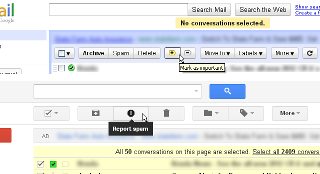
New Problem 4 — Action buttons disappear.
- CHANGE: Action buttons that were formerly always present, now disappear and reappear depending on selections in the table. While that implementation “seems to make sense” to designers and is easier than providing helpful messages, it is disconcerting to users. It is much better to enable and disable buttons as needed and update tooltips or have a message area to explain why an option is currently disabled. Formerly, Gmail displayed an explanatory error message when an option was selected that was unavailable (such as “No conversations selected.” at the top of Figure 10); that was certainly better than disappearing buttons. Figure 12 shows portions of screen shots with action buttons now hidden or visible depending on selections. Note the Refresh button when no messages are selected (top) is replaced by five other buttons (bottom). There is a helpful message on the More menu (top) to “Select message to see more actions,” which are shown at the bottom of Figure 12. The message is nice, but the previous implementation was overall much more helpful to the user—especially those new to the application.
- RESULT: Not good. (For further discussion see Vanishing Options — GUI Design).
New Problem 5 — Buttons use unfamiliar icons instead of text.
- CHANGE: The action buttons under the Mail navigation formerly were mostly text, but have now been replaced by icons that are mostly unfamiliar to users. See Figures 10 and 12. This requires hovering just to learn what they are for and will require repeated use before they become familiar.
- RESULT: Wrong direction. (For further discussion see Icons or Text? — GUI Design ).
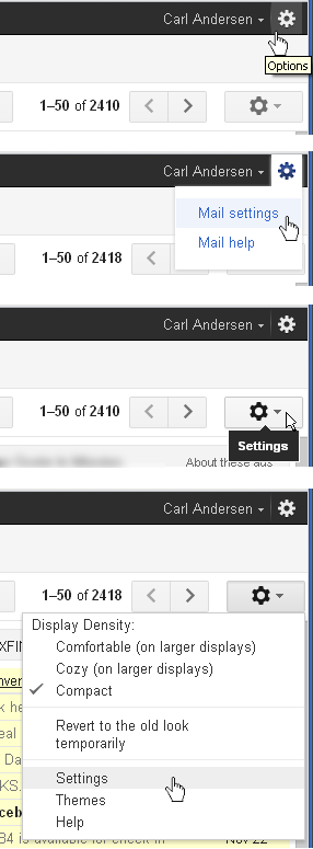
New Problem 6 — Multiple options/settings.
- CHANGE: A new Settings button has been added at the far right of the Action buttons row. Figure 13 shows portions of several screen shots of the new interface. The top two images show the Options icon with its tooltip and the menu items Mail settings and Mail help. This is essentially the same as the previous version of Gmail. The bottom two images show the new Settings button with its tooltip and menu options. It is only available under the Mail navigation, but the options apply to the entire application, not just the Mail panels. The Settings option on this menu invokes the same panel as the Mail settings option on the upper menu. (Also note that the mouse cursors are different for the two.) So, why are there two menus now? And why are they both gear icons, but slightly different from each other? Instead, why aren’t the Settings menu options available on the Options menu, which is visible for both the Mail and the Contacts navigation?
- RESULT: Confusion.
CONCLUSION

It’s great that Google is willing to keep making improvements. Of the twenty problems with the previous GUI that were briefly restated here, five were improved and one was made worse. (There are other minor problems described in the original review that still exist, that are not repeated here.) However, five additional improvements were found, along with six new problems. That results in a GUI that is somewhat better than the previous implementation. Based on this I’m rating the new GUI an improved 2 ½ GNs.
[…] with all the amazing services and apps it provides. When I did a GUI Review of Gmail® (and revisited that review) last November, I deliberately avoided any analysis of the navigation bar across the top, thinking […]
[…] Gmail® by Google® (Revisited) — GUI Review […]