Buttons have been around as long as GUIs have. They were initially only used to perform actions. When hyperlinks (or links) were first created, their usage was obvious: it was a method for linking documents to each other and for quickly jumping from one to another (hence the name hyperlink). Unfortunately, the difference between the two has been blurred such that in many GUIs there appears to be no rhyme or reason as to when either is used, other than the whim of the designer or developer. Buttons are often made to look like links and vice versa. Part of the reason for this is probably the fact that menu items usually look more like links, but often act more like actions; this is also true for the controls on tables of data.
Sometimes there is a deliberate design decision—based on a preferred look or layout—to make buttons look like links, for example. I don’t have a problem with that per se, unless buttons and links are used interchangeably within the same GUI, without regard to function or purpose. When that is the case, the user is unable to accurately predict the result of a click. That means the GUI is getting in the way of what users want to accomplish, because they have to think more about the GUI than should be necessary.
EXAMPLE: MICROSOFT® WORD® 2010
(black & white reproduction)
For the most part Microsoft® Word® 2010 consistently uses buttons for actions. It also follows the industry standard of using an ellipsis (…) with the text on buttons (and menu items) when more data is needed before the action can be done, indicating to the user that a dialog will be invoked in order to collect the needed data.
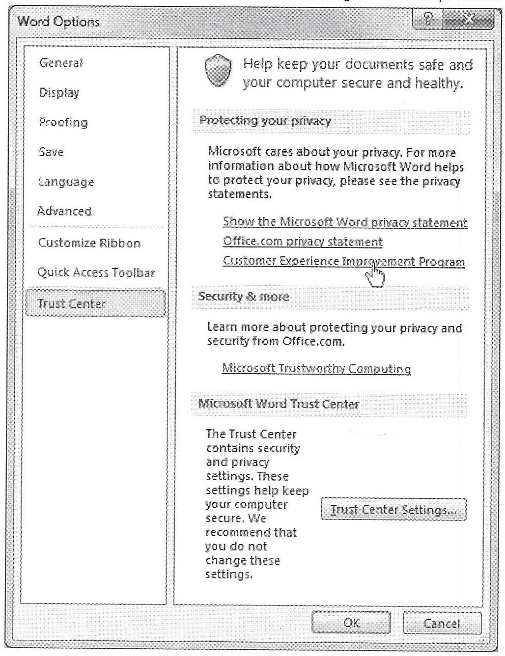
Figure 1 is a screen shot of the Word Options dialog, with the Trust Center pane selected. Note that there are several links at the center right. A mouse hover over any of the links changes the mouse cursor to the pointer. Clicking any of these four links will invoke a web page in a browser (here are the links: one, two, three, four). Exactly what links were designed for!
There are three buttons near the bottom of the pane which also follow the standard. The Trust Center Settings… button invokes a dialog (note the ellipsis), while the OK and Cancel buttons each perform their actions immediately. Thank you for that!
(black & white reproduction)
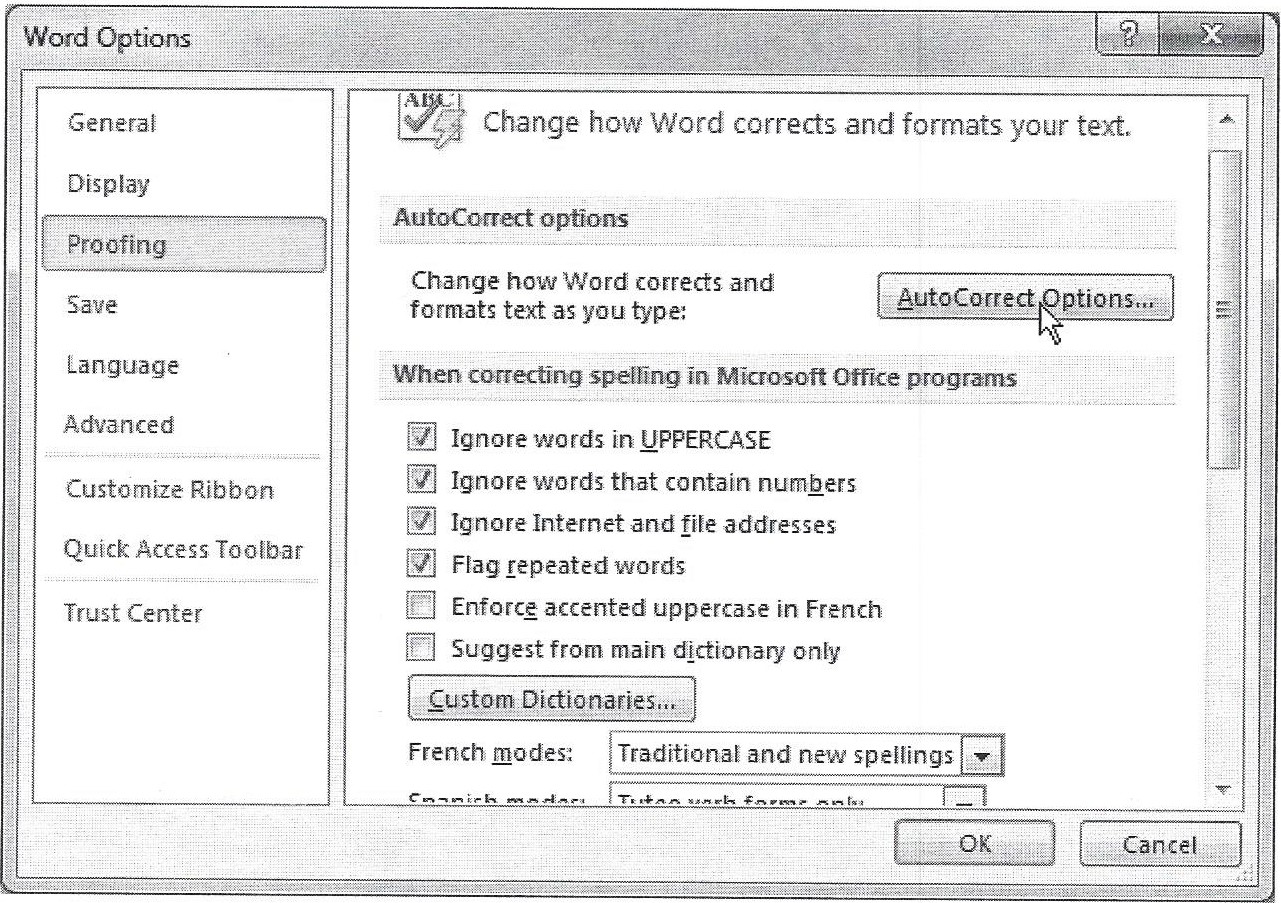
Figure 2 is a screen shot of the Word Options dialog with the Proofing pane selected.
This dialog also follows the standards for ellipses included with the button text when a dialog will be invoked. Thank you again! Unfortunately a problem lies in the dialog that is invoked by the AutoCorrect Options… button on this dialog.
(black & white reproduction)
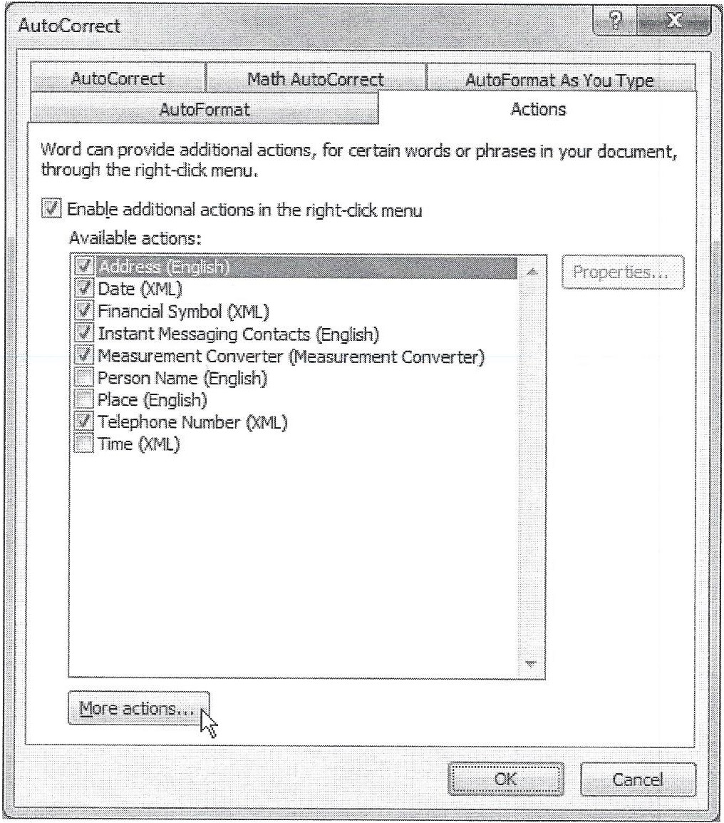
Figure 3 is a screen shot of the Word AutoCorrect dialog, Actions pane. There are three buttons visible near the bottom of the dialog. The OK and Cancel buttons act as expected. The More actions… button has an ellipsis, giving the idea that it invokes a dialog. But it doesn’t. It’s actually a link to another web page (see it here). So why isn’t this a link?
Figure 1 is a clear example that MS Word can correctly implement a link, so why did they fail to do it here? Why was a button used? I have no answer to that.
Unfortunately, this is not the only place where Word confuses the implementation of links and buttons.
(black & white reproduction)
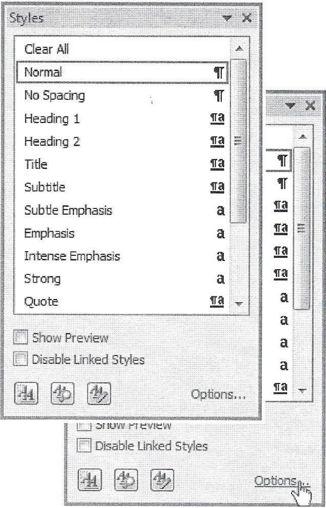
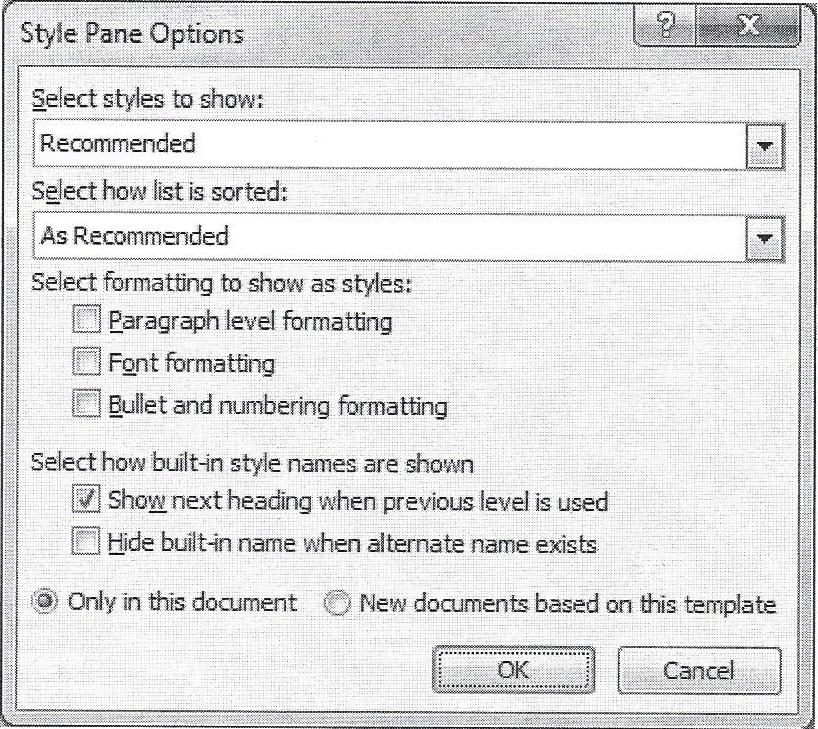
Figure 4 includes two screen shots of the Style Pane in Word 2010, one overlaid on the other. The first is the default view, while the image behind at the lower right includes a mouse hover. Note the bottom row of this pane. There are three buttons to the left that have icons and no text.
(Incidentally, the icons on the lower left buttons are unfamiliar to me and so I have no idea what they represent. A mouse hover is required to reveal a tooltip with descriptions of these buttons. Unfortunately there is also no keyboard access to the Style pane. But that’s a another topic! See GUI Design: 508 Compliance.)
At the bottom right of the Style pane is what appears to be a link. When hovering, the mouse cursor changes to the pointer and the link is underlined (see the lower right image in Figure 4). The text includes an ellipsis, which is the way a menu item (or button text) is displayed when it will invoke a dialog. This link does indeed invoke a dialog. Figure 5 is a screen shot of the dialog invoked by the Options… link on the Styles pane.
So this item appears to be a link, but here is a quick summary of the differences between this “link” and the links shown in Figure 1.
- This link has an ellipsis, where the examples in Figure 1 do not.
- This link adds an underline decoration on hover, where the examples in Figure 1 do not.
- This link invokes a dialog instead of a web page.
(black & white reproduction)
It’s surprising to me that there are so many inconsistencies here. The question is why this was implemented in this way. It’s clear from the examples in Figures 1-3 that the difference and correct implementation of buttons and links is understood. It is as if the wrong “style” was used on this option, causing it to look like a link instead of a button. (It’s ironic that a button on the “Style” pane has the wrong “style.”)
So, apparently, even a major application on a major Operating System can fall into the trap of sloppy implementation and randomly mixing the concepts of buttons and links. With examples like these to follow, it’s no wonder that designers and developers of other GUIs do not understand or follow the correct implementation of buttons and links.
EXAMPLE: SKYPE®
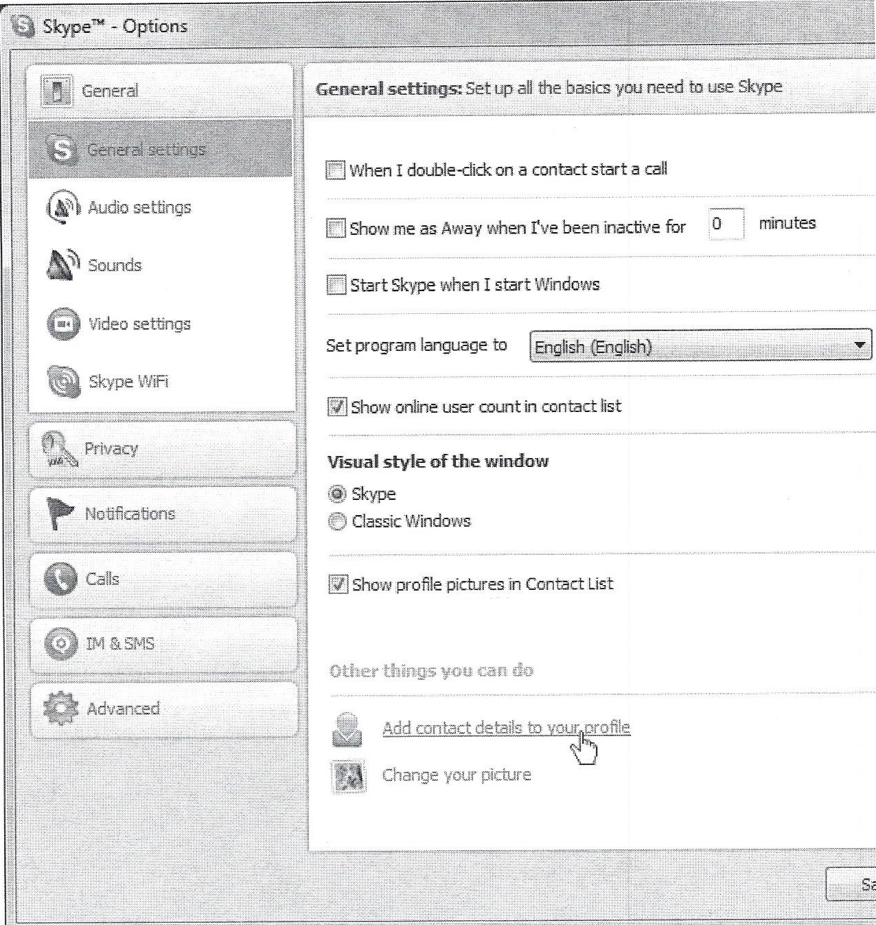
The following Skype® screenshots were taken using version 5.9 on Windows 7. Figure 6 is a portion of a screen shot of the Skype Options dialog, General settings pane.
(black & white reproduction)
Throughout the Skype application I continually have trouble predicting what will happen when I click something. The bottom of the General settings pane on the Options dialog is an example. When hovering over either of the last two options, the mouse cursor changes to a pointer and the text is underlined, indicating that these are links. So far, so good. However the two items act differently from each other. When Change your picture is clicked, a dialog pops up. When Add contact details to your profile is clicked, then the focus switches to the Profile tab on the main application window.
The first time I tried these links I had the Options dialog positioned to the side of the main window, and I already had the Profile tab selected there. The first couple of times I clicked the first link I didn’t notice what had happened because the change was so subtle. In Windows 7, the dialog flashes, drawing attention from the fact that focus has changed to the main window. Not good design.
It’s strange, too, that links are used for both items. Skype uses links throughout its GUI to jump to web pages and other areas of the application. But in most cases it uses buttons to open dialogs. So why was a link used for Change your picture instead of a button? I can only guess that someone thought the two options should look more like each other because they were the only two items listed under the Others things you can do heading. Not a great decision.
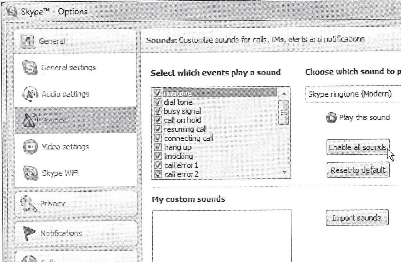
Figure 7 is a screen shot of the Sounds pane on the Options dialog.
(black & white reproduction)
Note the three buttons on the right side of this dialog pane. The first button toggles its text between Enable all sounds and Mute all sounds as it is alternately clicked, disabling the list of sounds to the left when they are muted. The Reset to default button pops up a dialog to verify the action, also giving the option to not verify in the future, so that this action will take place immediately when selected, instead of invoking a dialog. The Import sounds button always invokes a dialog for sound files to be selected.
Three buttons with three different behaviors. Not good design. The first actually toggles a setting, the second may or may not invoke a dialog, and the third always invokes a dialog. A button is the wrong control for the first item. The last button should include an ellipsis because it always invokes a dialog. Only the second button behaves correctly. One might argue that it, too, should have an ellipsis, but since it only optionally invokes a confirmation dialog, the implementation is appropriate.
Which brings us back to the previous panel. Since buttons are used here, why wasn’t a button used for the Change your picture option in Figure 6?
(black & white reproduction)
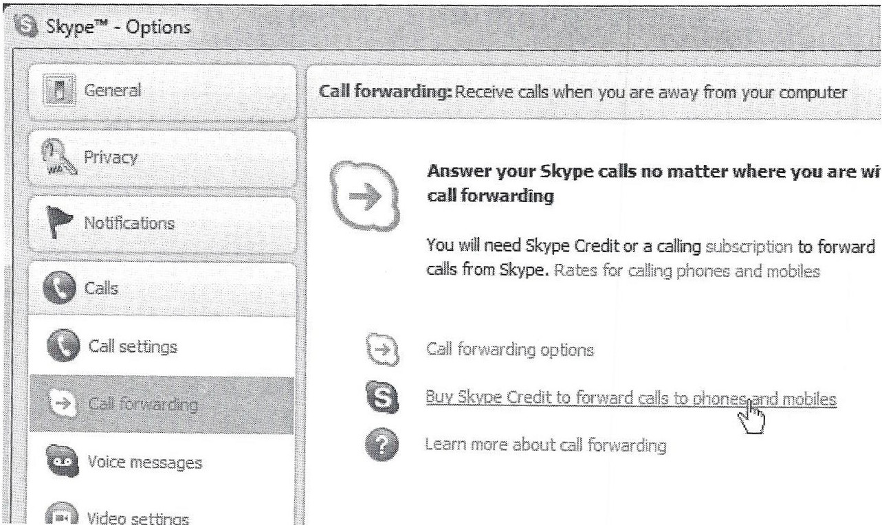
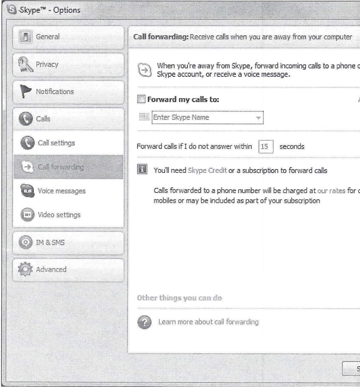
Figure 8 is a portion of a screen shot of the Call forwarding pane on the Options dialog.
There are five links on this pane. The first two in the descriptive paragraph near the top both link to web pages. Fantastic! That’s what a link is for. Unfortunately, each of the three links listed together at the bottom of the pane behave differently from each other. The good news is that the last link, Learn more about call forwarding, invokes a web page just as the links in the paragraph. The Buy Skype Credit to forward calls to phones and mobiles link invokes a dialog for the action. The Call forwarding options link actually redraws the pane. Figure 9 is a portion of a screen shot of the Call forwarding pane after the Call forwarding options link is clicked.
(black & white reproduction)
I often click through options and immediately return to the previous display in order to orient myself and discover the features of an application. It was frustrating to discover that there was no apparent way to return to the previous display after clicking the Call forwarding options link. Some of the same options are available here, but in a different layout. The last link on this panel is identical to the previous panel, while the Skype Credit link in the paragraph here mimics the Buy Skype Credit to forward calls to phones and mobiles link in Figure 8, also invoking a dialog.
KEY DESIGN POINTS
- Buttons are normally used for actions, while links are normally used for launching web pages.
- Menus and tables have their own standards, but don’t confuse them with unrelated buttons and links.
- Don’t be inconsistent within your GUI! If you don’t follow the first two patterns, then at least establish something predictable and use it throughout.
[…] as a link, rather than a button. Links are not my favorite choice for actions on a dialog (see GUI Design: Links vs. Buttons), but it does accomplish the goal of highlighting the difference between primary and secondary […]