Why do we fail to learn from the lessons of the past?
Because we don’t take the time to learn them!
Part of the problem is that we, as designers and creators, often never fully appreciate or understand what went into the products that we are enhancing or replacing. Most users of most software applications take advantage of a minimal subset of the product without gaining much depth or a complete knowledge to build upon. Designers can fall into the same trap.
The most effective users of applications I have ever known are those that take the time to read and understand the documentation. These users are efficient, effective, and knowledgeable, but they are the exception. We live in a day of impatience. If a feature cannot be found or understood quickly, the pursuit is often abandoned. This will get worse as software creators forego the creation of documentation, insisting that apps should be self explanatory. Yes, they should to some extent, but it will never be completely so. Users should not be forced to use trial and error to discover what a product can do, because no matter how hard they try they will never be able to discover everything. Documentation also answers the important “why” questions. Sometimes a user will discover a feature only to have no idea how or why to use it.
Below are two examples of problems that existed decades ago that were solved by some products, but remain ignored by others today.
HIDDEN CURSOR
WordPerfect® for Windows® figured out decades ago that users are annoyed by a hovering mouse cursor in the area where they are typing. The cursor can easily cover or distort what is being typed. This is especially true with the concept of a shadow cursor that is displayed to give the user hints about where focus will end up when the mouse is clicked. So WordPerfect hides the mouse cursor (and any shadow) when typing begins. Microsoft® Word® added this feature also. This is a logical, wonderful feature, so why don’t more GUIs follow suit? OpenOffice® doesn’t have it; few applications do.
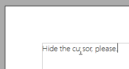
Figure 1 is an example of how a cursor can interfere with the text behind it. In this case the cursor is hiding a portion of the first “r” in the word “cursor.”
More than once I’ve been annoyed at the need to bump my mouse to get the cursor out of the way in order to clearly see a username I just typed, because there’s no room for error when logging in. I often use password-protected files or am logging into web sites. And, of course, if I just clicked in the input field, then the mouse cursor is right in the way!
Too bad Microsoft® didn’t include this feature in their other products, like IE®, when they added it to Word. I could find no browsers on Windows with this feature, but all browsers really should have it. Of course Mac® has this feature in its Operating System (including on the login screen), so most Mac applications have it, though OpenOffice for Mac does not. I’m pleased about Safari at least, because this is the browser I use most often when I’m working on my Mac.
WINDOW FOCUS
I owned a Mac® in 1984. That’s the year that Apple® introduced the Macintosh®. When I first started using Windows® 3.1 (almost a decade later) I was constantly annoyed that it was often not clear where the focus actually was. Windows was trying to replace the Macintosh OS, but this is something they missed. Amazingly enough, and very unfortunately, Windows has still not figured this one out. Figure 2 is a portion of a screen shot from Windows XP of two applications that each look like they have the focus.
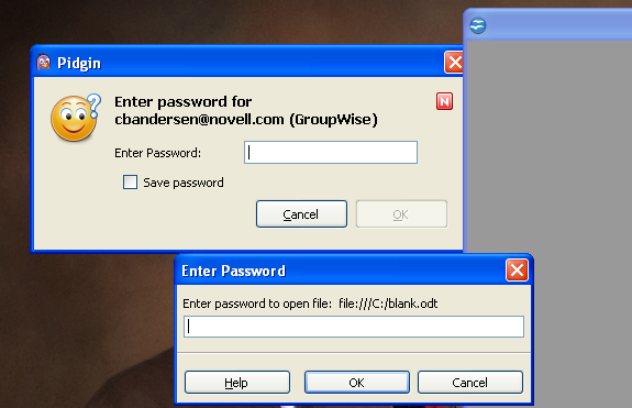
The upper left portion of the screen shot shows the password dialog for Pidgin®, complete with a bold title bar and flashing caret in the input field. The right side of the graphic shows that an OpenOffice® document window is covering the right edge of the Pidgin dialog, meaning OpenOffice actually has the focus, including its own Enter Password dialog with a bold title bar and flashing caret in the input field. Only because I have placed one overlapping the other would one be able to know which really has the focus without first clicking or typing. How often have Windows users started typing in such a scenario expecting something to occur in the window they are currently looking at, only to discover that the characters are appearing somewhere else? Crazy.
Figure 3 is a portion of a screen shot from Windows 7 of two applications that each look like they have the focus.
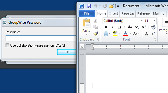
The left side of the graphic shows the Novell® GroupWise® Password dialog complete with the flashing caret and an OK button that is displayed as the default action for when the user presses the [Enter] key. As with the previous graphic, I placed the other window over the right side of the dialog to show that it does not in fact have the focus. In this case, Microsoft Word is also displayed with a flashing caret for the focus. So a user could easily type the GroupWise password and press [Enter] causing it to be displayed in the Word document instead of actually logging in to GroupWise. Not great.
It’s common for products that are trying to be a replacement for something that has existed much longer to not quite get it right the first time. Designers rarely have or take the time to completely know their competition. (In this case, however, it’s quite amazing that this problem still exists in Microsoft Operating Systems more than 20 years later!)
KEY DESIGN POINTS
- Read all documentation. You’ll be amazed what your favorite OS and app can do!
- “Try everything at least once.” Some persons use this as a motto for their lives in general. More software designers should try this with applications they are enhancing or replacing.
- Don’t assume that just because you don’t use or understand a feature that your users won’t want it.