We get in the habit of doing things in a certain way and don’t want to have to think about the details of repetitive tasks. This concept has come to be known as muscle memory. It applies in all areas of our lives, including repetitive tasks we perform with a user interface. GUI designers should take care to assist users of their products by placing the same controls in the same relative location whenever possible. This greatly enhances usability and reduces frustration. Two unhappy examples have come to my attention recently.
NOVELL® GROUPWISE®
Novell® GroupWise® is an outstanding product that has been around for a long time. Like all great products, however, sometimes new features are added without as much care as they should be given. Email applications over the last few years have provided richer functionality to the editing of new mail messages with the addition of outlining features, for example. Figure 1 is a portion of a screen shot of the Gmail® by Google® Compose panel.
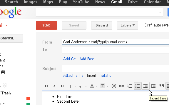
In the lower right area of the graphic are found the toolbar icons for outlining with numbers or outlining with bullets. The indentation of the various levels of the outline can be adjusted with the Indent Less (currently displayed with the mouse hover) and Indent More buttons. Most other email applications have the same type of functionality.
Figure 2 is a combination of portions of screen shots of the New Mail panel for both the Windows and the browser versions of GroupWise.
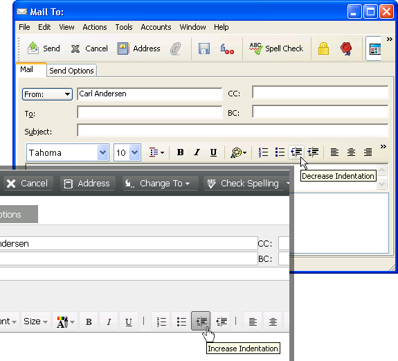
for Windows and for Browser
Notice the GroupWise toolbar options for Decrease Indentation and Increase Indentation for the Windows version (top right) are in the same order as the Gmail example. Unfortunately, the GroupWise browser version (bottom left) reverses the order. It’s one thing to have a variation between browser versions of competing products, but there is no apparent reason for having the order of the controls be reversed between different platforms of the same product from the same company.
This was brought to my attention by a co-worker who commonly uses both versions of GroupWise and was getting frustrated trying to remember the relative position of the two options, without needing to repeatedly look so closely at the icon or the tooltip before clicking.
(You may notice that other icons on these toolbars are in varying locations also, but where the two Indentation icons are so closely related to each other, their relative location is very important for the user.)

GMAIL® FOR iOS
I had a related experience recently as I was working with Gmail on my iPhone using the browser interface. I prefer the browser version of Gmail to the default iOS Mail app.
I was cleaning out my inbox from a lot of advertisement mail messages that I like seeing sometimes, but not all the time. I opened several individual messages which I ended up deleting one at a time while the message was open. Then I decided I was just going to delete several at once without reading them.
Figure 3 is a screen shot of the display when an individual message is open. Note the Delete (trashcan) icon near the top of the display for deleting the current message. Choosing this option will return the display to the list when the message is deleted. (The buttons across the bottom of the screen are part of the browser display.)
Figure 4 is a screen shot of the display with two messages in the list selected that I intended to delete. After opening several in a row and deleting them using the Delete icon at the top of the display for individual messages (Figure 3), it was disconcerting to select several from the list and reach again for the top of the display to delete them all at once, only to accidentally hit the& Search icon (Figure 4) because that was the nearest icon to the location where I was expecting the Delete icon to be.

That’s muscle memory. It’s something that affects everything users do repetitively, even when there is a slight variation, such as viewing an individual message or selecting multiple messages from a list.
Now, don’t get me wrong: I understand why this display ended up this way. It’s a result of the functionality of the display.
When individual messages are selected from the list using the check box, then a new toolbar appears near the bottom of the screen (just above the browser buttons) for actions which are only available when something is selected. This toolbar includes the number of items selected, followed by icons for the available actions Archive and Delete, as well as other items on the popup menu. There is also a Cancel icon that looks like an X (at the far right of the toolbar) which removes all check marks and hides the toolbar. It’s nice functionality, but it has problems. I didn’t even notice that the new toolbar appeared at the bottom when I began by selecting an item at the top of the list. It is common for users not to notice subtle changes that happen away from where they are currently focused.
I’m sure one of the reasons this toolbar was placed at the bottom of the screen was because inserting it at the top would necessarily move all the items in the list downward immediately after the first item is selected; users wouldn’t like that. I imagine another reason is that there is very little room at the top to include these actions in the bar that is already there.
So as stated above, I can understand how it might have ended up this way. And I’m not saying there is necessarily an easy answer for the problem, but I would highly recommend a change in any situation like this.
SUMMARY
Designers need to assume that users are not analyzing each new display and layout. Rather they are simply looking to find desired functionality as quickly as possible, ignoring the rest. If I didn’t write this blog I think I would just end up briefly shaking my head with annoyance and moving on. However, because I do write this blog, as I prepare for each article I post, I spend quite a bit of time analyzing the GUI around the annoyances I have found. Therefore, I usually end up with a better understanding of what is going on and why. Unfortunately, only rarely have I felt like the design which led to the annoyance was the best solution.
KEY DESIGN POINTS
- Take time to test your GUI in repetitive ways.
- If there is any way to put similar functionality in the same location on each screen that needs it, then do it!
- Remember that users often won’t notice changes to the screen that are not directly next to what they are doing (even on a small screen like an iPhone).