I recently completed a usability review of a web app that has not yet been released. After logging in I saw two icons and the words Welcome, carl at the upper right. One of the first things I look for when reviewing usability (for a product that requires login) is how to log out. On mouse hover I found there were tooltips for the icons but not for the welcome, carl, and none of these showed a down arrow or pointer curser indicating they were clickable. It turned out that clicking on the Welcome, carl actually displayed a menu with the option to Logout, but there was no clue that any options were there until I clicked the words. Of course I recommended that the mouse change to a pointer on hover and that the words include a down arrow to indicate an available menu.
Some weeks ago I received an e-mail from a GUI Notebook reader who was frustrated trying to figure out how to logout of a popular web app. He suggested that I post an article about it (thanks, D). I fail to understand recent trends by GUIs to make it more and more difficult to know how to logout.
HIDING THE EXIT
on Action Menu and Log Out option
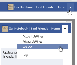
The GUI that the reader emailed me about happens to be Facebook®. Figure 1 shows portions of two screen shots showing the right side of the menu bar after logging in to an account.
It turned out that the down arrow at the far right was lost at the end of a list of other menu bar options that were written out (that is, the name of the account, “Find Friends,” and “Home”). None of these options (including the down arrow) have a tooltip associated with them, so the reader didn’t notice that the arrow was a separate item from the others. Actually, Facebook has done something similar to tooltips by updating the shaded area below the menu bar, but it is so far removed that the changing messages are easily lost by this unusual implementation. (Notice the text behind the menu that begins with “Update…”)
There is a vertical bar separating the options (which is an especially good idea when some options are more than a single word), but the lines are so light that they are practically unnoticeable.
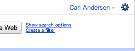
Figure 2 is a portion of a screen shot from the previous GUI for Gmail® by Google®. Notice that the account name has a down arrow at the right, indicating that menu options are available for this account. This is where the Sign out option is located. There was no tooltip, but at least the arrow gives a clue. The gear icon did have a tooltip that stated Options.
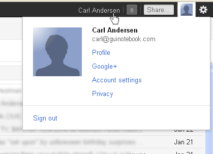
Figure 3 is a portion of a screen shot from the new Gmail GUI (which was made available in November 2011). Notice that there are now three more menu items between the account name and the gear icon.
Gmail has implemented these new menu options in unusual ways. The account name is the only option in the menu bar that does not change the color of its background on hover, though the mouse cursor does change to a pointer, indicating that it is clickable. Hovering over the 0 icon to the right of the account name shows the tooltip Notifications, but the next two menu items (Share… and the account picture) do not have tooltips. The gear icon still has the Options tooltip. The inconsistencies make learning a new GUI frustrating. Something else strange is the fact that clicking the account name and clicking the account picture both act as if the account picture was clicked (as shown in Figure 3). Note the Sign out option at the bottom of the menu. It’s unfortunate that the new GUI obscures this option even more than previously. This is an example of the evolution of a design resulting in a degeneration rather than an improvement.
START OR FINISH?
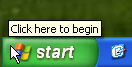
Where did the idea of hiding the log out option start? Most of us regularly have the opportunity to help family members with computer problems. I remember a phone conversation years ago when I was asked about the procedure for logging out of Windows®. This person was new to a Windows® XP system with multiple user accounts for other family members. As soon as I said, “Click the start button in the lower left of the screen,” she responded with, “No, I need to log out, not log in.” After I assured her that I understood, she asked, “Why do I need to choose start when I want to end?” Good question. Figure 4 is a portion of a screen shot of Windows XP, showing that not only does the button read start but even the tooltip states “Click here to begin,” giving a new user no clue that this would be the way to log out.
Figure 5 is a portion of a screen shot showing the tooltip for the Log Off option after clicking the start button.
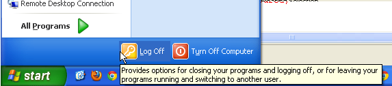
Clicking start of course displays an entire two-column menu of selections, drawing the user’s eyes upward, so the Log Off and Turn Off Computer options can easily be missed. Not only is the word start misleading, but the desired Log Off option is also easily lost in the clutter. Worse yet, the new user who has finally (and gratefully) found the option does not know that selecting Log Off will not log off immediately, but rather, give more options to choose from. (Incidentally, the same is true for Turn Off Computer, which does not immediately perform the action, but gives more options.) Not good design. (Those of us who spend most of our lives on computers become accustomed to poor implementations which are confusing and discouraging for new and/or occasional users.)
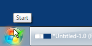
Figure 6 shows that Windows 7 is an improvement with the first problem. Notice that the previous start button is now simply a “Windows” icon, which more effectively gives the impression that “Windows options are available here,” which would reasonably include logging out of the system. Unfortunately the tooltip for the button still has the unhelpful text Start. A tooltip with lots of detail (similar to Figure 5) would have been much better.
Figure 7 is a portion of the screen shot after the Windows 7 Start button has been selected.
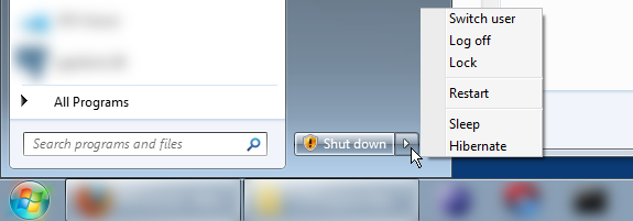
Though having an icon instead of the word start is less misleading, unfortunately, now the option to Log off is hidden under the Shut down menu. At least there is an arrow next to Shut down so the user knows there are options here, rather than just shutting down immediately.
PROVIDING HINTS
Providing hints that options exist should always be a minimum.
Figure 8 is a portion of a screen shot from the Pandora® web site after logging in to an account. There are two options at the right end of the menu bar: the account name and Upgrade. Note that the account name has a down arrow indicating that options are available for the account. Hovering over the account name (and the arrow) changes the background color; clicking shows the menu.
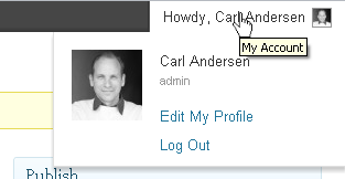
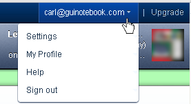
Figure 9 is a portion of a screen shot of WordPress® web site after logging in. The only option at the right end of the menu bar is the account name, preceded by Howdy, and followed by the account picture. There is no down arrow indicating a menu, but hovering over any of the words or the picture immediately expands the menu with the Log Out option at the bottom. (There is also a tooltip stating My Account.)
Hinting at it is certainly better than those GUIs that completely hide or obscure the option, but it really is better to just make it clear.
CLEAR PATH TO FREEDOM
I really appreciate the GUIs that make the escape route very clear. There is no good reason to make the user hunt for it.
The Home Depot® web site makes the exit clear. Figure 10 shows the upper right portion of the web site after logging in to a Home Depot account. The red Log Out button in the upper right is easy to see. The arrow is unnecessary and might give the impression that a menu will be displayed on clicking, but it’s definitely easy to find!

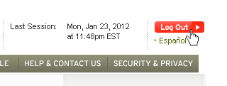
Figure 11 is a portion of a screen shot of the Chase® web site showing the upper right side of the panel. The LOG OFF button is red and bold; no user should ever have trouble finding it. Very well done.
KEY DESIGN POINTS
- Don’t make users search for Log Out. When they’re done, they want out!
- Don’t use an unusual implementation that offers no enhanced value (for example: a disconnected message area instead of a standard tooltip as in Figure 1).
- Don’t pretend that Start means End or that Welcome (or Howdy) also means Goodbye (unless you’re using the word Aloha).
[…] January of this year I posted an article entitled Let Me Out! — GUI Design where I discussed how some GUIs make it difficult to discover how to logout of their […]