I have frequently mentioned before how important consistency is in a GUI. In this post I will be looking at some inconsistencies in the Workday® product, specifically in the area of Goals. My Goal herein is to inspire them to make it their Goal to fix these silly inconsistencies ![]() , because they really affect the usability of the product.
, because they really affect the usability of the product.
I work for Micro Focus®, where we use Workday to manage the entire spectrum of employee details.
As a manager I regularly meet with team members to discuss goals. Keeping records of goals and accomplishments in Workday is great preparation for year-end reviews. Workday provides two main areas for goal setting:
- Individual Goals – We use this for individual tasks and assignments for our day-to-day business
- Development Items – We use this for promoting and encouraging personal skills development
INCONSISTENT ORGANIZATION
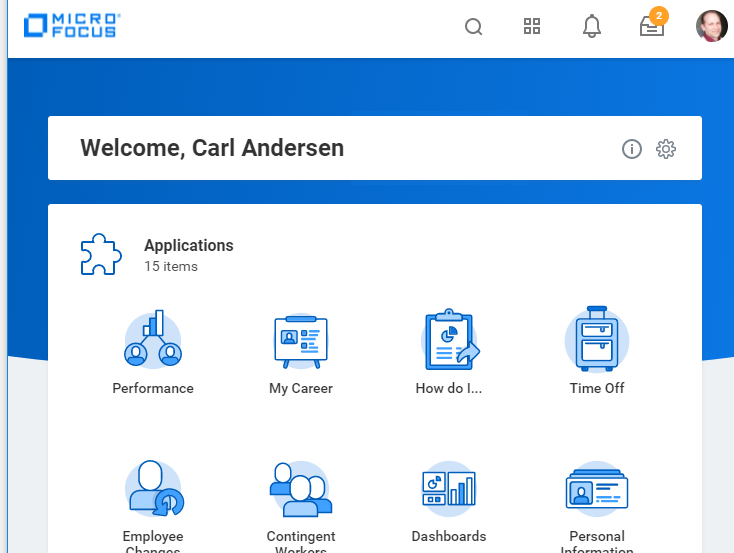
Figure 1 shows a portion of an edited screen shot of the panel I see when I first sign in to Workday. When I’m accessing my goals, or more often, when I ask a team member to share their screen (because we are all working from home now) and go to their goals in Workday, this is the best method for getting there.
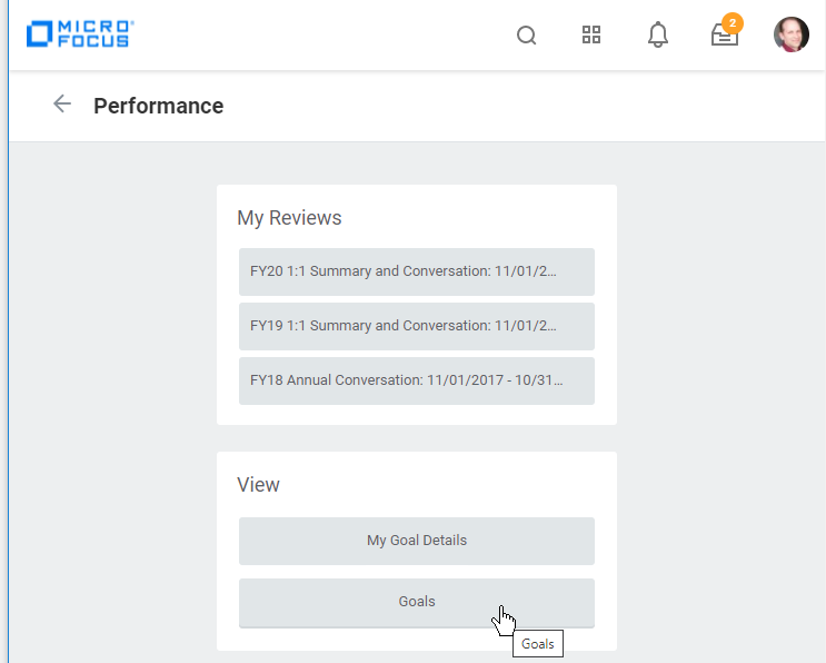
Selecting the Performance icon then displays the panel in Figure 2. Selecting the Goals button gets us where we want to be.
(Occasionally someone will accidentally select My Goal Details by mistake. I don’t want to spend much time on that here, but My Goal Details is a useless option in my opinion. All that is available is viewing the goal. It cannot be edited, deleted, or anything else. I don’t know why anyone would ever go here when they can select Goals and have all options available. Sometimes we think we “only want to view” something, only to discover we would like to edit it after all, but then it cannot be done. This is a typical case of “you can’t get there from here.” But I digress.)
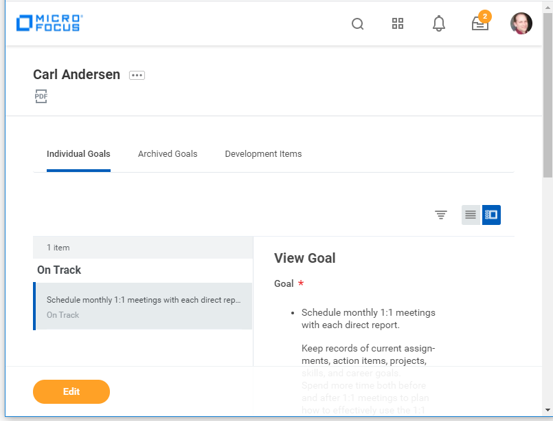
Figure 3 is a screen shot of the panel that is displayed when Goals is selected from the panel in Figure 2. I made the window quite small before taking the screenshot, but everything is still visible and usable. That part is well done. In fact, notice how the bottom portion of the panel with the Edit button stays in place when the screen size is reduced and when the panel is scrolled up and down. It even provides a shadow of the rest of the panel behind it. I like it. 
Now let’s focus the three tabs in Figure 3 for Individual Goals, Archived Goals (which is only for archiving Individual Goals), and Development Items. This is good. The reason I consider this the best way to navigate is because this panel gives access to both Individual Goals and Development Items. When I discuss goals with team members, we discuss both categories. However, as a manager, I’m not able to see this display for a team member. Rather I have to go to two different areas in the GUI to find these two types of Goals. Workday organizes them differently, grouping them in different categories. Workday considers Individual Goals to be part of an employee’s Performance, whereas Development Items are part of an employee’s Career. I suppose it makes sense, but it complicates the UI.
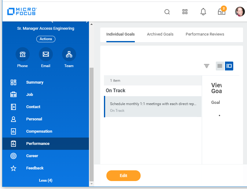
The two types of goals can be seen separately in the Performance or in the Career areas when navigating differently. For example, if I click on my picture icon in the upper right of any of the panels shown above and select View Profile from the dropdown (not shown), I am presented with blue navigation bar along the left side of the panel (with Summary selected). Figure 4 shows a screenshot of the panel displayed when I then select Performance from this blue navigation area.
Notice the difference in the third tab between Figure 3 and Figure 4. The third tab in Figure 3 is Development Items, whereas in Figure 4 it is Performance Reviews. Confusing. This happens because of the way we got to each of these panels. But we were not helped along the way either. Notice the header of Figure 2 states Performance because we selected that icon on the main page. But the Performance panel in Figure 2 is different from the Performance panel in Figure 4. Clearly, they should have different titles!
I don’t spend my life in Workday, so it was weeks before I figured all this out. Ugh.
INCONSISTENT EDITING METHOD
In any case, now that we are here, let’s take a look at at how we edit these different types of goals.
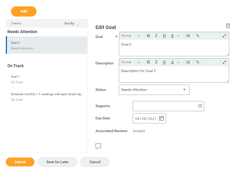
Figure 5 is a portion of a screenshot of the Edit Goal panel that is displayed when the orange Edit button (in Figure 3 or Figure 4) is selected.
Notice there are three goals along the left side, grouped by their current status (i.e. Needs Attention or On Track). When this panel is displayed, the first goal in the list is always selected by default. This is confusing to users who may have been viewing a different goal when they clicked Edit. I have watched many times where a team member starts changing the details of the wrong goal because they didn’t realize this.
I constantly need to remind them that they are “Editing” the entire list, so all of the current Goals can be edited and multiple new Goals can be added before Submit is selected and everything is changed at once. No one seems to like this paradigm. They want to see their changes immediately, so most will hit Submit after each Goal change and then select Edit again to a current one or Add a new one. It is also not intuitive for users who are happy with the items in the current list, and now they want to add a new Goal. I cannot count how many times I’ve been asked, “How do add a new one?” The answer is select “Edit” (because you’re editing the entire list) and then the “Add” button. The reason this doesn’t feel right is that a current Goal always appears to be selected when Edit is selected. Clunky.
(It should be noted that some improvements have been made here. For the first part of 2020 when Submit was selected, the display went all the way back to the beginning, requiring multiple clicks to get back to the Goals list. Then partway thru the year, a change was made such that a single click would return the display to the list. Now Submit takes you directly back to the list. Small improvements. ![]() They are trying.)
They are trying.)
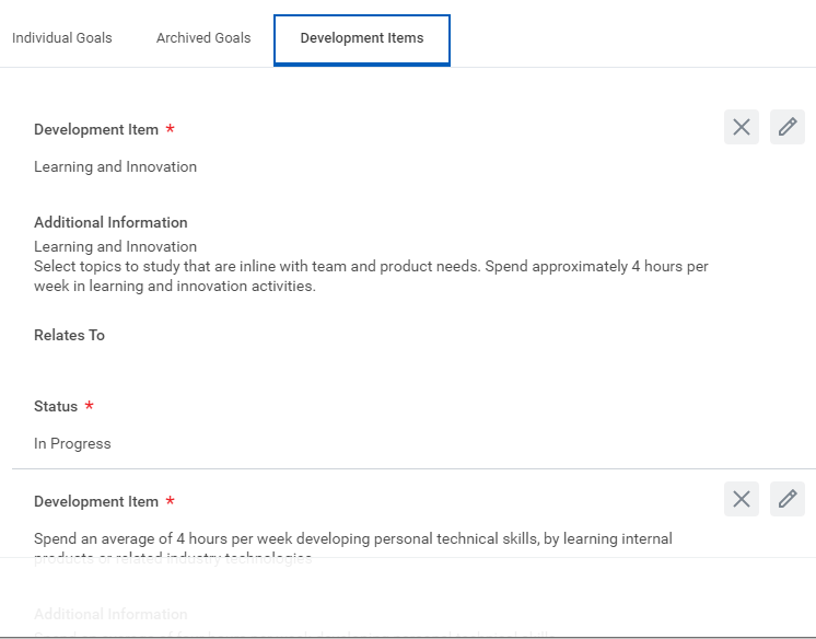
Ok, well, whether or not you like the paradigm, the problem is made worse by then selecting the Development Items tab. Figure 6 is a portion of a screen shot of that tab.
Notice that the GUI for editing a goal under Development Items is completely different from the GUI for editing Individual Goals. On this panel each goal is edited individually using the ![]() icon to the right of each one. The
icon to the right of each one. The ![]() icon is for deleting the Goal. Users seem to find this more intuitive than the first tab. But the inconsistencies are frustrating. For example, why is there no way to Archive these Goals? This list just keeps growing if items are not deleted. I prefer not to delete them until the end of the year so that we have a record of what was accomplished. The list can get long. Gratefully, the Completed items automatically move to the end of the list.
icon is for deleting the Goal. Users seem to find this more intuitive than the first tab. But the inconsistencies are frustrating. For example, why is there no way to Archive these Goals? This list just keeps growing if items are not deleted. I prefer not to delete them until the end of the year so that we have a record of what was accomplished. The list can get long. Gratefully, the Completed items automatically move to the end of the list.
But guess where you have to go to Add a new Development Item. It’s a button at the very bottom of the list. Again, not intuitive for the infrequent user. Why wasn’t it placed at the top of the list as it is for the Individual Goals Edit panel?
This is a clear case of design and implementation of two similar panels being done by different people (at least I hope so). And no one is reviewing the work for consistency. Users don’t appreciate the carelessness. As a last resort, I would hope that the documenters would bring it to the attention of those who created this problem. In many companies, however, even if this is brought up, it’s too late in the cycle to make the needed correction. Sad.
Because I’m using these areas of the product nearly daily, I’m able to work around this without much problem, other than annoyance. But my team members who only use it once or twice a month will likely never figure out the differences and will require guidance every time. Workday should do better than this.
INCONSISTENT MESSAGES
This next error is really the type that usability testing should catch.
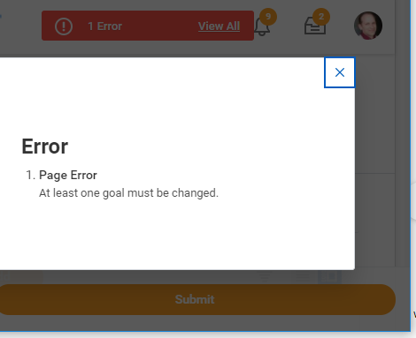
If you end up on Figure 5 by mistake, or simply decide not to make any changes, you will compound the error by selecting either the Submit button or the Save for Later button.
Figure 7 is a portion of a screen shot of the error displayed when selecting either Submit or Save for Later after making no changes. That’s fine. I guess it’s a good idea to ensure I realize that there is nothing to save. However, when I now select Cancel because I don’t want any changes, then Workday apparently suddenly forgot that I had made no changes.
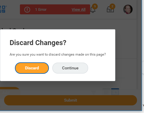
Figure 8 is a portion of a screen shot of the error displayed when selecting Cancel after trying either Submit or Save for Later. Annoying.
(Actually the red bar in the background of Figure 7 and Figure 8 with “1 Error” is the only thing that changes when these buttons are clicked, and the popup appears after selecting the “View All” button. It would have been much better to simply show the errors inline without requiring an extra click to see the message and then another one to dismiss it. Ugh.)
The Discard button in Figure 8 will get me out, while Continue takes me back to the Edit Panel. I guess it means “Continue Editing.” That distinction would be helpful. I looked back and forth before figuring out that it did not mean “Continue Canceling.” More annoying.
It should be noted that if Cancel is selected before trying either of the other two buttons, then it works just fine. Again, this is the type of error that usability testing should catch. Users simply do not just click every button in the exact order you intend. Either intentionally or by mistake, things will be out of order sometimes. Your product’s reaction to those events should not make the user even more frustrated.
INCONSISTENT TERMINOLOGY
Please create a Lexicon for your product. You should list every word and phrase that should be used and stick to it!
“Delete” or “Remove”
In my experience, if a product uses words inconsistently such as “Delete” and “Remove” when they intend to mean the same thing, or “Sign in” and “Log out” for opposites, then you will quickly find other far more important and confusing inconsistencies that make the GUI difficult to use. It also indicates lack of attention to detail, sloppiness, and inadequate usability testing. For example, I have used multiple products that use “Delete” to completely eliminate something (like erasing a file from a device), whereas “Remove” is for taking an item out of a list (like taking a song out of a playlist), but the item still exists. Users who are familiar with these distinctions from other applications can be momentarily confused when the terms are used interchangeably. Will this action really do what I want it to do?
Don’t use multiple terms for the same idea.
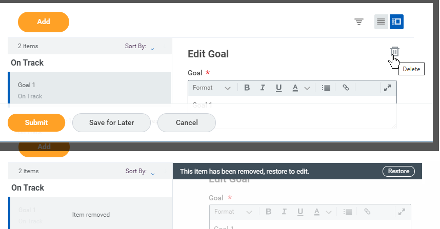
Figure 9 combines portions of two screen shots from the Edit Goal panel. Notice the ![]() icon near the top right with the “Delete” tooltip. When this icon is selected the panel updates to what is shown in the lower portion of the Figure, including the black message bar with “This item has been removed, restore to edit” and a Restore button. Ignoring the improper grammar of the sentence, the GUI has replaced the term “Delete” with “Remove.” It might seem like a silly complaint, but you’re making your users think more than they should have to. And what if I don’t want to “edit” it, but simply want to “undo” the delete/remove. That’s what the “Restore” button really does. There are just too many poor assumptions being made here. Sloppy.
icon near the top right with the “Delete” tooltip. When this icon is selected the panel updates to what is shown in the lower portion of the Figure, including the black message bar with “This item has been removed, restore to edit” and a Restore button. Ignoring the improper grammar of the sentence, the GUI has replaced the term “Delete” with “Remove.” It might seem like a silly complaint, but you’re making your users think more than they should have to. And what if I don’t want to “edit” it, but simply want to “undo” the delete/remove. That’s what the “Restore” button really does. There are just too many poor assumptions being made here. Sloppy.
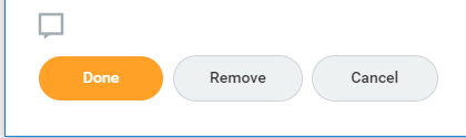
In order to capture screen shots for these posts, I often create small windows. I discovered that when editing a Goal with a very narrow window, the buttons along the bottom change to what is shown in Figure 10 because now only a single Goal is visible. The Done button is new, akin to Submit. The Remove button is the same as the Delete icon. And Cancel works as expected. Really?
Figure 9 and Figure 10 show inconsistency on a single panel. But let’s take a look at the same inconsistencies between panels.
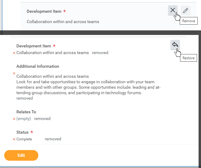
Figure 11 is a portion of two screen shots from the Development Items panel. The top portion shows the tooltip “Remove” with the ![]() icon.
icon.
Both the icon and the term are different from the panel in Figure 9.
Selecting this option updates the panel as shown in the lower portion of Figure 11. Note the “removed” text next to each individual attribute of this particular Development Item and the new ![]() icon with the “Restore” tooltip. Nothing on the Development Items panel is done in the same way as the Individual Goals panel.
icon with the “Restore” tooltip. Nothing on the Development Items panel is done in the same way as the Individual Goals panel.
(Something else to note is the orange Edit button at the bottom of Figure 11. This is a bug. It shows up when the window is resized. This button area is actually for the first tab (Individual Goals). Selecting Edit here will invoke the panel shown in Figure 5 and leave your Development Items panel in an unknown state. Not awesome. You can also see evidence of the button area at the bottom of Figure 6, though no buttons are currently displayed.)
“Goal” or “Event”
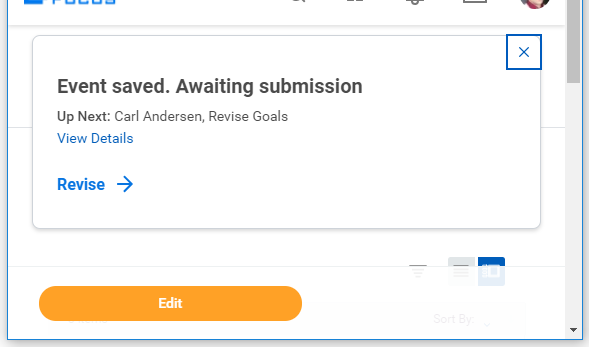
Figure 12 is a portion of a screenshot taken after the Save for Later button is selected (see Figure 5 or Figure 9). It works as intended (if changes have been made), but the text displayed is odd. I just saved “changes” to a Goal, but the message uses the term Event. The expression “Awaiting submission” is a good reminder that I haven’t submitted it yet, but it would be better to mention the actual button involved here, perhaps something like “Changes saved for later. Click Submit when done editing Goal.”
“Edit” or “Revise”
Which brings me to my next point. Where did the word “Revise” come from? If you’re a professional editor, then you probably appreciate the difference between “Edit” and “Revise” in that context. But what is it supposed to mean here? This GUI suddenly uses “Revise” for changes that have been saved for later, but not submitted. Is that helpful? I don’t think so. Selecting the  link takes you directly to editing the Goal that was just saved for later, but I only know that because I tried it. The text really should be “Edit this Goal” or “Edit the saved changes” or something similar.
Note that the orange Edit button acts like it does on all of the other panels (phew!).
SUMMARY
I really thought this would be quicker and shorter, but the more I got into it, the more issues I had to point out. I think I will need to write a complete GUI review for Workday at some point. There are plenty of areas that have similar problems, but this is where I spend most of my time. So for now, we will just see if Workday will take my suggestions here!
KEY DESIGN POINTS
- Consistency: Display a unique title for each unique panel; make the distinctions clear and obvious
- Consistency: Use the exact same method (and panel, if possible!) to do the same thing in different areas of your product
- Consistency: Create a lexicon for your product and follow it vigorously, so that users aren’t trying to figure out why a different word was used for the same concept
I just edited the wrong goal indeed.
“I really thought this would be quicker and shorter”, and I am surprised it’s not longer! Some of these things I was not aware of at all, but now that I am, it makes me dislike workday even more! It is a good thing I have this page as a reference now to work in workday. Only when you’re not avaiable of course. Great post about a headache of a tool!