Tooltips are a largely unused, yet potentially powerful resource in a GUI. I’ve noted in previous articles places where tooltips are well used and places where they could have been used to circumvent issues. For this posting I’ve decided to take a look at a few various tooltip implementations.
USELESS TOOLTIPS
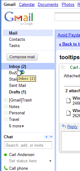
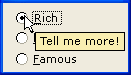
Figure 1 shows the left navigation area of Gmail® by Google®. The display is on the default Mail panel which presents navigation options of Inbox, Buzz, etc. The mouse cursor is hovering over the Inbox option which currently has the additional text (2) following it, indicating that there are 2 unread messages in my Inbox. Note that the tooltip has the identical text as the option itself. Hovering over any one of the nine options from Inbox down to Travel does the same thing: the tooltip shows the identical text as the option.
What’s the purpose of a tooltip that states the exact same thing that is already displayed? Tooltips, of course, take a moment before they display, so a user hovers in order to get some more detail and receives nothing for the effort.
These tooltips are useless.
(Hovering over the four options from [Gmail]Trash down to Notes does show a dropdown arrow at the left to give additional options, but the tooltips nonetheless offer no added value.)
Unfortunately, repeating the text is the default of many applications that create GUIs. WordPress® is no exception, as may be noted by hovering over the names of recent articles posted at the upper right on this panel. Ugh.
HELPFUL TOOLTIPS
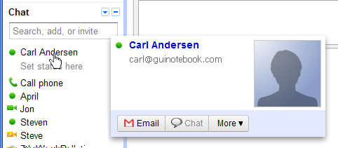
Figure 2 shows Gmail® with the mouse hovering over a contact name in the list. Unlike the tooltips for the items above, this is actually helpful. The popup shows more information about the current contact, including a flattering picture. 
Figure 3 shows Microsoft® Word® 2002 with the mouse hovering over the toolbar Print option.
I included this older example because Microsoft has always been pretty good at providing helpful tooltips. The tooltip not only states Print, which may or not be showing with the icon, but it also shows the keyboard sequence for the option (Ctrl+P), as well as stating which printer is the default selection. Very nice, especially since this option sends the print job directly to the printer without giving the option of changing any settings beforehand. Well done.
FRUSTRATING TOOLTIPS
Figure 4 shows the tooltip for Corel® WordPerfect® disabled Print option.
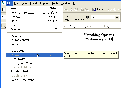
This screen shot was used in my article Vanishing Options — GUI Design. The tooltip for this option has the potential of being helpful, except for the fact that the Print option is currently inexplicably disabled. The tooltip really should be giving some information regarding why the option is disabled. As it is, the user is simply frustrated by the very unhelpful message Specify how you want to print the document. Poorly done.
TOOLTIPS THAT ARE EVEN MORE HELPFUL
In keeping with my claim that Microsoft does a good job with tooltips, Figures 5 and 6 show tooltips from Microsoft Word® on Windows® 7.
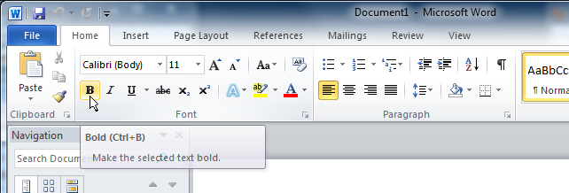
Figure 5 shows the tooltip for the Bold option. Those who have used almost any application over the past 20 years will quickly recognize the boldface B icon as the symbol for converting text to bold, but there really are some new computer users around! Not only does this tooltip state the obvious “Bold,” but it also gives the keyboard sequence, and for the newest of users, it actually includes a grammatically correct, very specific, complete sentence. What a thought!
I had originally entitled this section FANTASTIC TOOLTIPS, but that was before I realized that the tooltip text does not change whether there is “selected text” or not. The option not only toggles the bold state of selected text, it also toggles the bold state at the current location of the caret for the current word and for future typing. If the tooltip is not going to change, then it would have been better to state Toggle text between Bold and not Bold or something similar.
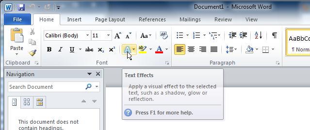
Figure 6 shows the Text Effects tooltip. This tooltip is as helpful as the Bold tooltip (with the same “selected text” problem), but with the addition of the explanation of the F1 key. Not too bad.
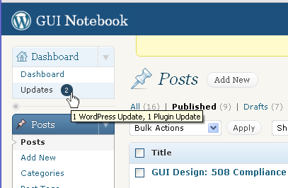
Figure 7 shows the WordPress® tooltip that appears when hovering over the number of Updates that are available. I referenced this my WordPress® — GUI Review. This tooltip is specific, it updates based on circumstance, and it’s very informative. Well done!
KEY DESIGN POINTS
- Tooltips that simply repeat the text that is already being displayed are useless.
- Tooltips should provide information about how to access the functionality using a keyboard sequence or similar, as well as where to get additional information.
- Tooltips should change based on the circumstance, such as explaining why an option is currently disabled or how the option applies to the current state.
What if the thing you want to display tooltips for is also a popout menu that pops out as the user hovers for a certain amount of time? Does being a popout menu preclude a tooltip?
Good question! In general you would not want to have both, simply because it is difficult to keep the tooltip and the popout from overlapping and obscuring each other. Most applications only show menu tooltips at the lowest level. In Windows® Explorer® on the “Favorites” menu if you hover over “Microsoft Websites” you get a popout, but no tooltips. If you hover over an item in the popout, then you get a tooltip with the URL. It could work (and certainly be potentially helpful) to give some instruction at the first level, but it should be a deliberate decision in each case. Thanks for asking!
I find that too much information in a tooltip, sometimes precludes you from doing what you need to get done quickly, because you can’t see the rest of options you have for a given selection because of the darn tooltip. Particularly when you’re looking at check-box settings that have additional settings below them and a paragraph-size tooltip shows up in the middle of things obstructing your view of the rest of the option settings. You have to memorize the options below and then hover over the setting you want so you know what to select next below it.
This can be particularly annoying when you’re working in an IDE, where it gives you a list of methods you can use; you pick one of the three overloaded methods, and the tooltips for the parameter list remains active as you type, ANNOYING !!! Once you start typing, the tooltip should go away, but no, it’s a tooltip, it must be really important! 😉
Tooltips must be considered as pertaining to their place of action. Concise, explicit, and unobtrusive seems appropriate to me. Maybe a fading effect would be welcomed for tooltips, so you have a chance to see the text for a little longer, if needed, but it should definitely go away when the real typing/selection starts, IMHO.
Exactly! Huge tooltips can be a real pain. Your case about IDEs is especially true. I find myself moving the mouse as I am examining code, but if I stay in one place too long then that annoying, huge tooltip obscures what I’m trying to see. The nice thing about the Gmail® Contacts tooltip example (Figure 2) is that it appears to the right and not over the other items in the list; similarly, the tooltips in the Word® examples (Figures 5 & 6) always appear below the ribbon. Thanks for your comment!
[…] information shown about a contact in the Chat list. I wrote in depth about tooltips in March (see Tooltips — GUI Design), and interestingly enough the first two graphics I used were these two examples of good and bad […]
[…] Figure 6 is a portion of a screen shot from the Marriott® Find Hotel panel found at http://www.marriott.com. Hovering over the checkbox label Use Marriott Rewards points results in the cursor changing to a pointer, the checkbox being highlighted, and also a tooltip being shown. The tooltip text itself is not helpful because it simply repeats the label text, however, the fact that a tooltip exists makes it clear to the user that the label is clickable. (For a discussion about what makes a good tooltip see Tooltips — GUI Design.) […]
[…] written before about how tooltips should be used to help the user under certain conditions. (See Tooltips — GUI Design.) This is a great example of that principle. Note how only one option is available because nothing […]