
I currently have multiple e-mail accounts with Gmail® by Google® which I use for various purposes. I was slow to adopt Gmail early on because it had many limitations (including the inability to handle attachments), but I made the jump once it had the features I needed. Gmail has become more and more popular in recent years, due to the many reasons, including:
- There are great features, which are continually being improved.
- New features are being added frequently.
- There are quick links to other Google web applications.
This article will briefly explain some Gmail features as needed to comment on certain aspects of the GUI, however this review is for the Gmail GUI alone. All images and icons used below are trademarked by Google and/or their respective trademark holders.
Names and text have been altered in the screen shots below.
NAVIGATION
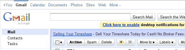
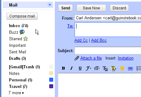
Figures 1 and 2 are portions of a screen shot from a sample Gmail account. Figure 1 is the header, while Figure 2 is the left side.
First of all, don’t be confused by the links across the top of the Gmail display that show the options +You, Gmail, Calendar, etc. These are navigation links for the Google family of web applications. This navigation area currently indicates that Gmail is selected. (The text for the current selection is bold and black, and there is a blue bar above the selection.)
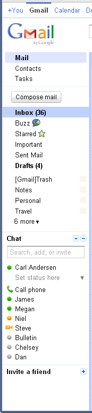
The Gmail navigation is along the left side underneath the Gmail logo. By default Mail is the current Gmail panel being displayed, which is indicated by highlighting the background and making the text bold.
There are only two navigation options in Gmail: Mail and Contacts. Everything else is either 1) a filter or option for one of these two, or 2) an independent feature that pops up over the top of the current display. Unfortunately, the navigation display does not make this obvious. I had used the application for quite some time before I realized this.
I have never liked the “floating selection” variation of a tab control, where the current selection is not connected to the portion of the window it controls. In this instance, the way the Mail and Contacts options are displayed does not give the idea that these selections redraw most of the rest of the panel as a tabbed display would. That may be partially due to the fact that alternating between Mail and Contacts updates both the right side as well as portions (but not all) of the left side, so a single rectangle wouldn’t enclose the affected portions of the window. Interesting. Maybe that’s a clue that there is a problem with the layout.
The Tasks link is positioned directly under Mail and Contacts. Once you realize that the first two are for navigation, it’s easy to assume that Tasks is another navigation option, but it is not. Selecting Tasks actually causes a popup to appear in the lower right area of the window. Tasks is an option that is independent of whether you’re in the Mail or Contacts navigation area.
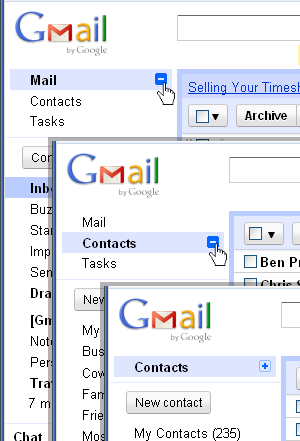
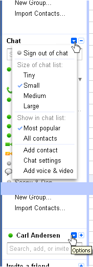
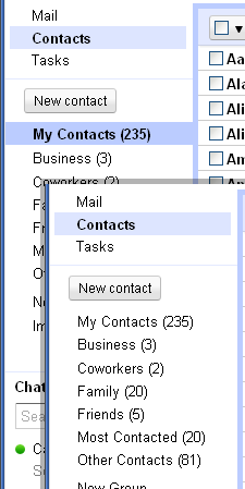
Figure 3 show portions of three screen shots of how Gmail combines the three items into what appears to be a grouping of navigation options. Hovering over either Mail or Contacts causes the collapse icon to appear. Clicking the icon collapses the three lines into a single line, only showing the option where the cursor had previously been hovering (bottom of Figure 3). This gives the impression that the three items are related and therefore all part of the top-level navigation. The only clue that this might not be the case is the fact that hovering over Text produces no collapse icon. Note also, that this feature is not available via the keyboard.
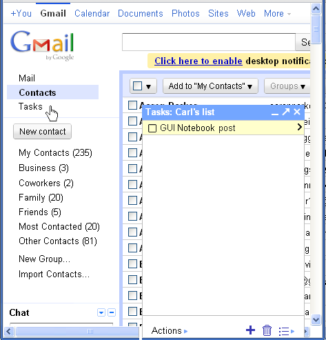
Figure 4 is a portion of a screen shot after Contacts has been selected, followed by Tasks. (I made the window very small for this screen shot.) Note that Contacts is highlighted, indicating that this is now the panel being displayed. The Tasks popup is available for interaction, but it does not preclude interaction with the rest of the display. All of the visible controls are active, and interacting with any of them does not dismiss the Tasks popup. The popup is only dismissed when the icon in the upper right corner of the popup is selected.
We’ll return to the Tasks popup in a minute, but first let’s look at the rest of the items in the left column. The middle section of the left column is delineated by two narrow horizontal lines that enclose everything between Tasks and Chat. This is the area for actions and filters related to the selected navigation option. When Mail is selected (Figure 2), the first item is the Compose mail action button, followed by a list of filters and other options applicable for the Mail panel. When Contacts is selected (Figure 4), the first item is the New contact action button, which is followed by a list of filters and other options for Contacts. It’s strange that the Tasks option is placed in between the navigation selection and the options for that navigation selection.
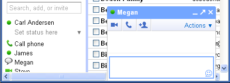
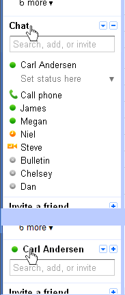
The next section in the left column is the Chat area (see Figure 2). It remains present even as the Mail Contacts selections change. Selecting the name from the chat list of a person that is currently logged into Gmail will pop up a chat window in the lower right area of the window, similar to the Task window display. Figure 5 is a portion of a screen shot that includes a chat window. Note that the icon next to Megan’s name in the Chat section at the left changes from a green circle (indicating that she is logged in) to a conversation bubble (indicating that there is a chat window open for her).
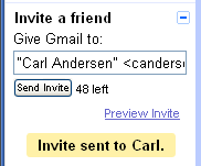
We’ll get back the Chat popup in a minute, too; I first want to point out all of the options in the left column of the screen that are not associated with the main navigation selections, but appear somewhat intertwined with them. There is one more section at the bottom of the left column entitled Invite a friend, which is separated from the items above it by another horizontal line. It’s a quick way to encourage selected Contacts from your contact list to use Gmail. (This feature seems mostly to the advantage of Google, but I guess I can understand users wanting to do all their chatting through this one interface, or some similar motivation to “invite a friend.”) Figure 6 shows an expanded version of this option after I sent myself two invitations. (See the collapsed display of this option at the bottom of Figure 2.)
There is one more item in the left column that is intertwined with navigation options. When Mail is selected, there is a Buzz option displayed after Inbox. This really has nothing to do with e-mail, but is another unrelated feature, much like Tasks or Chat. Google has recently announced that Buzz is going away, so I won’t bother with a description of what it is, other than another example of poor organization. (In fact, I believe these organizational decisions have more to do with marketing new features with an in-your-face approach, than with convenience and ease-of-use for the user.)
MAIL: TYPES & CATEGORIES
The Mail display has three types of e-mail message listings: Inbox, Sent Mail, or Drafts. (Note that these are not listed together.) The Drafts list is for any e-mail messages that have been started, but not sent. The Inbox is for e-mail that has been received, including all the responses back and forth to the original e-mail (called a “conversation” in Gmail), which is very convenient. TheSent Mail is for e-mail that has been sent and, like the Inbox, includes the complete conversation. Figure 7 shows a portion of a screen shot with a Inbox (36) selected.
Each row in the Inbox table represents an e-mail conversation. The rows are divided into columns, though there are no column labels for any of them. The columns are (using my own titles):
- Drag Handle
 — For dragging one or more conversations to an option at the left (e.g. Starred, Personal, Trash, etc.).
 - Checkbox
 — For selecting one or more conversations for dragging or for the Actions listed at the top of the table: Archive, Spam, Delete,
  (for setting/removing Important), Move to
 , Labels, and More(partially cut off in the Figure).
 - Starred category
 — For clicking one or more times to categorize.
 - Names of those who have contributed to the conversation and the total number of exchanges.
- Important
 — Hovering over the icon indicates why this conversation is important.
 - Subject of the conversation proceeded by any optional Labels
 — The initial text of the conversation is included in this column as space allows.
 - Date or Time of the last message (not shown in the Figure).
Although there are no column headers, per se, there are two items at the top of the table which are strategically located near columns they affect, or are affected by.
The first is the Important control which is used to add or remove the Important icon for selected items.
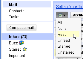
The second is the header checkbox. Figure 8 shows a header checkbox that gives options for selecting items in the current list. Similar header checkboxes in other products usually select All or None when the checkbox state is changed and may also have a tri-state display when not all items in the column are checked. Gmail provides not only All and None, but several other convenient options as well. While I don’t like the mostly-disabled look of Gmail’s tri-state checkbox, that’s a discussion for another time (Tri-State Checkboxes — GUI Design).
Gmail has three different “categorizations” (my word, not theirs) that can be used for e-mail messages and conversations, whether they be in the Inbox, Sent Mail, or Drafts.
- Every message can be Starred with a number of various icons.
- Every message is categorized as Important or not.
- Every message can have one or more Labels assigned to it (Notes, Personal, etc.).
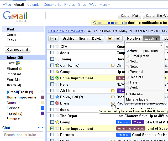
Figure 7 shows a portion of a screen shot with a list of various example e-mails, some of which have representations of each of these three categories. The Starred value can only be set manually, but the others may also be set automatically. Important is determined automatically by Gmail’s own rules depending on the recipient list and how similar messages have been treated by the user in the past, while Labels can be automatically set by user-defined Filters. It’s interesting to note that if a conversation is dragged to the Starred option or some other Label at the left, it no longer appears in the Inbox list, but only in the new location; this is inconsistent with items that are simply given a Starred value or other Label without dragging; they continue to appear in both. The action of dragging makes the Labels act more like folders or sorting bins in other e-mail applications. But this is a bad combination of the two paradigms.
Why are there so many different ways to categorize and so many different categories within each of them? And why would conversations with the same categorization appear in different lists simply due to the manner in which a the category was assigned?
CATEGORY: IMPORTANT
Let’s start with Important. This designation appears automatically on apparently (to most users) random conversations. Using the mouse to hover over the icon (see Figure 7) displays the tooltip “Important mainly because it was sent directly to you.” Interesting. Clicking the icon does not change the setting, but opens the conversation. Instead, the Important designation is turned on or off using the controls. Selecting Important in the left column filters out all other messages from the list. This is completely different from the way that the Starred categorization is changed.
CATEGORY: STARRED
Now take a look at the Starred items. By default, this setting is off for all new conversations and, just like Important, toggles between on and off. Unlike Important, there is always an empty, disabled-looking star that shows the conversation is not Starred. Simply clicking the empty star changes the icon to a yellow star with the blue outline. Afterward, selecting the Starred option at the left will show all the starred conversations or e-mails of any type (Sent Mail, Drafts, etc.) Subsequent clicking of the star toggles its state.
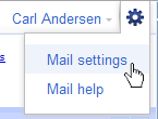
Though Starred toggles between on or off by default, more levels of stars are available through the Mail settings available at the upper right of the window (Figure 9). When more than one star is used, then subsequent clicks rotate through each of the available stars and then back to the off state.
I can see no advantage to having both the Starred category and the Important category. Important seems entirely superfluous. That may be why Gmail has the option to completely remove Important markers from the display. I suppose one possible benefit (which could also be seen as a disadvantage) is that Important is in a column by itself and doesn’t get lost (or found) with the Starred icons. Note also that the Important feature is available via the keyboard, whereas Starred is not.
CATEGORY: LABELS
Labels are used to categorize items in lists. By default Gmail provides some default Labels that may be removed or hidden as desired, including Notes, Personal, Receipts, etc. Just like the Starred items, Labels can be set manually by checking items and selecting the Labels menu at the top of the table (Figure 7). But they can also be set automatically by defining Filters to match certain criteria (on both existing and future items) and assign a specified Label to the item. Selecting any Label in the left column will automatically update the list at the right to only show those items that have that Label. It’s a great feature, but it does have some GUI problems.
The terminology used in Gmail is not only unusual, it is inconsistent with industry standards. When results in a list are reduced by applying some criteria, this is commonly referred to as a “filter” or “filtered” results. But Gmail uses the expression Filter to describe criteria for assigning a Label to an item, which is generally referred to as a “rule” in the industry. Interesting that Gmail would rearrange the standard terminology in this way.
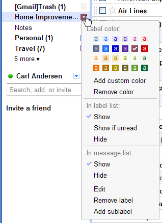
For this article I created a Label with a long name called “Home Improvement” and defined Filters (rules) to automatically assign this Label to e-mails with certain terms in their subject line. Figures 7 and 10 show that the left column is not wide enough to show the entire text of my new Label and therefore truncates it and also cuts off its number of unread messages, which is visible for shorter labels. Unfortunately, the left column width cannot be adjusted, so I’m stuck with it.
Figure 10 is also contains a screen shot of the Label display options. Hovering over the small square to the right of the Label causes a down arrow to appear for the display options drop-down menu. (Note that this, too, is unavailable via the keyboard. For a discussion about keyboard access see 508 Compliance — GUI Design.) On this drop-down the user can set several options regarding the given Label, including the colors used to identify a conversation in the list (see the bottom right of Figure 7 for Labels appearing with conversations).
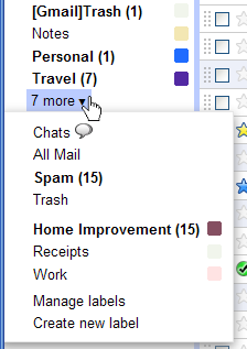
Not all defined and visible Labels are necessarily shown in the left column. This is a setting that can be changed as well. The Hide option under In label list: (Figure 10) will move the specified label to the 6 more menu, changing the value from 6 to 7. Figure 11 shows a screen shot of the new 7 more menu with the Home Improvement Label now included. Note that on the menu there is enough room to show the entire long name with its number of unopened messages. This view also shows the other Labels that Gmail included by default (Spam, Receipts, Work, etc.), and (also by default) did not show in the main list.
Figure 11 also brings up an interesting confusion: Note that there is both a “[Gmail]Trash” Label as well as a “Trash” Label. The meaning and difference between these two lists has confused users for years as evidenced by the number of questions on message boards about it. (I will make no attempt to explain it here. ![]() ) But with so many questions over such a long period of time, improvements should have been made to clear up the confusion.
) But with so many questions over such a long period of time, improvements should have been made to clear up the confusion.
I stated at the beginning of this section that Gmail has three e-mail listings that are not grouped together. Selecting any of these labels combines into a single list subsets of e-mail messages and conversations from all three of the listings. They also include Chat conversations that have the same Label.
CHAT HISTORY
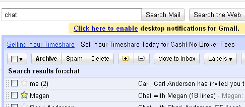
As long as I’ve mentioned Chat conversations showing up with Labels, I suppose now is as good a time as any to pursue Chat a little more. Figure 12 is a portion of a screen shot of the Search Mail feature when I typed the word “chat” into the text field.
Originally I did not know that a Chat history was maintained in Gmail. I thought there should be, but upon searching around a bit, I was unable to find anything. It wasn’t until I performed a Search and found Chat conversations in the results that I determined to find where this was located. I tried Mail help (see Figure 9). This was an interesting experience. No matter what help navigation option I tried or what I searched for, I could not find anything about Chat history.
Not when Collapsed (bottom)
Finally I found an area in Mail settings where the user has the option to Save chat history, which is on by default, and the explanation next to it reads “Your chats will be saved under ‘Chats’ in your Gmail account, and you can search for them later.” Ah! Just what I was looking for—but when I clicked the Chat title in the left column it just alternated between “Chat” and my name “Carl Andersen.”
Figure 13 shows portions of two screen shots with views of the way that the Chat area toggles between expanded (top) and collapsed (bottom). I have no idea why the title changes back and forth when the display is expanded or collapsed. I see no benefit to it, but certainly potential for confusion.
In any case, I looked under the Chat![]() option (Figure 14) and found nothing about chat history there. Eventually I discovered my error in reading the description. Users (including me) typically scan rather than reading with precision, and so I didn’t notice the “s” on the end of “Chats” in the description. It turns out that Chats is the first item under the “… more
option (Figure 14) and found nothing about chat history there. Eventually I discovered my error in reading the description. Users (including me) typically scan rather than reading with precision, and so I didn’t notice the “s” on the end of “Chats” in the description. It turns out that Chats is the first item under the “… more![]() ” option (see Figure 11)—information that certainly would have been helpful.
” option (see Figure 11)—information that certainly would have been helpful.
Interestingly, the Carl Andersen ![]() option (bottom of Figure 14) shows the tooltip “Options” but nothing happens when the arrow is clicked; the Chat area must be expanded for the options drop-down menu to work.
option (bottom of Figure 14) shows the tooltip “Options” but nothing happens when the arrow is clicked; the Chat area must be expanded for the options drop-down menu to work.
Interesting, too, is the fact that the Chat area is visible at all times, but only under the Mail navigation does the “… more![]() ” option show up which contains the Chat History entitled “Chats.” That means that if I have navigated to the Contacts panel (see top of Figure 14), I don’t have access to Chat history. Ugh. Very poor organization.
” option show up which contains the Chat History entitled “Chats.” That means that if I have navigated to the Contacts panel (see top of Figure 14), I don’t have access to Chat history. Ugh. Very poor organization.
MAIL: SECONDARY OPTIONS
Now that many of the options have been explained, it would be well to take a quick look at the secondary options that appear for each navigation selection.
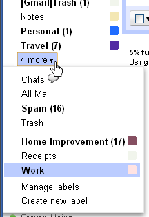
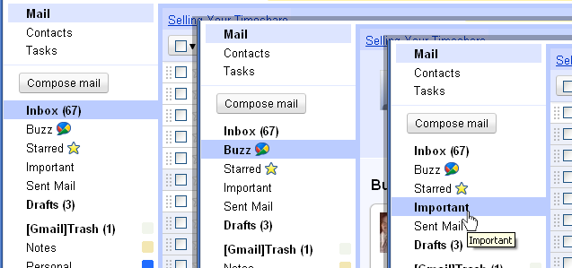
Figure 15 is a portion of three screen shots with different Mail options selected: Inbox, Buzz, and Important. The secondary options are laid out as a classic tab control, where the background of the selected item extends and frames the area of the window that it controls. It is much easier to interpret than the floating navigation of Mail and Contacts. It works well. Unfortunately that concept is lost if something from the more![]() menu is selected. Figure 16 is a portion of a screen shot with the more
menu is selected. Figure 16 is a portion of a screen shot with the more![]() menu expanded. Only when the menu is expanded does the user know that the current display is of conversations with the Work label.
menu expanded. Only when the menu is expanded does the user know that the current display is of conversations with the Work label.
There are other cases when no apparent selection appears as shown in Figure 15. Figure 17 shows a portion of a screen shot after the Compose mail action button is selected.
The right side of the window updates as expected with the controls needed to compose and send a mail message, but there is no apparent tie to the secondary navigation options that invoked it. Note the Save Now button at the top of this display. Selecting this option saves the current unsent message in the Drafts area. This means the user can return at any time to pick up where the message was left off. Nice. Gmail actually also has a great feature that automatically saves a message to the Drafts area every minute or so while the draft is being edited; the number of messages listed with the Drafts& option automatically increments to show the new message is saved there. Figure 18 is a screen shot of a portion of the display after my e-mail message was autosaved.
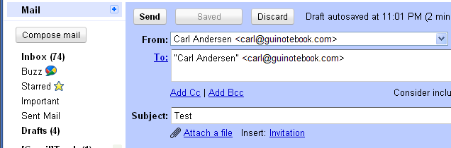
Notice that the Drafts (3) in the left column has now incremented to be Drafts (4). Notice also that the previous Save Now button has changed to a disabled Saved button, and to the right of the buttons along the top is the message “Draft autosaved at 11:01 PM (2 minutes ago).”
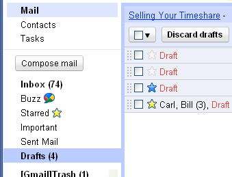
If I now select Drafts (4), the autosaved draft appears in the list, as shown in Figure 19. Note that the fourth item in the list shows a Draft that I have begun in response to a conversation that already has three exchanges in it between me and someone else.
Also notice that the Drafts (4) selection is displayed as a tab control.
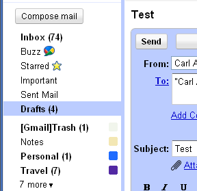
If I select the first draft in the list for editing—the one that was autosaved—it appears as shown in Figure 20. Notice that Drafts (4) is still displayed as a tab control.
What is interesting to me is the fact that choosing the Compose mail option is essentially the same as creating a draft. With the autosave feature, any draft that takes more than one minute to send is automatically saved in the Drafts folder. It would make sense to me to simply put it there immediately and select the Drafts folder on the tab control, rather than having it display as though it is not associated with any area in the Mail navigation, as seen in Figure 17.
CONTACTS: SECONDARY OPTIONS
The Contacts secondary options are much more straight-forward than those for Mail navigation. All the contacts in the list can be viewed together, or under groups. The user has the option of using default groups or creating additional ones. By default when Contacts is selected, the My Contacts option is selected which includes all contacts for the current Gmail account, and is displayed as a typical tab control. Selecting different groups such as Business or Friends also displays as expected for a tab control.
It is strange, however, that the tab control display seems to initially get lost on subsequent navigation to Contacts. Figure 21 shows portions of two screen shots of the Contacts secondary options. The top image shows the first time Contacts is selected. The bottom image is the view after navigating to Mail and then back to Contacts. Notice that there is no tab control display, though the display to the right is showing the 235 entries in the My Contacts list.
MAIL SETTINGS
I have mentioned certain items that can be adjusted in the Mail settings. My first encounter with the Mail settings happened when I selected the Manage labels option which is found both on the more![]() menu in the left column and on the Labels menu at the top of the conversation table.
menu in the left column and on the Labels menu at the top of the conversation table.
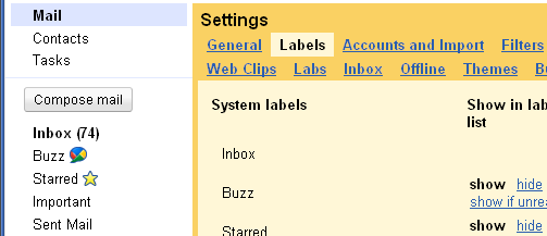
Figure 22 is a portion of a screen shot of the Settings display which appeared when Manage labels is selected. The Settings area is displayed as a secondary option to the Mail navigation, filling the right side of the window. Notice the Labels selection at the top. This is another “floating selection” tab control implementation, but only the items on the top row appear to float; the items on the bottom row connect to the area below as with a classic tab control, as seen in Figure 23. Figure 23 is a portion of a screen shot of the Inbox settings. (At least they don’t rearrange the rows. For a discussion on tab controls with multiple rows see Too Many Tabs — GUI Design.)
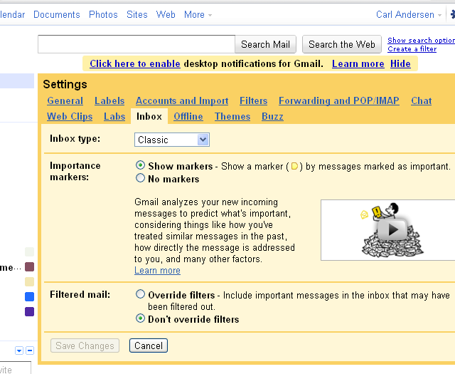
I was frustrated with my first use of the Mail Settings because after I had created a new Label on the panel shown in Figure 22, I could find no way to exit. Unlike Figure 23 which has buttons to Save Changes or Cancel at the bottom, no such buttons exist on the Labels tab. Clicking the Contacts navigation seemed to get me off of the Settings display, but as soon as I clicked the Mail navigation again, the Settings display reappeared. I eventually found that I needed to click Mail again, or some other Mail option in the left column to get Settings to dismiss. Apparently changes on the Labels panel are saved immediately, requiring no further action. I was surprised by the variation between tabs: some had no buttons at the bottom, some had them left aligned (Figure 23), while others had them centered (General, Chat, and Buzz). This type of inconsistency makes the application look sloppy and unprofessional. It also makes it harder to use and predict.
By the way, the Save Changes and Cancel buttons operate as a typical tabbed dialog where the action applies to changes made on any of the tabs. Too bad they are not displayed that way; if that is how they operate, then they really should be in the same dark background as the border and the tabs at the top. But then those panels where changes are effective immediately would be more difficult when Cancel is selected.
POPUP WINDOWS
Now let’s go back and take a look at those two similar popup windows we discussed earlier: Chat and Tasks. These two popup windows look similar on the surface, but have odd inconsistencies between them, as well as by themselves. One sad similarity is the lack of keyboard accessibility. The differences are quite noticeable because they pop up next to each other at the bottom of the window. Multiple Chat windows may be open at one time and they are always to the left of the Tasks window, no matter the sequence they are opened. The Tasks window is always at the far right.
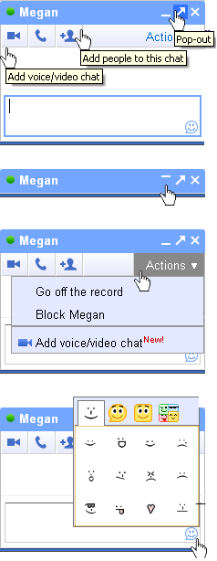
Figure 24 shows portions of multiple screen shots of the Chat window. The top image is a combination of three screen shots of tooltips. There are three icons on the right end of the title bar, but only the middle one “Pop-out” has a tooltip. That’s probably because the designers thought the other two were “common enough.” The  is well-known, but the
  may not be immediately recognized as “minimize” until the user clicks on it (or anywhere else in the title bar) and the window collapses down, and replaces the minimize icon with
  (see the second image in Figure 24). If one icon in a group has a tooltip, then they all should have a tooltip.
The bottom two images in Figure 24 show popup controls for Actions and Smileys. Not only are the controls that invoke the two completely different, but the display of each of the popups is also completely different. Also note that neither of them have tooltips. It’s not necessary for the Actions, of course, but the ![]() could benefit from a tooltip. Every clickable icon should have a tooltip.
could benefit from a tooltip. Every clickable icon should have a tooltip.
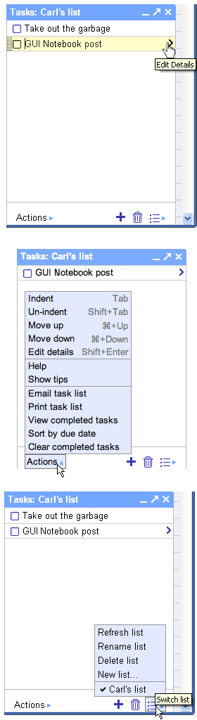
Figure 25 shows portions of multiple screen shots of the Tasks window. It has the same three icons that the Chat window has at the far right of the title bar. And, like the Chat window, only the middle icon has a tooltip. Gratefully, they all act the same, too. But that’s about the end of the similarities.
The top image in Figure 25 shows how a task in the list changes on hover. There is a drag handle that appears at the far left with the helpful tooltip “Drag to reorder.” It’s strange, however that this appears even when there is only one task in the list. That seems like a sloppy implementation.
The arrow at the right of the task shows the tooltip “Edit Details” when hovering. It’s great that it’s there, but having both words capitalized makes it inconsistent with other tooltips and labels throughout the application. It might be understandable if the window that this icon invoked was entitled “Details,” but it’s not. The capitalization is also inconsistent with the “Edit details” option in the Actions menu. (For a discussion on capitalization see CAPITAL Idea — GUI Design.)
The center image in Figure 25 shows the Actions popup menu. Like the Chat window, it has no tooltip, but nothing else is similar. It is in a different location. It is displayed in a different color (both before and after clicking). It has a different arrow. In fact this arrow points right until hovering at which time it rotates up. The good news is that the way the items in the list are displayed is the same between the two windows.
The bottom image in Figure 25 shows the Switch list popup menu. It, too, displays items in its list the same as the Tasks Actions list and the Chat Actions list. And its arrow acts in the same way as the Tasks Actions nearby. It, gratefully, has a needed tooltip on hover, as do the icons next to it for  (“Add task“) and
  (“Delete task“).
TOOLTIPS
Interspersed throughout this review I have mentioned problems and inconsistencies with tooltips. Gmail uses tooltips on some, but not all, of the Mail navigation secondary options. Some are useless, such as Inbox (…), Buzz, Starred, etc. which simply repeat the exact text you are hovering over, whereas others can be quite helpful, such as the expanded information shown about a contact in the Chat list. I wrote in depth about tooltips in March (see Tooltips — GUI Design), and interestingly enough the first two graphics I used were these two examples of good and bad tooltips in Gmail.
FINAL THOUGHTS
Do I use Gmail? Yes. It provides great functionality. It’s sad that the great features are so obscured by the poor GUI. I have asked others about some of the features I’ve mentioned here and most are unaware of them or do not use them. I believe a better GUI would change that.
CONCLUSION
This GUI has problems. I give it only 2 out of 5 GNs. The first six categories I typically look at during a GUI review are consistency related. Gmail has inconsistencies both within its own presentation and with industry standards. It has organization problems with groups of related items intertwined with unrelated items. It does not provide keyboard access to all functionality and some areas may be truncated because fixed widths are inadequate. Also, the help documentation is lacking.
There are certainly some great features here, but many of them are difficult to understand and use. Because of this, I believe most users will only employ the most basic of options. Gmail seems to ignore conventions as though there were no reason for them, other than tradition. Users will tolerate/ignore GUI problems as long as the features are what they want. But the problems need to be addressed eventually, or users will find something they like better (especially when all the options are free of charge).
[…] and also looks at other GUI items that are new to this release. For the original review refer to Gmail® by Google® — GUI Review. (That review resulted in a rating of 2 out of […]
[…] is fast taking over the internet with all the amazing services and apps it provides. When I did a GUI Review of Gmail® (and revisited that review) last November, I deliberately avoided any analysis of the navigation […]
[…] all of its other problems (see Gmail® GUI Review) Gmail® is actually one web app that does remarkably well with Keeping Tabs. Figure 5 is a portion […]
[…] Gmail® by Google® — GUI Review […]