Back when I was first designing GUIs we talked about two types of capitalization: Title Capitalization and Sentence Capitalization. There’s a new category now that I have never heard a name for, but I call it “txt msg capitalization.”
btw it has no caps
& no punctuation 2
Title Capitalization
Title Capitalization refers to capitalizing a phrase as would be done for a title in English. From the introduction of the Apple® Macintosh® in 1984 through Microsoft® Windows® 3.1 in the early 1990s, Title Capitalization was generally used for all buttons, headings, and labels.
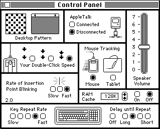
Figure 1 shows a screen shot of the Macintosh 3.0 Control Panel dialog. Notice that every label in the entire dialog follows Title Capitalization, including the dialog title, groups labels, and labels on individual controls. The only words not capitalized are the prepositions of (from Rate of Insertion at the middle left side) and until (from Delay until Repeat at the lower right side), because prepositions are not capitalized in a title unless they are the first or last word. (This is not the place for a discussion about whether a title should ever end in a preposition!)
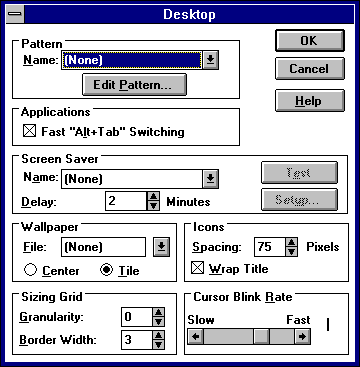
Figure 2 shows a screen shot of the Microsoft Windows 3.1 Desktop Dialog. It, too, follows Title Capitalization. The title, group labels, and individual control labels are consistent with the Macintosh example (Figure 1). The Windows dialog also has several buttons, including a two-word button labeled Edit Pattern…. The buttons in this dialog and every button in Windows 3.1 follow Title Capitalization. Title Capitalization was the standard for many years.
Sentence capitalization
Sentence Capitalization refers to capitalizing a phrase as would be done in an English sentence. In the early GUI days this was generally used for explanations and instructions (with or without an ending period). Windows 95 began the trend of using Sentence Capitalization for labels and controls. By the late 1990s, most Windows applications were doing the same.

Figure 3 shows screen shots of several dialogs from Corel® WordPerfect® 9 released in 1999.
Notice how in the various dialogs in Figure 3 the labels for groupings and individual controls now follow Sentence Capitalization for the Print dialog (upper right) and the Guidelines dialog (lower left). Unfortunately, the Underline tab of the Font Properties dialog (background upper left and lower right) changed the text of some items to Sentence Capitalization for this version, but others still follow Title Capitalization (see the radio button labels under Apply to: in the upper left).
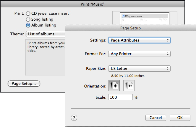
Figure 4 shows the Print and Page Setup dialogs from iTunes® on Mac® OSX®.
Notice that the dialogs in Figure 4 show capitalization inconsistency as well. The radio button labels on the Print “Music” dialog follow Sentence Capitalization, but the Page Setup labels follow Title Capitalization.
txt msg: no capitalization
For more than a decade now, some designers have tried using no capitalization whatsoever, especially on web sites and browser-based interfaces. From the very start I felt like this was just a carryover from text messaging and instant messaging, which of course is all about just getting the point across without regard for presentation. Some probably thought it was trendy and flashy, but to me the impression was more along the lines of being more interested in trying to be cool than trying to make the text easy to read and the interface easy to use. In some cases, it just looks like the designer was lazy or else didn’t know enough about what proper presentation (or capitalization) should be and so it was just easier to pretend it wasn’t important. When conventions and standards are followed, users don’t need to think nearly so hard about how to interpret your interface and can therefore more quickly accomplish what they need.
Art with No Capitalization
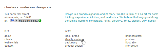
I have no problem with using no capitalization when it serves a real purpose. Here are two (non computer-specific) examples: first, the author E. E. Cummings used no capitalization in some of his writings to bring more attention to the words and the patterns on the page; and second, Figure 5 shows an example of a web site for a designer which emphasizes the designer’s style by using all lower case. Notice also that each menu item is on a separate line so that the lack of capitalization does not interfere with the use of the site.
In both of these examples, the lack of standard capitalization serves the purpose of drawing attention to the presentation, not the function. It works. It’s appropriate.
GUIs with No Capitalization
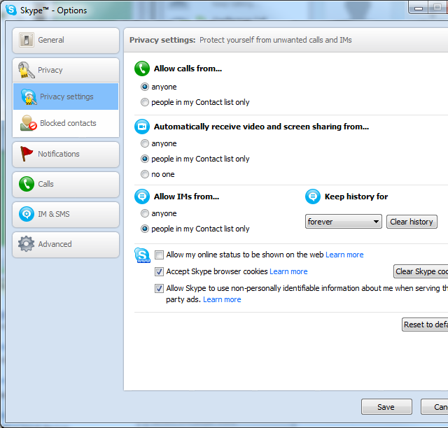
Skype® uses an interesting implementation of no capitalization in some cases. (The following screen shots were taken using Windows 7.) Figure 6 shows the options for Privacy settings.
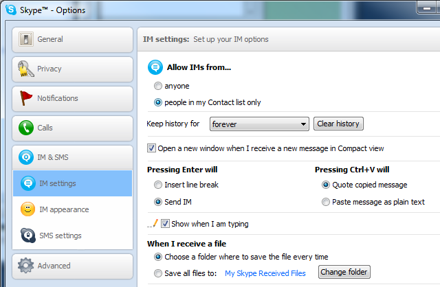
The titles for each section in the panel in Figure 6 use sentence capitalization and end in an ellipsis, allowing the radio button selection to complete the sentence, as the labels are all lower case. It’s an interesting idea. Unfortunately the design is not used consistently throughout the GUI. Figure 7 shows a portion of the Skype IM settings panel.
This panel design matches the previous panel for the first section, but the lower sections that have radio button options do not. The titles for these sections do not end with an ellipsis and the radio option labels are not lower case, though the wording does complete the sentence started by the title.
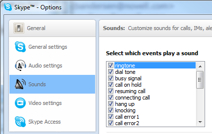
Figure 8 shows a portion of a screenshot of the Skype Sounds panel. Note that the multi-select list (lower right) uses all lower case, and the title for the control does not start a sentence that would be completed by the option selected (as with the previous Skype examples). There is no consistency between these panels as to when lower case is used and when it is not. It makes the interface seem sloppy and unprofessional. That’s too bad, because the inconsistency (both with itself and with common standards) is distracting. Remember, an interface that is intended for accomplishing a task shouldn’t get in the way. And when your non-standard GUI doesn’t add any value, it just gets in the way, because you’re forcing users think about things that have nothing to do with the task they want to accomplish.

Gmail® by Google® is an application that makes limited use of lower case in a way that is appropriate. The Gmail main menu is shown in the screen shot in Figure 9. Note that the very last item on the menu bar (top right) is not capitalized.
Where each of the first six items in the menu bar will open a new window with a new interface, the more menu item drops down a list of more menu items; it’s different than the others and the lower case emphasizes that difference. Note also that the last item on the more dropdown menu, even more, is also lower case, again indicating that this item is different from the rest. It does, however, behave the same as its parent and is appropriately, therefore, displayed in the same way. Though I’m still not a fan of lower case, this is an excellent example of using lower case in a GUI in a way that makes sense. Well done.
KEY DESIGN POINTS
- Your capitalization shouldn’t make users lol.
- Be deliberate about the capitalization in your GUI and be consistent throughout.
- If your users are using your interface to accomplish a task, then always use standard capitalization (it’s not the place to be artsy).
ACKNOWLEDGMENTS
Great thanks to Marcin Wichary and guidebookgallery.org
[…] The arrow at the right of the task shows the tooltip “Edit Details” when hovering. It’s great that it’s there, but having both words capitalized makes it inconsistent with other tooltips and labels throughout the application. It might be understandable if the window that this icon invoked was entitled “Details,” but it’s not. The capitalization is also inconsistent with the “Edit details” option in the Actions menu. (For a discussion on capitalization see CAPITAL Idea — GUI Design.) […]