

Google® is fast taking over the internet with all the amazing services and apps it provides. When I did a GUI Review of Gmail® (and revisited that review) last November, I deliberately avoided any analysis of the navigation bar across the top, thinking that it deserved a separate treatment. Now I think it’s time.
I have lots of questions about the implementation of the Google navigation, so it seemed to make sense to have each section below entitled with a question.
WHAT IS SELECTED?
Google is constantly changing the way it displays the current option in its navigation bar. Following are a series of portions of screen shots of the various displays from the last year.
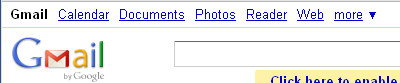
Figure 1 is a screen shot of the Google navigation bar with Gmail selected, as it appeared in May 2011. The current selection is in bold, black text, while the other options are blue, not bold, and underlined to indicate that they are links.
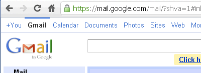
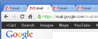
Figure 2 is a screen shot of the Google navigation bar with Gmail selected as it appeared in October 2011, before the Gmail new look was released the following month. Note that Gmail now has a thin, horizontal, blue line above it and the unselected options are no longer underlined. This change made it more difficult to detect the selected item. The text of the unselected items is a lighter blue than before.
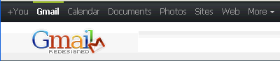
Figure 3 is a portion of a screen shot of the same panel and selection, but using the Gmail Redesigned add-on for the Firefox® browser. The colors of the text, background, and horizontal line are different, but it’s basically the same as the default look in Figure 2. However, the bold, white text seems to make the current selection somewhat easier to detect.
Personally, I never noticed the horizontal line above the selection until I was cropping a screen shot for a previous post some months ago. I don’t think it does much to draw attention to the fact that this is the current selection. Google is going away from this horizontal line as seen in Figure 4.
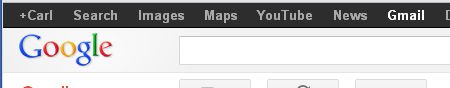
Figure 4 is a portion of a screen shot of the navigation with Gmail selected as it appeared with the new look, released in November 2011. Note that this new look resembles the previous Redesigned look, except that all the text is bold (for both selected and unselected items) and the horizontal line above the selection is now gone. Finding the current selection now is more difficult than ever. This is definitely moving in the wrong direction.
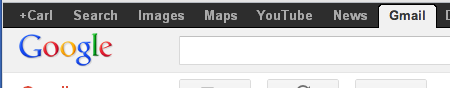
Figure 5 is an example of how much clearer the current selection could be displayed by changing the background to allow for an obvious contrast. It would be a simple and welcome improvement to the usability. Making the unselected options not bold would also be very helpful.
WHAT HAPPENS WHEN SOMETHING NEW IS SELECTED?
No matter which item in the menu bar is selected, the entire panel is redrawn. What is a little disconcerting is the fact that to the casual user there appears to be no rhyme or reason to which panels are invoked in the same tab and which are launched in a new tab or window. As I tested each item I finally realized that it was controlled not by which selection I made, but rather, by which panel I was currently on. Here is a list of the panels that always launch any other selection from the menu bar in a new tab or window:
- Google+
- Gmail
- Documents
- Calendar
- More | Offers
All other panels will invoke the new panel in the current tab or window. I’m not sure why Google feels that these panels should not be replaced, but there must be some reason. Unfortunately, clicking around on the menu options makes it easy to end up with lots of various Google tabs open, including duplicates of one or more of the panels. Figure 6 is a portion of a screen shot with multiple Gmail tabs.
It seems like a silly implementation. Most users are aware that a right-mouse click provides the option of launching a particular link in a new tab or window, if that’s what they want.
WHY CAN’T I GET BACK?
As strange as it is for the menu options to launch differently depending on the current selection, it’s even more strange that not all destination panels display the menu bar. That leaves the user stranded. If they happen to be on a panel that launched in the same tab or window, then the browser’s Back button will work. But if the new panel is in a new tab, then the user must select the previous tab and/or close the current one. It can be done, but the inconsistency requires that the user think a lot more about navigating than should be necessary. The panels that do not have menus are as follows:
- YouTube
- More | Mobile
- More | Wallet
- More | Blogger
- More | Even More
WHY ARE THE MENUS DIFFERENT?
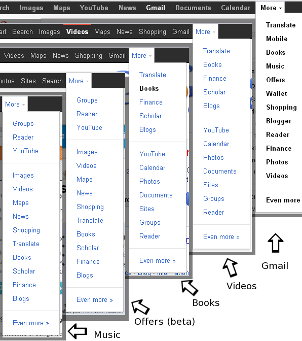
It’s bad enough to have menu options constantly being rearranged over time, but the fact of the matter is that at any given time, the menu options are arranged differently depending on the current panel being displayed. Figure 7 is a combination of portions of screen shots of the menus from various panels on the same day in February 2012. (Note the labels and arrows at the bottom right, indicating which panel is currently displayed.)
February 2012
The variation between these menus is amazing! Here is a partial list of differences:
- Display of the currently selected option:
- Bold on the Gmail and Books panels.
- Bold with a horizontal red line on the Videos panel.
- Not even shown on the Music and Offers (beta) panels.
- Display of unselected options:
- Bold on the Gmail panel.
- Non-bold on all other panels.
- Location of the Gmail menu option:
- Fourth from the right on the Gmail panel.
- Directly left of the More menu on the Videos and Books panels.
- Second from the left (not shown) on the Offers (beta) and Music panels. (Similar to Figure 2.)
- Location of the Videos menu option:
- Bottom of the More sub-menu when on the Gmail panel.
- Fourth from the left when on the Videos and Books panels.
- Fifth from the top of the More sub-menu when on the Offers (beta) and Music panels.
- Location of the Books menu option:
- Third from the top of the More sub-menu when on the Gmail panel.
- Second from the top of the More sub-menu when on the Videos and Books panels.
- Fourth from the bottom of the More sub-menu when on the Offers (beta) and Music panels.
Not only do the options for Offers (beta) and Music not even appear on their own panels, but they don’t display on each other’s menus either. This is a genuine case of “you can’t get there from here.” Wow.
One gets the impression that there are various menu widgets in use here and as new panels are created some of them end up with older versions of the widget. There is no telling if this is deliberate or not.
THE WEB: GUI ADVANTAGE OR DISADVANTAGE?
The best part of web GUIs is the fact that problems and bugs can be fixed immediately. The worst part of web GUIs is the fact that anything can be changed immediately—without warning; without justification, and without reason. Having spent many years working toward and releasing platform-specific applications and their subsequent upgrades, I can appreciate how fabulous it is to be able to take care of problems so quickly, without needing to wait for a service-pack or minor release. Unlike applications that have releases that are deliberately installed, a web GUI can be changed without notice, either to the delight or to the chagrin of the user. This power can really be misused.
It wasn’t until I took the time to evaluate what was going on that I realized some months ago what Google was doing that was so frustrating to me. This screen shot from May 2011 (Figure 1) shows the Reader option on main menu (third from the left). I regularly use the Reader, so imagine my surprise one day when it was no longer in the list. I’m sure I read through the menu at least twice before slowing down enough to convince myself that it really was not there. Finally, I found it in the more sub-menu at the far right. My first thought: Oh no! Does this mean it’s being demoted, will soon go away, and I will need to start using a different Reader? Well, it hasn’t happened yet, but with the way Google introduces, promotes, and then discards features, I fear that it could happen at any time.
At first I found Reader near the top of the More sub-menu, but now it’s usually somewhere at or near the bottom, depending on the current panel you may be attempting to access it from. I use the term “usually” because in fact it is found in three different locations on the five sub-menus shown in Figure 7, all of which were taken within a few minutes of each other on the same day. Wow, this is really unkind. Perhaps Google is trying to make us so miserable when we use Reader that we will be happy to have the option gone when they decide to remove it completely?
CONCLUSION
Some of the problems listed above seem so random that it makes the Google navigation seem very sloppy and unprofessional. I’m surprised that Google places so little concern on a nice, predictable presentation that could help users navigate and accomplish their tasks quickly. I enjoy and use many of Google’s applications, but I give this navigation only 2 out of 5 GNs.
[…] of Google® web applications, multiple changes have occurred in the short time since my Google® Navigation — GUI Review posted in March. (Actually, the changes appeared in advance of my post, but I usually have my […]