The most important responsibility of a GUI is to allow users to accomplish what they need. Most users are focused on a specific task and usually would like to complete their tasks as quickly as possible. Logical, timely interruptions certainly have the potential to save users from errors, but often applications interrupt in ways that are just wrong. Examples include either the wrong timing or the wrong question.
BAD TIMING
Some months ago I was due on a conference call where multiple persons from international locations planned to use Skype® for the meeting. I was delayed in the hallway for an important conversation as I returned to my office for the meeting, arriving about the time the call was to have started. I didn’t have the application running yet, so I started it as quickly as possible. Figure 1 is a screen shot of what I saw next.
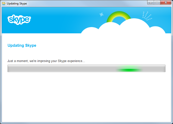
This dialog appeared without warning. Bad timing! The extra wait time was not excessive, however at the time I had no idea I would be forced to wait, nor how long the wait would be, and since I had several persons waiting for me, it was quite frustrating to sit and stare at this display, especially when I read the claim “we’re improving your Skype experience….” Well it was absolutely no improvement in that moment. The version I used the previous day was just fine, so there was no reason to force me to update before I used it one last time. I should have at least had the opportunity to select whether I wanted to update to happen immediately or when I exited the application. Badly done.
POOR CLEANUP
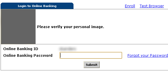
Figure 2 is a portion of a screen shot of the login screen to access Online Banking for a certain bank.

Note that the focus is in the only field where data needs to be entered. This screen is waiting for a password after which the user should choose the Submit button. So far, so good. However, this particular bank recently began offering some new cyber fraud protection for online customers. That sounds great. They thought it was important enough that they interjected a popup over the screen in Figure 2 before the user has the chance to enter a Password. Figure 3 is a portion of a screen shot of the popup informing users of the new offering.
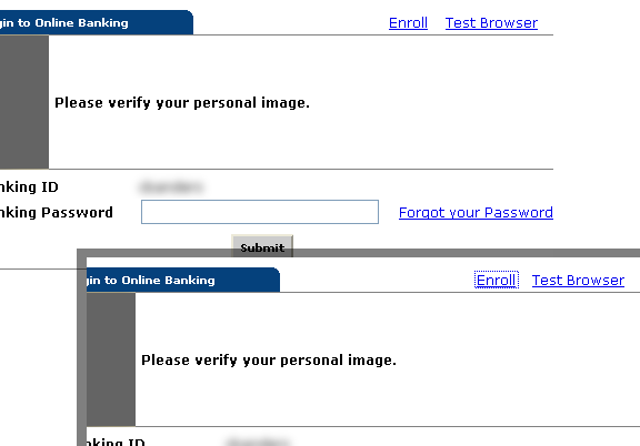
Ok, I suppose this is fine. Obviously the big Download Now button makes it clear what the bank would like the user to choose. But just below it is the option to Remind Me Later for those not interested at the moment. That seems fine, also. Unfortunately, the site doesn’t bother to return the focus back to the Password field when the dialog is dismissed. Figure 4 is a combination of portions of two screen shots after the popup dialog is gone.
The upper left screen shot shows that the focus is no longer in the Password field. In fact there is no evidence of focus anywhere on the panel. The lower right shot shows what happens after the [Tab] key is pressed. The focus now appears on the Enroll link. More [Tab]s are required to get the focus back to the Password field. Poorly done.
UNNECESSARY QUESTIONS
What would be the point of saving a blank document that has yet to be given a filename? Why would a word processing application ask the user if a blank document should be saved? Really? C’mon. If I want a blank document saved, then I will just save it and give it name. It’s not like I’m going to lose anything if I don’t save a document that has no name and no data. What I am losing is the time it takes to read the silly popup dialog, determine if there is something worth saving, and then closing the dialog. This may seem like an unusual issue to blog about, but I was shocked to discover how common it is.
I suppose there are occasions when various types of blanks should be saved, but only in context. For example:
- A blank space might be necessary for word separation or graphic alignment. That should definitely be saved.
- A blank stare should probably be noted when a ridiculous question is asked that a conscientious individual might want to avoid in the future. That should probably be saved.
- A blank check that has been signed and received should probably be filled in and cashed before the generous benefactor realizes the mistake. That should rarely be saved.
But a blank document? That should only be saved if the user specifically asks for it, and so the user should never be bothered with the question.
Ok, now I admit that I may have temporarily saved a word processing document that contained unseen settings such as fonts or margins before I actually added any text. But that’s not what I’m talking about. That is a case where it would make sense to ask if the document should be saved when the user closes it.
And I also admit that I have occasionally saved blank documents with specific names in a particular folder as a reminder to myself of something I want to work on in the future. But that’s not what I’m talking about either. That is a case where I deliberately save a file with a specific name.
What I am talking about is a document with no settings, no data (visible or otherwise), and no name. After being annoyed by this several times, I decided to test various word processors to determine how many of them would make me answer the question as to whether or not a blank document should be saved.
The test I performed was simply this:
- Open the application.
- Press the [space bar] key once.
- Press the [Backspace] key once.
- Click the [X] in the upper right corner of the window.
Figures 5 through 8 are screen shots of each dialog that appeared for various applications, as indicated by the caption for each. Not awesome. WordPerfect® has long been touted for its Reveal Codes feature, so I actually opened the window to see if some codes had been entered that it was trying to save: Nothing.
(By the way, I also tested simply opening and closing the applications. In each case, the user is not prompted to save the blank document.)
It has long been a common programming practice to mark something has “changed” so that the application will act appropriately regarding the data, saving, updating, etc., as needed. I suspect that in each of these cases the change was noted when the original key was pressed and the application never bothered to check if anything valuable was actually in the document; it just knew that something had changed and therefore prompted to save the document. That’s lazy and inconsiderate.
The only other word processor I tested was Microsoft Notepad® which did detect that there was actually nothing in the document to save and therefore did not prompt. Funny that the least sophisticated of all those applications was the one that made the effort to avoid an unnecessary waste of the user’s time. Well done.
SUMMARY
Users start an app to do something specific. That’s rarely the best time to ask them unexpected or unnecessary questions. Give a small attention icon somewhere. Even if they might be interested in what you have to offer, when they are focused on something else they will be more likely to simply dismiss the prompt without taking time to consider it.
KEY DESIGN POINTS
- It’s simple: Don’t make users think about something unnecessary.
- If you insist on interrupting, at least have the courtesy to return the display to the previous configuration and focus when you’re done.
- Use reasonable logic to determine whether an Interruption really is needed.