Microsoft® Windows® drove everyone crazy years ago with the now infamous “Are you sure?” dialogs that seemed to incessantly ask users to verify supposedly critical and/or irreversible actions. Warnings have their place, to be sure, but in many cases they were overused to the point of reducing their effectiveness. Gradually changes were made to only warn when it really was critical, or better yet, to give the user a remedy.

One good example is the Windows Recycle Bin. Figure 1 is a portion of a screenshot of the Recycle Bin on Windows 10 (with items in it).
Originally, when files were “deleted” from the file system, they were really gone. Asking “Are you sure?” was a very good idea for users that might be deleting something by mistake. Now, however, with the development of the Recycle Bin, nothing “deleted” is completely gone until the Recycle Bin is emptied. Fabulous! We get to avoid the “Are you sure?” dialogs. If I delete a file by mistake, I can immediately undo that with a simple [Ctrl]+[z] from the keyboard. Or later I can find the file in the Recycle Bin.
I’m constantly annoyed by applications that make me click unnecessarily and/or answer unneeded questions. It’s especially bad when it’s something that is used a lot, like Gmail® by Google®.
I’ve made it clear in the past I have several Gmail accounts and use it daily. It has some great features. However, I’ve also made it clear that Gmail also includes poorly-designed features. Some of these appear in the GUI in ways that make it obvious that no usability research was performed in advance. One such change is the process for logging into a secondary email account using a browser.
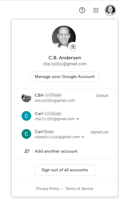
Figure 2 shows a portion of a doctored screenshot of some of my Gmail accounts on Google Chrome®. This popup appeared when I clicked on the icon in the upper right of the screen. This is a quick way to switch between various accounts. Across the top it shows the details of my current account and displays the “Manage your Google Account” button. Selecting this button provides options for viewing/editing details of the account. So far, so good.
Below this area is a listing of other Gmail accounts that it is currently aware of. Along the right side it displays which of the accounts is Default and which accounts are currently Signed out. The Default designation is interesting. Apparently whichever account was the first to be signed into during this session becomes the the default. I’m not sure what value that information provides, especially since it can change with every session. Odd. Other accounts that are currently signed in, but not the default, will have no designation along the right side. Clicking on any account that is currently signed in (either the Default or one of the others) immediately displays that account. Great.
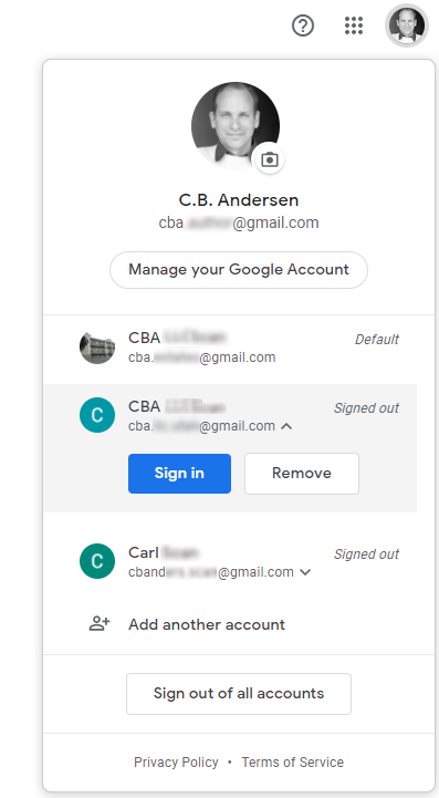
with Signed out Item Selected
The problem is with logging into another account. It seems logical that clicking on one that is listed as Signed out would simply give the option to sign in. Nope! Apparently, that is way too simple for the Google designers to go with.
Figure 3 shows a portion of a doctored screenshot after selecting a Gmail account that is listed as Signed out.
The user is now presented with two options: “Sign in” and “Remove.” Care to take a wild guess as to how often “Remove” would be chosen over the “Sign in” option? I’m guessing some users will never, ever, … ever want the remove an account. Certainly users are going to want to “Sign in” infinitely more often that removing it. Why would Gmail make “Remove” so prominent?
[Deep breath.]
The one good part of this display is that the “Sign in” button is at least displayed in bright blue, making it the obvious default choice. But still. Ugh.
Fine, yes, I’ll select “Sign in.”
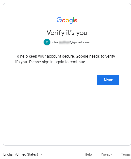
Figure 4 is a portion of a doctored screenshot when I select “Sign in” from the display in Figure 3.
Are you serious?!? Why would anyone possibly need the explanation shown on this panel?
The display in Figure 2 tells me that a certain Gmail account is Signed out. And just in case I didn’t notice that, the display in Figure 3 clearly gives me the “Sign in” option and that’s what I selected. Is there really anyone in the world who would deliberately make these two selections and not know that Google needs to “Verify it’s you” now?
Wow. And now my only option is the “Next” button. Wow. Just … wow.
Well here is good news! After clicking the “Next” button, we have arrived at the proverbial Promised Land.
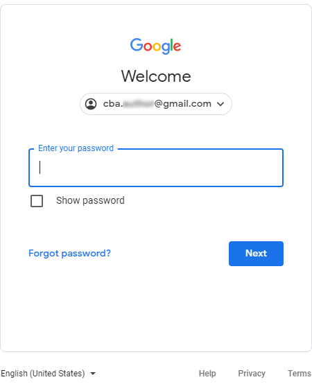
Figure 5 is a portion of a doctored screenshot of the display where I finally get to sign in. Gratefully it states “Welcome” at the top. It’s a “welcome” sight. It’s a “welcome” relief. I would certainly “welcome” some simple improvements to this user experience. This is the display that should have been presented as soon as I clicked on an account in Figure 2 that was marked as “Signed out.”
As great as it is to finally be here, I do have a problem with the “Next” button. This button text should used on a wizard, not a login panel. What the user is trying to do is “Sign in” to their account, so that’s what the button should say. There is nothing “next” coming along; this is (wahoo!) the last step in this painful Sign in process. Weird. Ok. Moving on.
As noted above, clicking on an account in Figure 2 should either take me to that account (if it’s already signed in) or take me directly to Figure 5. The display in Figures 3 and 4 should not even exist. The saddest part of this entire fiasco is the fact that Google already knows how to do all of this correctly. Figure 6 is a doctored screenshot of the Gmail Android app where the correct functionality is implemented.
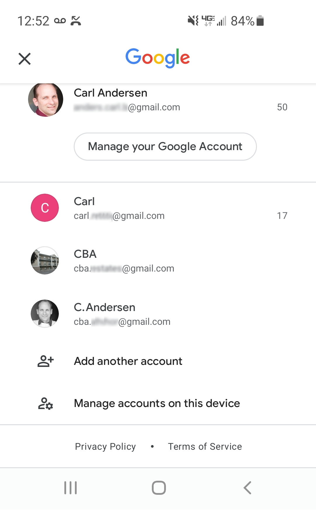
Figure 6 looks very similar to Figure 2, so let’s compare the two and see what makes the app implementation so much better than the browser version.
The top area is identical, with details about the current Gmail account, including the “Manage your Google Account” button to access details of that account.
The middle area of Figure 2 and Figure 6 is nearly identical, with a display of other known Gmail accounts. The app version, however, does not include the unnecessary and unhelpful “Default” designation. Also, there is no “Signed out” label, as the app version keeps the user logged into all accounts. I don’t know why the two versions are different, but they could easily act the same way. Perhaps because a phone is usually a personal device, so logging into the phone should give access to everything? In any case, they should be same. Users shouldn’t have to think about which device they are on because different devices give different options. The browser and app versions act the same when the user selects an account (that is already signed in). If there is a good reason, then simply providing a login panel when needed when selecting an account would work just fine.
The bottom section has the “Add another account” option in both versions. But only the app version has the very helpful “Manage accounts on this device” option. This is where the user goes to “Remove” an account. Perfect! This is a very uncommon option that is improperly prominent in the browser version. There’s no reason for this feature to be different between the two. And there is certainly more real estate in a browser than on an app; if there’s room on the small screen, then what’s the rationale?
KEY DESIGN POINTS
- Don’t require unnecessary clicks to accomplish anything; provide help text when requested, but don’t inflict it along a series of clicks.
- Don’t make uncommon options as prominent as frequent ones.
- Make browser and app versions consistent with each other; your user should only be required to learn one GUI to use your product.