It is beginning to be more common for GUIs to attempt to help the user distinguish the most likely button (primary) from the lesser likely selections (secondary). In principle it’s an idea that can be helpful. But the implementation needs to be consistent with good GUI design.
IMPLEMENTATIONS THAT CONFUSE STANDARDS
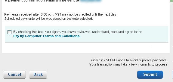
I recently logged into the web site for my car insurance and started the process of scheduling a payment. Figure 1 is a portion of a screen shot of the popup window that was displayed, which is the first panel of a wizard.
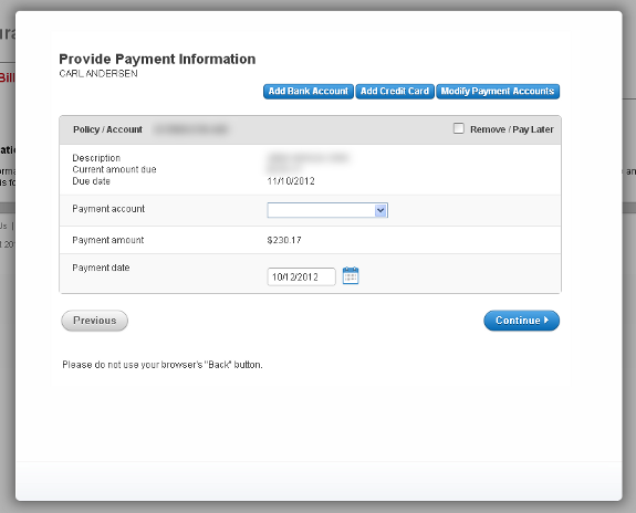
There are actually several problems with this dialog, but for the purposes of this article I want to point out the Continue and Previous buttons below the table of data. Continue is the primary button as evidenced by its color and location. The Previous button is considered secondary and therefore the designers decided to display it grayscale and placed it to the far left. This is a poor implementation of the concept of primary and secondary buttons. Here are the two main reasons:
- Buttons that have similar actions and that the user will be deciding between should be located next to each other for quick access. On a wizard the Previous/Back and Continue/Next buttons should be in the same grouping.
- The secondary button is so gray that it’s not obvious that it is even active. It looks disabled.
I changed my mind and decided to schedule the payment later (the due date was still a month away) and couldn’t find a way to cancel. Eventually I realized that the Previous button was available and it might be my only option of escape. It was. (Also, the word Previous was certainly misleading since this was the first panel in the wizard.)
GUIs have long used grayed buttons to represent options that are sometimes available, but not currently.
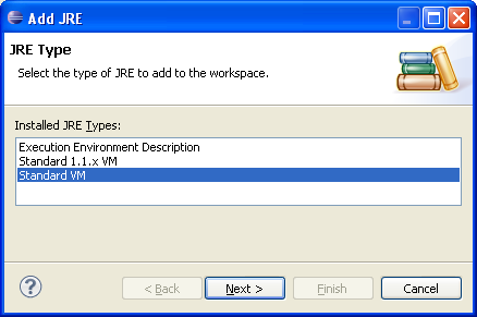
Figure 2 is a screen shot of a wizard dialog in Eclipse® that shows all three button examples. The grayed buttons are disabled, the primary button has a thick, colored border, and the secondary button has a standard border. It is obvious which buttons are available and which are not. Browser-based and mobile GUIs should follow this standard.
Notice also that the <Back and Next> buttons are closer together than the other buttons, giving a clearer idea that the user will likely select between the two.
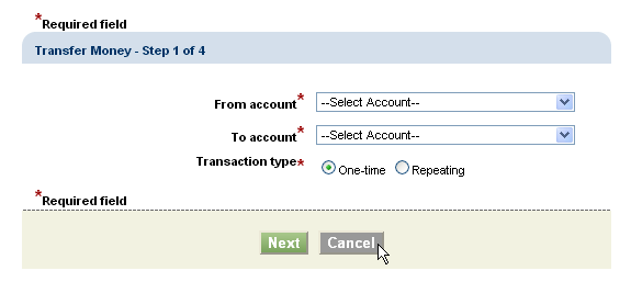
Figure 3 is another example of a browser-based wizard from the Chase® Bank web site that uses the concept of primary and secondary buttons.
This implementation is better than the example in Figure 1 because the buttons are appropriately grouped together, however there is still the interesting choice of grayscale which can lead the user to wonder if the Cancel button is active. This is not helped by the fact that the mouse cursor does not change to a pointer when hovering, so the only way to be sure the button is active is to actually select it.
BETTER IMPLEMENTATIONS
Figure 4 is a portion of a screen shot of a dialog from a credit union web site. Note the primary and secondary “options” in the lower right corner. The “Next” button is obviously the primary option. The “Cancel” option is displayed as a link, rather than a button. Links are not my favorite choice for actions on a dialog (see GUI Design: Links vs. Buttons), but it does accomplish the goal of highlighting the difference between primary and secondary options.
Figure 5 is a portion of a screen shot from the American Express® payment wizard.
The secondary buttons Cancel and Back in this example are the best example of all those shown in this article. The actions are buttons, not links, and the buttons are less prominent, but still have enough color and substance to make it obvious that they are enabled.
There are certainly times when spacing between selections is a good idea, such as when one button commits a credit card transaction or something equally significant. The design should help the user not accidentally click the wrong button.
MISUSING PRIMARY & SECONDARY
I recently logged into the web site for a wireless phone company and was greeted with a popup advertisement for adding a new phone line. Figure 6 is a portion of a screen shot showing a blurred and condensed image of the middle section of the dialog.
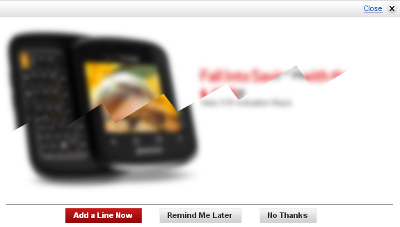
This is an example of a very poor implementation of primary and secondary buttons, but for a different reason than the previous examples. This type of display is intended to make it easy to find and choose the button that the designers decide is the button most likely to be selected —but in this case, the primary button (Add a Line Now) is the one the company would most like for the user to select. I mean, really, how likely is it that the average user logging in to an account is most likely wanting to add a new line? How often does that happen, as opposed to checking minutes used or last months’ bill? Instead, 99% of users will just want to find the quickest way to dismiss the popup. Not nice.
KEY DESIGN POINTS
- Don’t make secondary buttons look disabled.
- Don’t break up groupings (unless a certain button chosen by mistake would be very frustrating).
- The primary button should be what most users will want, not what the designer wants them to want.