 In keeping with the frequent changes found in the navigation of Google® web applications, multiple changes have occurred in the short time since my Google® Navigation — GUI Review posted in March. (Actually, the changes appeared in advance of my post, but I usually have my articles scheduled to post automatically several weeks ahead of time.) Unfortunately, some of the inconsistencies shown in that original review are now even worse. The changes revolve around the new Play option which now combines the previous Android Market, Google Music and the Google eBookstore. Google Music was specifically noted in the previous review.
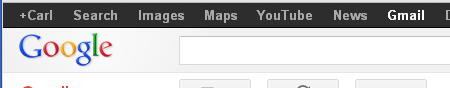
As a brief review, Figure 1 shows the Google Navigation bar when using Gmail. Note that “Gmail” at the far right is displayed with text that is white, indicating that it is the current selection, but the white text is the only indication of the current selection. All non-selected items are displayed in the same bold font as the selected item. And the gray used for the non-selected options is really not too much different from the white. This is especially difficult for anyone with less-than-perfect eyesight. Figure 2 is a portion of a screen shot taken in April 2012 after the new Play option was inserted between Maps and YouTube.
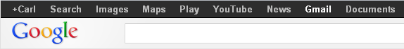
Figure 3 shows a portion of a screen shot of the Google navigation with the new Play option selected (and the More menu expanded).
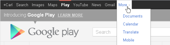
Something interesting about the navigation options on the Play panel is the fact that Documents is the top option on the More menu instead of immediately following Gmail as seen in Figure 2. But there are some good things here.
The best part about the new navigation options as displayed on the Google Play panel is what appears to be the return (hopefully) of an easier-to-detect selection. Note that Play has a red, horizontal line above it and that each of the non-selected navigation options are no longer displayed in bold text. Combined, these two things make it much easier to find the current selection.
I use the term “return,” because — as pointed out in the original review — there has been a gradual decline over the past year in this navigation display. As was also pointed out in that review, there are actually several different versions of the display, depending on the current selection. The version used by Play is actually the same as the version currently used when Videos is selected, so I hope that means it’s the version of choice going forward. (Unfortunately, Videos is not a top-level option in all cases, so I may yet end up being sorely disappointed.) Figure 4 is a portion of a screen shot of the current Videos panel.
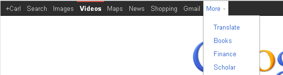
Note that the display of the navigation options for Videos is the same as for Play in that the selected option has a red, horizontal line above it, and the non-selected options are not displayed with bold text. However, they are obviously not be using the same widget, because across the top the options themselves are different, and the options on the More menu are also different. Interesting.
Another inconsistency shown last time was the layout of the More menu. Three different layouts were documented previously. Figure 5 was used in the previous review and is a combination of portions of screen shots of the menus from various panels on the same day in February 2012. (Note the labels and arrows at the bottom right, indicating which panel is currently displayed.)
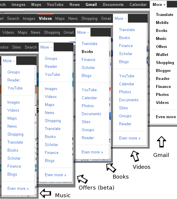
Note that of the examples shown, the More menu for Gmail is unique, but the menus for Videos and Books match each other, as do the menus for Offers (beta) and Music.
Figure 6 is a combination of portions of screen shots of the menus from the same panels on the same day in April 2012 Another inconsistency shown last time was the layout of the More menu.
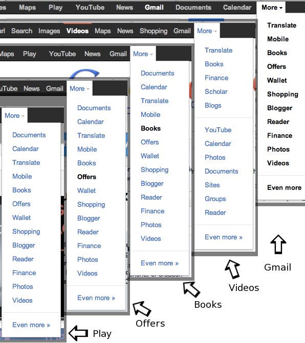
There has been no change in the More menu options for either Videos or Gmail (except that Music has moved to Play.) But all three of the More menus for Play, Offers (no longer in beta), and Books have changed to be the same menu. Great news!
SUMMARY
 Google seems to take a while to realize which changes are improvements and which are a step backwards. I’m very pleased that the navigation display seems to be improving both in readability (only the selected option is bold on most panels) and in consistency with the order of options at the top level and on the More menu. There are still some problems noted in the original review, but overall this results in a GUI that is somewhat better than the previous implementation. Based on this I’m rating the new GUI an improved 2 ½ GNs.