Web GUIs have a lot of freedom when it comes to design and layout. Unfortunately all those options can easily and quickly lead to poor decisions for the user. One of those layout decisions is the GUI’s minimum width. By “minimum width” I am referring to how wide the browser window must be in order to see all of the important functionality at the top of the screen at one time.
It is presumptuous and short-sighted to act as though yours is the only window the user will want to see at any given time. For many users, larger screen size and screen resolution are met with gratitude for the ability to display more than one window at at time, not necessarily so that more of the same window can be seen (although that is certainly the case in certain instances).
POOR IMPLEMENTATION
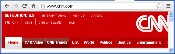
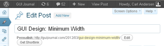
Figure 1 is a portion of a screen shot for cnn.com, the web site for CNN®.
The CNN GUI has a wide layout that does not adjust for window sizes smaller than 1028 pixels. The image shown was created by narrowing the browser window to a width of 575 pixels (the standard for graphics on this blog). Barely more than half of the CNN minimum screen width is visible.
Compounding the issue is the fact that when the window is made smaller, no horizontal scroll bar is visible. The only way to see what is on the right side of the panel is to make the browser window wide enough to view it. This is a very poor design. (April 2013 Update: Since this was originally posted CNN has updated its site to use a horizontal scroll bar when the window is narrow. They must have read my article.)
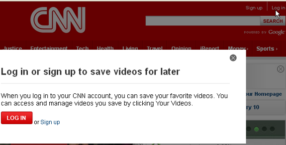
Figure 2 is a portion of a screen shot of the upper right portion of the same web page after Log in has been selected.
Note the features of Sign up, Log in, and SEARCH, all of which are not visible unless the full width of the panel is displayed. By the way, I wondered why someone would log in to CNN, but the popup panel shown in Figure 2 describes the functionality. Logging in is also required to post comments on articles. Any users who keep their browser window narrower than 1028 pixels may never realize that this type of functionality exists. Not great.
SLIGHTLY BETTER IMPLEMENTATION
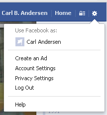
This problem shown on the CNN web site is not uncommon. The Facebook® web site, facebook.com, also has a minimum width of over 1000 pixels. The Gear icon at the far right is the only way to access Log Out, as well as other actions.
The reason this implementation is slightly better is the fact that a horizontal scroll bar does make it possible to see these features on a narrower screen.
It should be noted, however, that for a time (last year) Facebook’s horizontal scroll bar only adjusted the content area and not the blue title bar at the top. That meant that the browser window still had to be adjusted to be at least 1000 pixels to see the Gear icon. Without the welcome change, Facebook would have remained in the same category as CNN, with the difference being that logging out of Facebook is probably a much more important feature than logging in to CNN.
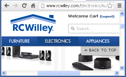
Figure 4 is a screen shot of the web site for RC Willey®, rcwilley.com, with the browser window adjusted to be small both vertically and horizontally.
This web site has an implementation similar to the last year’s Facebook implementation, in that the scroll bars only affect the content area, not the title bar. The white area at the top and the dark blue horizontal menu area do not move or adjust in any way when the scroll bars are used. The advantage that this implementation has over the previous Facebook design is that the Logout option is much nearer to the left of the screen than the Facebook Gear icon, so it’s less likely that the option will be unseen.
MUCH BETTER IMPLEMENTATION
Gmail® by Google® has a better implementation than any of those above. (There is much about Google’s GUIs that I don’t think is very good, so it’s important for me to point out when they have done something well.) Gmail makes great adjustments for changing browser widths. Making the browser window extra wide will cause messages to expand to fill the available space, keeping both left side and right side data at the far sides of the browser window. Gmail also does well when the window is narrow. The minimum width for Gmail is just over 700 pixels, which is significantly smaller than either CNN or Facebook. Figure 5 is a portion of a screen shot of Gmail’s title bar area, scaled for this display.
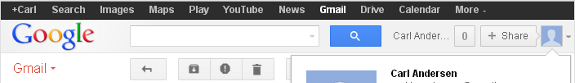
Gmail makes several adjustments to get the display to fit into the current space. The items on the left and right sides move closer together, the Search area becomes narrower, and the account name is truncated, showing only “Carl Ander…“ instead of my entire name. Of course, a horizontal scroll bar is also available when the browser window is adjusted to be narrower than 700 pixels.
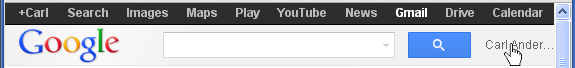
The user can Sign out of Gmail through a popup window which is invoked by selecting either the Avatar icon at the far right or the account name in the title bar. Figure 6 is portion of a screen shot of the Gmail display when the browser window has been narrowed to 575 pixels.
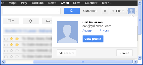
Note the account name is still visible and can therefore be used to access the Sign out feature. Figure 7 is a screen shot after the truncated account name shown in Figure 6 was clicked.
Because a horizontal scroll bar is available, the GUI invoked the popup window under the Avatar icon and automatically scrolled the display to make the popup visible.
BEST IMPLEMENTATIONS
The web access version of Novell® GroupWise® has a great implementation for handling different browser window widths. The minimum width for showing the title bar with all elements in their original location is 940 pixels. However, when the window is narrow, then some elements simply begin moving closer together, while others begin wrapping to the next line. Figure 8 is a portion of a screen of the Novell GroupWise display with the browser at 620 pixels.
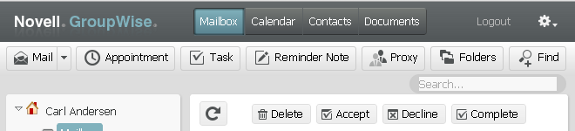
Note first the Logout option and the Gear icon at the far right of the top line. These two items are always in this location relative to the right side no matter how wide or narrow the browser window currently is. The rest of the items to the left are always in the same location relative to the left side of the window.
Still on Figure 8, next take a look at the wide light gray area below the dark title bar: the area with buttons for Mail, Appointment, etc. When the browser is at 940 pixels or above, the Search… box on the lower line (at the far right) is on the same line as these buttons, immediately following the Find button. Because the display wraps the Search… control to the next line, it is still available with the narrower display. The 620 pixel display shown in Figure 8 is as narrow as it can be before the Find button wraps also (followed by each of the other buttons as the window gets even more narrow). Well done.
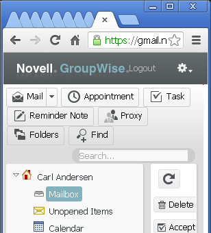
Figure 9 is a portion of a screen shot of GroupWise when the browser gets excessively narrow (about 300 pixels). Notice how the Logout and Gear icon controls have continued to move to the left even. Also, note how the buttons and Search… control (on the gray background) have continued to wrap so that all of the functionality is still visible on the narrow window. A designer may not think that this size of window is ideal for the user to access the functionality of the app, but that is no reason to make it inaccessible or invisible. A user may have occasion to work in this environment and should be afforded the best experience possible.
WordPress® is another example of a great implementation of minimum width. Similar to GroupWise, the minimum to see all elements in the title bar and left side navigation is about 930 pixels. Depending on which panel is currently being displayed, elements in the content area may wrap as needed to keep them visible. However, the window can be as small as 625 pixels before a horizontal scroll bar is displayed and the elements in the title bar stop moving closer together. Figure 10 is a portion of a screen shot of the WordPress title bar at 625 pixels.
The Howdy, Carl Andersen account name and avatar icon at the far right (Figure 10) adjust to always be at the far right side of the title bar, regardless of the width of the browser window.
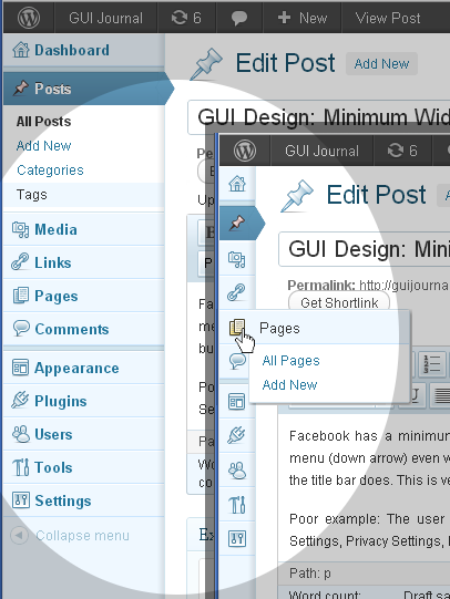
WordPress makes another automatic adjustment based on the width of the browser window which is a great benefit for the user. Figure 11 contains portions of two screen shots of the WordPress left side menu.
The upper left shows the menu in its expanded view, which is the default when the browser width is about 930 pixels or greater. The lower right is a screen shot of the same menu on the same panel when the browser window width is reduced. The icons for each menu item become the only part of the menu options that are visible, in order to save space and leave more room for the content area. Though the menu text is gone, hovering with the mouse (as shown in the figure) will expand certain menus, giving more details.
It’s unfortunate that 1) the menu options are only available via the mouse in the collapsed state and not with the keyboard (see GUI Design: 508 Compliance), and 2) not all of the menu icons show additional detail on hovering. But for the focus of this article, the minimum width adjustments of this GUI compared to most others are fantastic!
KEY DESIGN POINTS
- Don’t assume that your browser window is the only window your user will want to see at a time.
- Don’t put important actions (such as Log Out) at the far right of screens with a wide minimum width.
- Be creative and helpful to the user in the way that your GUI adapts to changes in the width of the browser window.