In the evolution of “everywhere access” it’s easy to make mistakes. Most organizations already have a web presence and are in the process of providing access that is specific for mobile devices. Unfortunately there are some common mistakes that can be very frustrating for users.
EVOLUTION OF MOBILE ACCESS
Here are the steps that most organizations have taken or are taking in making their offerings accessible everywhere:
- Check the web browser on a mobile device to verify that the web site displays.
- Update the web site to function better through a mobile browser.
- Detect that a mobile device is being used and adjust the display accordingly.
- Create a mobile app instead of relying solely on a web browser.
PAST: PROBLEMS, YES, BUT MANAGEABLE
When the first users of mobile devices began to access web sites years ago, most were generally ecstatic about what they could do. Were there problems? Of course! Most web sites were designed for large screens and high-speed connections. But the new mobile accessibility made most things well worth any hassle. Repeatedly moving around the screen (because only a small portion was visible at a time) or waiting a little longer were issues that were far out-weighed by the advantage of being mobile.
These sorts of things are only acceptable to users for so long, however, and so responsive organizations began trying to be more accommodating. Sometimes those attempts are well executed; other times not so much.
PRESENT: SOLUTIONS WORSE THAN THE PROBLEM
Gone are the days when users are satisfied with limited access on mobile devices. Some users do not even use anything else anymore, so everything a GUI offers should be available on a mobile device. It’s great to make your web site display and function better on a small screen, but your mobile “solution” better not remove functionality from the user. How is that a solution? If the only thing your mobile GUI does is make it easier to see a limited set of data, then you may have done more harm than good.
TYPICAL EXAMPLE

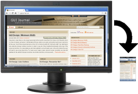
The Daily Herald® is local newspaper based in a city where NetIQ® and Novell® have a shared business office. Figure 1 is a screen shot of the main page of its web site when viewed on a mobile device. This was accessed through a web browser, however the site detected a mobile device and adjusted the display for the small screen.
This is an excellent example of how to limit the data currently being displayed and make the layout appropriate for the current screen size. Everything displays easily within the available width, allowing for vertical scrolling. Here are the visible data items, top down:
- An advertisement (blurred).
- The title of the newspaper, its URL, and the current temperature.
- The title Latest News.
- The beginning of a short list of brief summaries of the latest news stories. (There were ten summaries at the time I took this screen shot.)
Fantastic!
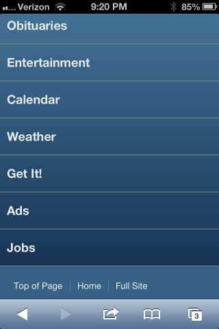
Of course, not every user has necessarily visited the web site for the latest news, so the list is short, and scrolling past the list quickly leads to other options. Figure 2 is a screen shot of the web site after scrolling past the summaries of the latest news.
Again, rather than trying to display too much data, each newspaper category is listed on a separate line, allowing for quick access. On a small mobile screen, the data access is much more important the aesthetic design normally found on a full web site.
Selecting any one of the categories shown in the display in Figure 2 results in a summary list for that category (similar to the list of Latest News items shown in Figure 1). This is a great design that allows for quick, easy access to the most current content.
The designers of this mobile GUI made the choice not to make all news stories and other items in each category available by default through the mobile device. However, they did provide another option. Note that they provided a Full Site link near the bottom in Figure 2. Again, this is excellent!
Figure 3 is a portion of a screen shot of the web site when the Full Site link is selected.

Note that much more data is shown on the full site than the default mobile version. Among other things, more data is available in the weather summary, more links to various categories are displayed, and search options are available.
Of course the long horizontal line of categories is much more difficult to view and access, but this is acceptable if it is the only way to get to certain data that are no longer in the list of “latest” items. Unfortunately, this web site missed the entire point of providing access to the Full Site. It only provides the main page! As soon as one of these category links is selected (such as Sports or Obituaries) then the display returns to the concept of only listing summaries of the most recent items. That means a user can’t , for example, find a story about a ball game that happened two days ago. Ugh!
Perhaps that’s acceptable for items in the Sports category, but what about someone driving to a funeral who needs to double-check an address from an obituary that appeared two or three days earlier. Because the Obituaries category only displays the current items, that mobile user will not have access to the data. Wow! That is amazingly short-sighted.
KEY DESIGN POINTS
- If your GUI is available through a browser, then detect mobile devices and adjust accordingly, limiting the amount of data displayed by default.
- No longer are users satisfied with limited access through mobile devices; remember that some users never use anything else.
- Always offer a “full web site” link from a mobile display or app, but don’t pretend that it’s ok to restrict access to certain areas “because it’s mobile.” Full web site access should mean nothing less than FULL web site.