Tri-state checkboxes are used to indicate that some, but not all items in a list have been selected. As with a typical checkbox, it is displayed as checked when all items are selected and unchecked when nothing is selected, but the third state does not look the same in all interfaces. A tri-state checkbox is one of those controls that still doesn’t have a clear standard. I think there are three reasons for this:
- They aren’t needed very often.
- What has been used in the past doesn’t work very well and so designers keep trying to come up with something that works better.
- Rather than solving the problem, some designers simply avoid it.
DIFFERING IMPLEMENTATIONS
Figures 1, 2, 3, and 4 show four unique implementations of tri-state checkbox displays.

Figure 1 is a screenshot from Yahoo!® Developer Network of a functioning TreeView example that includes checkboxes. The dash inside the checkbox indicates partially checked, or that some, but not all, of the child checkboxes are checked. Clicking a parent checkbox will toggle the state of all the child checkboxes. Also, changing the state of child checkboxes one by one will automatically update the parent to reflect how many of its child checkboxes are checked. This is valid at any level in the hierarchy. Unfortunately, the dash in the checkbox is quite similar to the dash used to indicate an expanded portion of the TreeView, though it helps that the checkbox has a gray background. In any case, does a dash on a gray background give the impression of partial selection?
Figure 2 shows a screenshot of the Web Properties dialog for the C:\WINDOWS file folder on a Windows® XP system. At the bottom of this dialog are tri-state checkboxes for Read-only and Hidden files. In this example the green square inside the Read-only checkbox indicates that some, but not all of the files in this folder are currently Read-only. As with the first example, clicking the checkbox will toggle the state between checked and unchecked, which in this case would change the state of all of the files. Personally, I don’t think the square gives the impression of “partially checked” to most users any better than the dash in the first example.
Figure 3 shows a portion of a screenshot of the Features tab from the Corel® WordPerfect® Office X5 install application.

This display changes the background inside the checkbox to indicate a partially selected list below. WordPerfect has used this implementation of a TreeView with tri-state checkboxes since the 1990s. This seems to give a more accurate representation that the item is checked, but not completely. Unfortunately, the check mark against a gray background has a different meaning in this example than in does in the example in Figure 1. Also, I have concern about how well this would work for the visually impaired on a high contrast display.
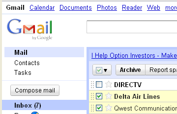
It’s common, when a table of data has checkboxes in the first column, to also have a checkbox in the header of that column. Figure 4 shows a portion of a screenshot of the Gmail® by Google® implementation of a tri-state checkbox in the header of the first column of the table of e-mail messages.
The Gmail implementation is similar to the WordPerfect example in that it still has a check mark, but Gmail dims the entire control rather than just graying the background inside the check box. Unfortunately, the “graying” paradigm is already used for a control that is disabled or unchangeable. This was a very poor choice; an interface should never use such a common standard to represent something entirely different. (Close inspection reveals that it may not really be disabled, because the check mark itself is still a faint green rather than gray like the rest of the control. However, using an interface should not require such “close inspection” and it only works for those who are not visually impaired!)
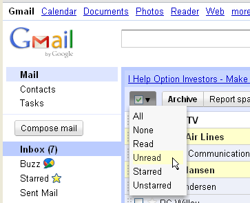
The Gmail control does have some redeeming qualities, however, on the dropdown menu to the right of the checkbox as shown in the screenshot in Figure 5. The first two options on the menu are All and None (which is the same as simply clicking the box, but perhaps helpful for those who are unfamiliar with it.) The other options are helpful and easy filters for the list, providing the ability to quickly select everything that is Read, Unread, Starred, or Unstarred. (Cool, but not the focus of our current discussion.)
AVOIDANCE
Many GUIs provide other means for selecting multiple items in a list, without attempting to use a tri-state checkbox to show state, thereby avoiding the whole concept of indicating whether all, none, or some are selected. Here are two examples:
- Multiple, specific items in a list may be selected with a mouse, using SHIFT+Click or CTRL+Click.
- A table of data will often have Select All and Deselect All options.
Both of these cases are simply actions, so there is no need to show state. Unfortunately, some interfaces make no attempt to show state even when a header checkbox is used for Select All and Deselect All actions. Figure 6 shows a screenshot of the Windows® 7 Updates dialog. (I know, I know, it’s practically brand new…so why does it need updating already?)

Notice that some of the items in the list are selected, yet the header checkbox is unchecked. Clicking the header checkbox toggles all the child checkboxes on the current tab, as expected, and a summary at the bottom of the panel indicates how many of the available updates from each tab have been selected. Unfortunately, the header checkbox does not update when the state of its child checkboxes changes. This implementation is further complicated by the fact that there are items to be selected on multiple tabs. This display could have been greatly improved by using something similar to the hierarchy layout shown in Figure 3. That would also have allowed the user to view all updates from each category (Important and Optional) at the same time, if desired.
TIME FOR A NEW DISPLAY
Is it possible to design something new at this point in the evolution and history of GUIs that will catch on and receive widespread appeal? Possible, yes. Likely, no. But it’s worth a try! I believe a partially filled box makes the most sense, but how does one depict half a check mark?
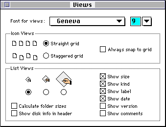
It wasn’t until Windows 95 that checkboxes actually had check marks in them. Before that time diagonal lines stretching from corner to corner were used in both Windows and Macintosh®. It looked like an X inside the box. Figure 7 displays a screen shot of the Mac® OS 7 Views dialog with checkboxes. (OS 7 was released in 1991.) It would certainly be easier to show half an X than half a check mark.
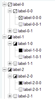
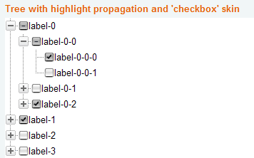
Perhaps instead of a checkbox having an X or a check mark, it should just be completely filled in when selected. That would make it much easier to display something that was partially checked. Figure 8 shows some ideas for both. The first group, under label-0, uses the Macintosh X with a single diagonal line for partially checked. The group under label-1 fills in the checkbox completely for checked and the lower right triangle for partially checked. The group under label-2 is my current favorite, but there’s an obvious problem with the outlined square (for checked) looking identical to the partial check in Figure 2. Oh well.
If you have a better idea, and/or want to attempt to establish a new worldwide GUI paradigm for tri-state checkboxes, I’d be anxious to hear about it!
KEY DESIGN POINTS
- Don’t ever use a standard display to represent a new idea (e.g. grayed always means disabled).
- Don’t use a control that represents state (e.g. checkbox) for an action and then allow the state to be incorrect because of future actions.
- Follow standards when they are great, but be brave and try to promote something better when you find it.
ACKNOWLEDGEMENTS
Thanks to Marcin Wichary and guidebookgallery.org
[…] The second is the header checkbox. Figure 8 shows a header checkbox that gives options for selecting items in the current list. Similar header checkboxes in other products usually select All or None when the checkbox state is changed and may also have a tri-state display when not all items in the column are checked. Gmail provides not only All and None, but several other convenient options as well. While I don’t like the mostly-disabled look of Gmail’s tri-state checkbox, that’s a discussion for another time (Tri-State Checkboxes). […]
>>Is it possible to design something new at this point in the evolution and history of GUIs that will catch on and receive widespread appeal? Possible, yes. Likely, no.
I think I already did next step for a TreeView, look at http://programtree.com.