When I use the expression Keeping Tabs I mean the opposite of Losing Tabs—that is, specifically, losing the current location of focus when using the [Tab] key for navigation. Many web sites and web apps seem to no longer have any concern for this functionality. The [Tab] key on a keyboard was originally meant as an abbreviation for Tabulator, to be used for data alignment in columns, but GUIs have long used the [Tab] key to move between controls. I can’t understand why such a basic standard is ignored.
INVISIBLE FOCUS
The CNN® web site found at cnn.com is an example of a GUI where the focus is hidden at all times. The only available clue about the current focus is the text in the status bar (typically at the bottom left of browsers) that displays the URL or Javascript function associated with the current link. But, honestly, most users never look at the status bar. CNN displays nothing in the status bar when the focus is in the Search area.
Figure 1 is a combination of portions of several screens taken after hitting [Tab] multiple times. (The window height was reduced in order to show the status bar at the bottom.)

The upper left image shows “http://mexico.cnn.com/?hpt=ed_Mexico” in the status bar, giving the clue that the focus in on the MÉXICO link along the top line. The inset image to the right shows the mouse hovering over MÉXICO with the same text displayed in the status bar. The image at the lower left shows how the status bar changes when the mouse hovers over the INTERNATIONAL link, but when the mouse is not over any link, then the status bar text returned to the upper left display.
It’s clear that CNN has no interest in helping visitors navigate their site via the keyboard. Limiting accessibility is extremely careless and short-sighted. It can drive away potential users. For a more extensive discussion on this topic see GUI Design: 508 Compliance.
INTERMITTENT FOCUS
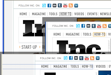
I often read articles from Inc.® Magazine found at inc.com. For the most part the display of the current focus works correctly when using [Tab] for navigation. Figure 2 is a combination of screen shots after tabbing to the How-To link in IE® (upper left), Chrome® (mid-right), and Firefox® (bottom) browsers in MS Windows®. The display is appropriate for the first two, but in Firefox the dotted box mistakenly extends all the way the left margin, regardless of which item on the menu has focus. This is an annoyance, but the real problem is found on the next menu bar.

Figure 3 is a portion of a screen shot of the Inc. menu bar displayed below the Inc. logo after [Tab] is used to place focus on the START-UP Option. This menu option, like the previous menu, seems to display correctly. Unfortunately, the next eight times that [Tab] is pressed the focus is gone. It is not until the ninth [Tab] that the focus suddenly reappears on the RUNNING A BUSINESS Option. Subsequent [Tab] presses result in the same vanishing behavior. This is because the options on this menu actually have sub-menus and the focus is moving through those sub-menus items, even though there is no evidence of it because the sub-menus are not visible.

Figure 4 is a portion of a screen shot after the mouse hover automatically expands the START-UP menu, revealing the location of the focus to be Naming a Business on the sub-menu. Notice that the icon next to START-UP has changed from a right arrow to a down arrow. This is becoming a new way to display expanded/collapsed menus, but it conflicts with the standard of the past two decades of a down arrow indicating a hidden menu or available options. I originally thought the right arrows were just item separators, which would be helpful when the list of menu items include both one-word and multi-word options with no other delineation (see Figure 3).
Another unfortunate aspect of this implementation is the fact that the sub-menus cannot even be accessed via the keyboard. With focus on the START-UP menu, pressing [Enter] changes the display to the Start-up section of the web site, with no chance to see/select the sub-menu options. Pressing the [space] bar simply scrolls down the page (with no regard for the current focus).

VISIBLE FOCUS
With all of its other problems (see Gmail® GUI Review) Gmail® is actually one web app that does remarkably well with Keeping Tabs. Figure 5 is a portion of a screen shot of Gmail after using [Tab] to navigate to the Starred option on the left side and pressing the [Enter] key to select it. The gold rectangle is used in Chrome to show current focus, and Gmail remembers where the focus was and continues to display the rectangle after the panel is redrawn. (This rectangle is not shown when all actions are initiated via the mouse.)
This implementation does have one case of “intermittent focus display” when arriving at the right arrow icon to the left of the Circles option; the focus is not shown here. However, pressing the [Enter] key when the focus is at this location will indeed expand the Circles sub-menu and then subsequent [Tab]s move through the sub-menu options. As is appropriate, when the Circles sub-menu is not expanded, then the [Tab] focus movement ignores these options. This implementation is much better than the sub-menu implementation at the Inc. web site.
Something else that’s a little quirky with Gmail is when the focus reaches the contacts in the Chat area (just under the Call phone option). The focus rectangle actually surrounds all of the names and status icons at once, but the up/down arrow keys move the selection (shown with a gray background) between names in the list. Pressing the [Enter] key when a name is selected will invoke the chat box for that contact and place the focus there. The part that’s quirky is the fact that the up/down arrow keys simultaneously scroll the unrelated list to the right as the chat name selection changes. But, as I stated above, all in all, this is a very good implementation of Keeping Tabs.
STRIKING A BALANCE
Allowing keyboard access is vital, but it can also be overdone. Jennifer Kyrnin, a web designer and author of several books about web design, posted a blog article entitled Tabindex: Making Your Pages Accessible (not currently available). In the first paragraph of this article she mentions a web page that she accesses every week that requires her to [Tab] 24 times before getting to the only button on the page she ever uses. She ends the explanation with, “This can be very frustrating.” I agree.
The Novell® Cloud Security Service® Home panel is a dashboard which includes literally dozens of status and configuration links (with icons) for all aspects of the service. Figure 6 is a portion of a screen shot of the Home panel showing just a few of these.
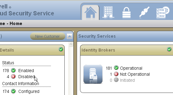
Clicking on an item that states, for example, that a certain number of customers are Disabled will drop down a list of those customers, allowing the administrator to then click and go directly to the details of a given Customer in the list. This is very convenient. However, having every one of these dozens of items accessible via the [Tab] key would render the panel very cumbersome. Because this information is available in other ways, such as invoking the Customer panel through the main navigation along the top of the panel, only the most important functions on the dashboard are in the tab order. (For example, the individual buttons for New Customer and New Connector.) The dashboard is still a visual indication of all important information in the system, allowing the administrator to know what items need attention and where to go for more details.
KEY DESIGN POINTS
- Some users employ the [Tab] key to navigate (either by choice or necessity), so the current focus should never be hidden.
- The [Enter] key is a standard method for selecting a menu option and expanding any available sub-menu.
- Keyboard users know that navigation will be slower when using the [Tab] key, so it’s important to be judicious about how many items can potentially receive focus, but users also expect full access to all functionality once the focus is where they want it.