For years web browsers opened multiple windows to display multiple web sites, which is sort of amazing since multiple document interfaces (MDIs) have been around since the 1980s. Those of us that liked having multiple web sites open at the same time would sometimes lose track of the window we were looking for as it was hidden behind all of the others. It was a great day when browser designers finally added tabs.
BAD “NEW TAB” DESIGN
Firefox® is my browser of choice most of the time these days, but from the start I was amazed at their implementation of the New Tab feature. Figure 1 shows the Firefox 3.6 display when a new tab is opened.
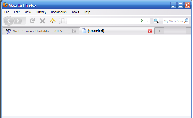
It’s a blank screen!
Really? Do they really have absolutely no idea what to put on a new tab? How about my home page? I have always had my home page set to be a page of links where I commonly want to browse; I know many others who do the same. So when I use Firefox, my CTRL+T (for a new tab) is always followed by clicking the [Home] button.
Apparently not much usability testing went into this feature with any of the major browsers at first, but Firefox still hasn’t done anything to improve their implementation. A blank screen probably makes sense when I open a new document in a word processor or a spreadsheet, but really, for a web browser? Wow. (It’s now possible to get this functionality through an add-on or extension, but it seems silly to have no useful default.)
A LITTLE BETTER “NEW TAB” DESIGN

Gradually, however, most other browsers have finally tried to provide a little help to users. Figure 2 shows the display of Microsoft® IE8 when a new tab is opened. (IE7 still showed a blank panel, so this is relatively new.)
Typical of Microsoft, they make me read a whole lot more than I want to. But there are some good things here, including 1) reopening recently closed tabs, 2) reopening the last browsing session, and others. This is definitely better, if only a little. At least they figured out that I most likely don’t want a blank screen.
MUCH BETTER “NEW TAB” DESIGN
Safari® is my browser of choice when I’m working on my MacBook® Pro. Figure 3 shows an example of the display when a new tab is opened.
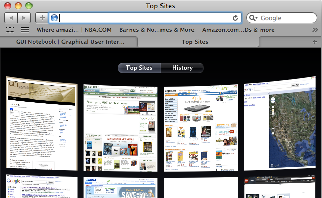
First of all, I like that I don’t have a bunch of reading to do! For a new user, the browser shows mostly web sites that are common for most users and presents a graphical display of those sites for easy selection. Better yet, over time this browser keeps track of the places I go the most often and adds them to the display. At the bottom of the page there is an [Edit] option so that I can permanently hold on to or permanently remove web sites from the list. This is a much better implementation.
GREAT “NEW TAB” DESIGN
I don’t use Google® Chrome® very much for various reasons (including the vacuous display and problems I have had with RSS links), but I really like their implementation of the New Tab feature. Figure 4 shows the Chrome new tab display.
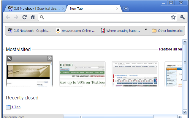
The Chrome new tab shows graphically my most visited web sites along with various other options for recently closed sites and other things. It’s a great combination of the best features from the other browsers. I also really like that I don’t have to click an [Edit] button to make permanent changes to this list (like Safari requires), but rather, simply hovering over an image will show the editing options for the item right above the image. I can immediately keep a web site on this page or delete it. Very well done.
KEY DESIGN POINTS
- Look at other seemingly unrelated applications to get ideas of what could be done with your GUI.
- Do usability testing with lots of users with various backgrounds to get an idea of how they will use your feature, then enhance it.
- Don’t make me click [Edit] (or anything else) to accomplish something that could easily be done in place.