I first made some notes for myself about Calendar Pickers several years ago because I came across many that were difficult to use and not well designed. Gratefully those have largely improved and are now the exception, so I won’t be spending any time on those in this article. However, there certainly are still some implementations that could use some improvement.
INVALID DATES
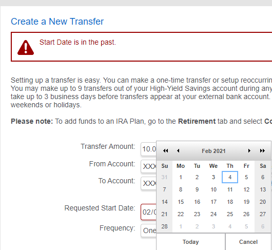
One of the most ridiculous implementations of a Calendar Picker is allowing an invalid date to be chosen. American Express® has a Personal Savings Account option that can transfer funds in and out of other accounts. Figure 1 is a portion of a screen shot when choosing a date in the past.
It’s nice that the error “Start Date is in the past” is shown, but why was it ever allowed in the first place?
Figure 2 is a portion of a screen shot of the American Express Credit Card Payment calendar. Unlike the Transfer Funds calendar (Figure 1), this calendar grays out the invalid dates. There’s no need to show an error message when a “Date is in the past” because there’s no way the user can select one. Perfect.
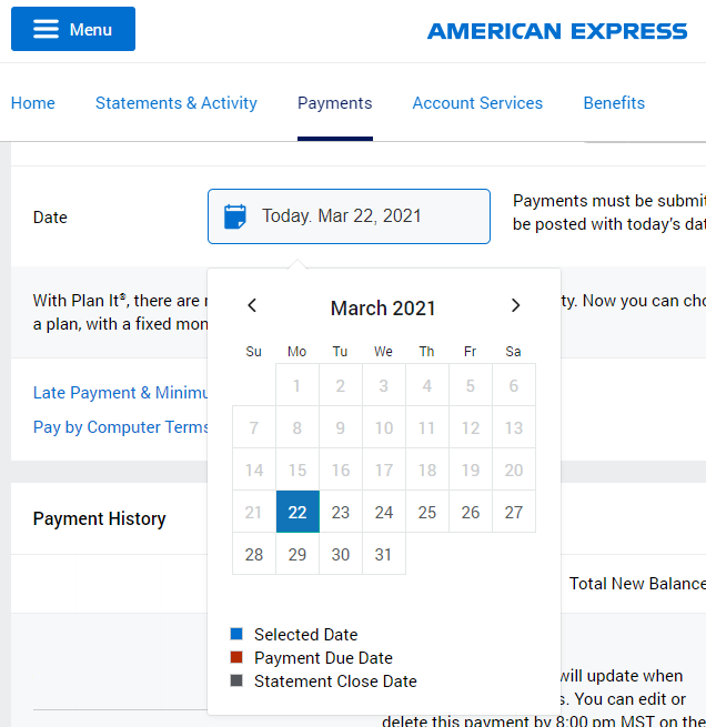
Even though these are from the same company on the same website, it’s clear that these are two different widgets. Why was time wasted coding two different versions of a calendar when the same one could have been used for both screens?
Here is a list of some of the differences between the calendars in Figures 1 and 2.
- Figure 1 grays the blocks for Saturdays and Sundays; this is likely simply to emphasize the weekends, as the dates are still allowed
- They both have grayed out the numbers of certain dates:
- Figure 1 for those not in the currently selected month, but can still be selected
- Figure 2 for invalid dates, that cannot be selected
- Figure 1 abbreviates the name of the month, but clicking through the months in Figure 2 showed the full name for each month
- Figure 1 includes options for Today and Cancel, but Figure 2 provides neither
- Figure 1 includes double arrows in addition to single arrows for movement, but Figure 2 does not
Regarding the last bullet point, I wasn’t sure what the double arrows were for until I clicked them and found that they increment/decrement the year. Of course in both Figures 1 and 2, the single arrows adjust the month. But note that the arrow icons themselves are different in the two implementations. Silly.
JUMPING ICONS
Figure 3 is a combination of portions of three screenshots from the Edit Goal panel in the Workday® web app. Depending on where the “Due Date” control appears on the panel, the calendar might appear upwards or downwards. The top two calendars show October and November 2021. I lined them up horizontally to show that when it displays upwards, the left and right arrow navigation jump around, depending on how many rows are in the display. The problem does not occur when the calendar appears below the control, as shown in the bottom portion of the Figure for December 2021.
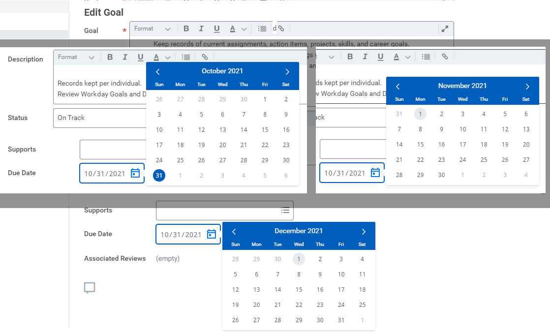
Figure 3 is a case where the user will likely be clicking the navigation arrows multiple times in quick succession.
That’s quite frustrating for the user when the icons jump around. An easy solution would be to add an extra row of blank space at the bottom for certain months in order to ensure that these navigation arrows are always in the same location when the calendar is displayed upward.
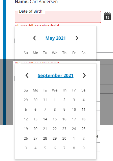
Figure 4 is a combination of portions of two screenshots from the MetLife® web site calendar. This is another example of jumping arrows. Because the control redraws for the name of the month, the arrow icons move back and forth depending on the length of the month name. This control would be much better if the arrows were always positioned at the same location relative to the sides of the calendar, so the user didn’t need to constantly adjust where to click.
UNCLEAR CONTROLS
As mentioned above, it was not clear to me what the double arrows in Figure 1 would do. The icons for double left  and double right
  are shown on either side of the current month. It wasn’t until I clicked them that I discovered that they incremented or decremented the year, whereas the single arrows would increment or decrement the month. Perhaps that should have been logical, but for me it wasn’t. If I had thought about it for longer, I probably would have figured that out. But that’s a big clue regarding a usable, friendly GUI: the user shouldn’t have to think about what is there.
GREAT IMPLEMENTATION
The web site for UCCU® (Universal Campus Credit Union) has a great implementation of a calendar picker.
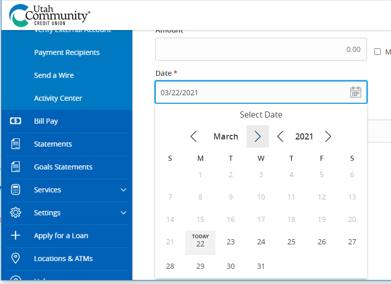
Figure 5 is a portion of a screen shot of that control. It incorporates all of the good ideas discussed above and avoids each of the difficulties. Here is a list of the great design features:
- Note that the calendar not only grays out the number for any invalid date, but it also includes the text “TODAY” on the current date
- If the control is near the bottom of the current screen, the window automatically scrolls, allowing the calendar to always display downward
- Instead of single and double arrows, it actually displays arrow icons on either side of the month and on either side of the year, making it very obvious (without thinking) what the arrows will do
- The placement of the arrows does not move when cycling through the months, regardless of a short month name (May) or a long month name (September)
Well done!
KEY DESIGN POINTS
- Don’t allow invalid dates to be selected. What a waste of time!
- Don’t let controls jump around when selected, especially when they are likely to be clicked multiple times in a row.
- Use the same calendar control throughout your product. Don’t make users learn more than one control.