For more than 15 years GUI applications have given users the option of clicking the label of a checkbox or radio button instead of clicking just the button itself. Browser-based GUIs did not provide that functionality early on, but in recent years it has become standard. So much so, that I’m still surprised when I find a GUI that does not have that implementation.
Most implementations are as minimal as the example above, where the only clue that the text Click this Label is clickable is the fact that the radio button highlights when the mouse cursor hovers over the text (there is no highlighting on the Mac® OS). Note that no highlighting occurs when hovering over the label for the second option No Clicking Here.
MINIMAL IMPLEMENTATIONS
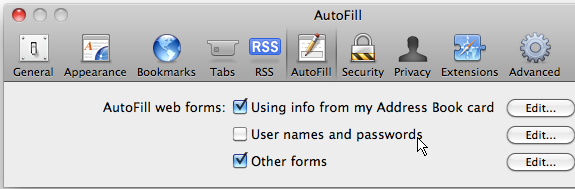
Here are several examples of implementations that could be much more helpful to the user. Figure 1 is a portion of a screen shot of the Safari® Preferences dialog on Mac® OS X.
It’s the standard on the Mac OS for checkbox and radio button labels to be clickable, but unfortunately it is also standard to show no evidence of this fact when the mouse hovers over the label. The mouse remains the arrow cursor as it hovers over checkboxes, radio buttons, and the labels themselves.
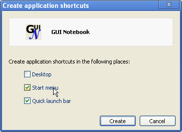
Figure 2 is a screen shot of the Create application shortcuts dialog found on the Tools menu in the Chrome® browser on Windows®. The graphic shows that the arrow cursor does not change when hovering over the checkbox labels, but the associated checkbox does highlight, indicating that clicking the label has the same effect as clicking the checkbox.
Figure 3 is the New Layer dialog from The GIMP® (The GNU Image Manipulation Program) on Windows. Like the Chrome dialog in Figure 2, this dialog highlights the control when the mouse hovers over its label, but no other indication is given that clicking the text is equivalent to clicking the button. This isn’t ideal, but it’s fairly standard, and it is certainly better than another dialog found in GIMP.
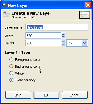
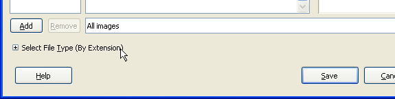
Figure 4 is a portion of a screen shot of the bottom part of the GIMP Save Image dialog on Windows. Near the bottom of the dialog is an icon with the label Select File Type (By Extension). Clicking either the  icon or the associated label will expand the area to allow for selecting from a list of file types. It’s great that the label is clickable, but unfortunate that the GUI gives no clue that it’s available. There is no change in the cursor, and neither the icon nor the label highlights on hover.
It seems quite shortsighted to provide a feature without making it clear to the user that the feature is available, as in Figures 1 and 4.
HELPFUL IMPLEMENTATIONS
A helpful implementation is one that gives clues that the option exists. Figure 5 is a portion of a screen shot from the American Express® Log In panel found at americanexpress.com.
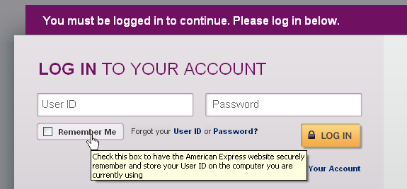
Not only does the cursor change from arrow to pointer, but there is also a very descriptive tooltip. It probably should also highlight the checkbox, but all things considered, this implementation is very nice.
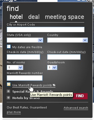
Figure 6 is a portion of a screen shot from the Marriott® Find Hotel panel found at www.marriott.com. Hovering over the checkbox label Use Marriott Rewards points results in the cursor changing to a pointer, the checkbox being highlighted, and also a tooltip being shown. The tooltip text itself is not helpful because it simply repeats the label text, however, the fact that a tooltip exists makes it clear to the user that the label is clickable. (For a discussion about what makes a good tooltip see Tooltips — GUI Design.)
Note that the Marriott implementation is a little quirky because clicking the Use Marriott Rewards points label also pops up an information window about the option itself, and clicking the label when the checkbox is already checked will not uncheck it, but rather just pop up another information window (yes, multiple will open if the previous was not closed first). The user must click the actual control to remove the check. I cannot figure out why they decided to have it only ever check the box instead of toggle it; perhaps they are trying to promote this option.
MISSING IMPLEMENTATION
I mentioned at the beginning of this article that I am surprised when I find GUIs that still do not allow the user to click a label to access the control. Here are a couple of examples from prominent web sites that are missing this feature.
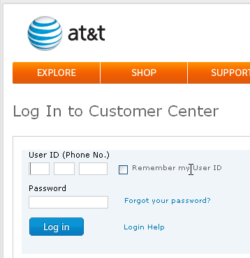
Figure 7 is a portion of a screen shot of the AT&T® web site Customer Center found at att.com. Notice that the mouse cursor changes to “text select” when hovering over the label for the Remember my User ID checkbox.
Figure 8 is a portion of a screen shot of the Verizon Wireless® web site at verizon.com. (I have edited the image to merge the left side of the panel with the drop-down menu at the upper right.)
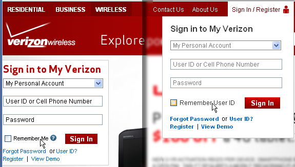
There are two locations available to Sign in on this panel. The upper right menu has the standard minimal implementation, which is indicated by highlighting the checkbox for Remember User ID when the mouse hovers over the checkbox label. The cursor does not change. Unfortunately, the checkbox label for Remember Me at the left side of the panel is not clickable. The mouse cursor does not change on hover, nor does the checkbox get highlighted.
It’s not unusual to find inconsistencies within a GUI, but to find an inconsistency within a single panel is a blatant error, especially when that panel is the doorway to the rest of the site. And not only is the feature itself inconsistent, but even the text is different between the two controls that apparently do the exact same thing (“Remember Me” vs. “Remember User ID”).
It’s funny that these two web sites for “communication” companies both have the same problem.
BEST IMPLEMENTATIONS
This feature really ought to be better than it is. Clicking the label of a control is a great feature for quick access and yet many users are unaware of it because even those GUIs that implement it often don’t make it obvious that it’s there. It’s time for that to change!
It is common to change the background color or text decoration (bold, underline, etc.) when hovering over a link or on a menu, so why don’t GUIs also do that for a checkbox or radio button label when it is clickable? Below are two examples of GUIs that are starting to move in that direction.
Figure 9 is a portion of a screen shot of the Privacy Settings for a Facebook® account at facebook.com.
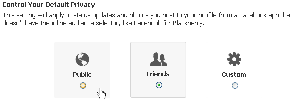
The radio buttons for the three Control Your Default Privacy options have both icons and labels associated with them. The selected option not only has the standard dot in the radio button, but also adds a background color and border. Hovering in the area of one of the unselected options not only highlights the radio button, but it also slightly grays the background making it even more clear that the entire area is clickable (not just the label, icon, and control). Nicely done.
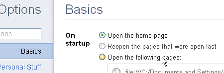
Figure 10 is a portion of a screen shot of the Chrome Options panel. There are three radio buttons in the Basics area. Notice that the text of the second option is actually slightly gray in color because it is not selected. The same was true for the third option before the mouse hovered there. When hovering over the label, the text changes to black and the radio control is highlighted, both of which indicate that the label is clickable. It would be a better implementation if the color difference were more obvious and/or the background changed color as with the Facebook example, but in general this is an improvement over the standard implementation and is certainly moving in the right direction. Quite well done.
KEY DESIGN POINTS
- Labels for checkboxes and radio buttons should always be clickable. (Other controls should have clickable labels also, when it makes sense.)
- At least be consistent within your own GUI! If the feature is implemented in some places, then there is no excuse not to have it implemented everywhere.
- Give clues that the option exists; highlighting the button is a minimum, but tooltips, highlighted text, and background colors are even better.