It’s difficult enough for users to try to understand a new application without confusing them with inconsistent terminology. One of the recommendations made by Jeff Johnson in his book GUI Bloopers 2.0 is that every project should have a lexicon. This lexicon is a complete list of terminology that will be used throughout the GUI and documentation.
I thought this was a good idea long before I read it in Johnson’s book and appreciated his treatment of the subject. Not having a lexicon that defines what will and will not be used can lead to two problems:
- More than one term may be used to describe the same concept.
- Some terms may be used for more than one concept.
EXAMPLE: DELETE OR REMOVE?
(black & white reproduction)
The terms Delete and Remove can reasonably used interchangeably in written and spoken English, so does it make any difference in a GUI?
Novell® GroupWise® uses both Delete and Remove. Most Novell products have both, because these products make a distinction between:
- Eliminating an element that will no longer be available (delete), and
- Taking an item out of a list or group, but that will still be available (remove).
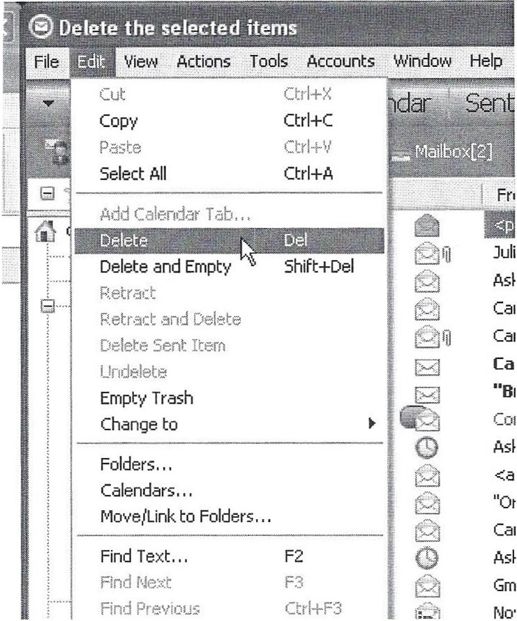
Figure 1 is a portion of a screen shot of the Edit menu. Note the Delete option highlighted on the Edit menu. The Delete is available when one or more items in the list are selected.
Figure 2 is a screen shot of the Accounts dialog in the same application. It is currently displaying the News options.

(black & white reproduction)
This dialog uses the term Remove on the button because the selected News server is being taken out of this list, but the actual server itself is not being changed or eliminated in any way; it can be re-added to the list at any time. I showed this example because the distinction is a little more subtle here than in most cases.

(black & white reproduction)
Unfortunately, there is an error which could still lead to confusion. When the Remove button is selected, the dialog shown in Figure 3 is displayed. Note that the term Delete is used both in the title bar of the popup as well as in the text. Anyone aware of the normal usage of (and distinction between) Delete and Remove may think twice before being confident that the correct action is taking place.
But what about an application that does not have the two separate concepts? Would it matter if Delete was used in some cases and Remove was used elsewhere? Other than perhaps causing a little more expense in language translation, does it make a difference?
(black & white reproduction)
Yes, it does. Why would you want to potentially cause a user to wonder if there is a difference? Some may not notice, but others will. Then they may spend time trying to decide if there is a difference, or simply conclude that the application is sloppy and unprofessional. Either way, that’s not what you want for your users.
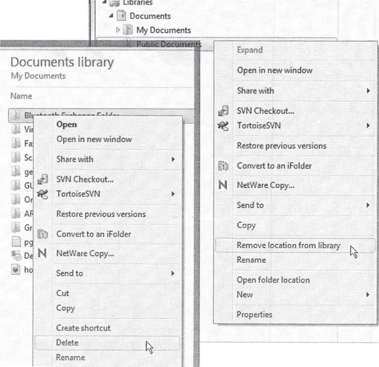
Microsoft® Windows® 7 file Explorer uses the same distinction between these terms. Figure 4 includes portions of two screen shots with menus showing both Delete and Remove as options. The term Delete is used when eliminating selected Files or Folders completely, while Remove is displayed when a location can be taken out of a library.
EXAMPLE: SIGN/LOG IN/OUT/OFF

(black & white reproduction)
It is a little amazing how many different expressions there are for the same concept of authenticating and then ending the session. It only took a few minutes to find several web sites that were inconsistent within their own GUIs in this regard.
Figure 5 includes portions of screen shots from the web site for The Home Depot®, which uses the expressions Sign On (upper and lower images), Log Out (inset center), and you are now signed out (lower image).
Of course “Sign On” and “signed out” are consistent with each other, but where did “Log Out” come from?

(black & white reproduction)
Figure 6 is a combination of portions of screen shots from the Best Buy® web site. This site uses the expressions Sign In (upper and lower images), Sign out (center image), and both Signed Off and Sign Off (lower image).
Well, “Sign In” and “Sign out” are consistent, but where did “Signed Off” and “Successful Sign Off” come from? These messages should both use “Out” instead, because that’s the text on the selected button. Incidentally, the word “out” in the center image should also be capitalized for consistency.
Additionally, it is interesting to note that the links for Contact Us and Privacy/Security (along the top of each panel) switch positions in the center image. Is this deliberate or just sloppy? If it’s deliberate, then for what purpose?
Figure 7 contains portions of several screen shots from State Farm® web site, which uses the following expressions:
- Link text: Account Login (top image), Log Out (center right image)
- Button text: Log In (top and left center images), Login (bottom image)
- Other text: Login (top image: drop-down area label), Secure Login (left center image), You are now logged off… (bottom image: message), Log In To Your Account… (bottom image: area label)

(black & white reproduction)
After seeing the upper and left center images, the expressions “Login” and “Log In” might seem to be making a distinction between the description and the action. But then the text on the bottom image swaps the usage: the label Log In To Your Account describes the action and the button text Login is inconsistent with the text Log In on the first two displays (upper and left center).
The only conclusion from the displays in Figures 5, 6, and 7 is carelessness. Fortunately, this feature is common enough that most users won’t be tripped up by it, but I believe it’s a strong indication of what will be found when a user dives deeper. Features that are far less common and/or unique to particular sites will most likely be confusing and frustrating for users if the same carelessness exists.
Further evidence of this is actually found on the screen shots already displayed in Figure 7. Three different check box controls use the expressions Save User ID (top), Remember My User ID (left center), and Remember me (bottom), all to do apparently the same thing.
When a user is trying to use or figure out a feature for the first time, then multiple expressions for the same concept forces users to concentrate harder than should be needed as they attempt to determine what the variation might indicate.
EXAMPLE: NOUN OR VERB?
One of the easiest ways to confuse users is to group items together that mix the nouns and verbs. English can be difficult because so many words (and terms) can be either, so the grouping is important to help with the interpretation.
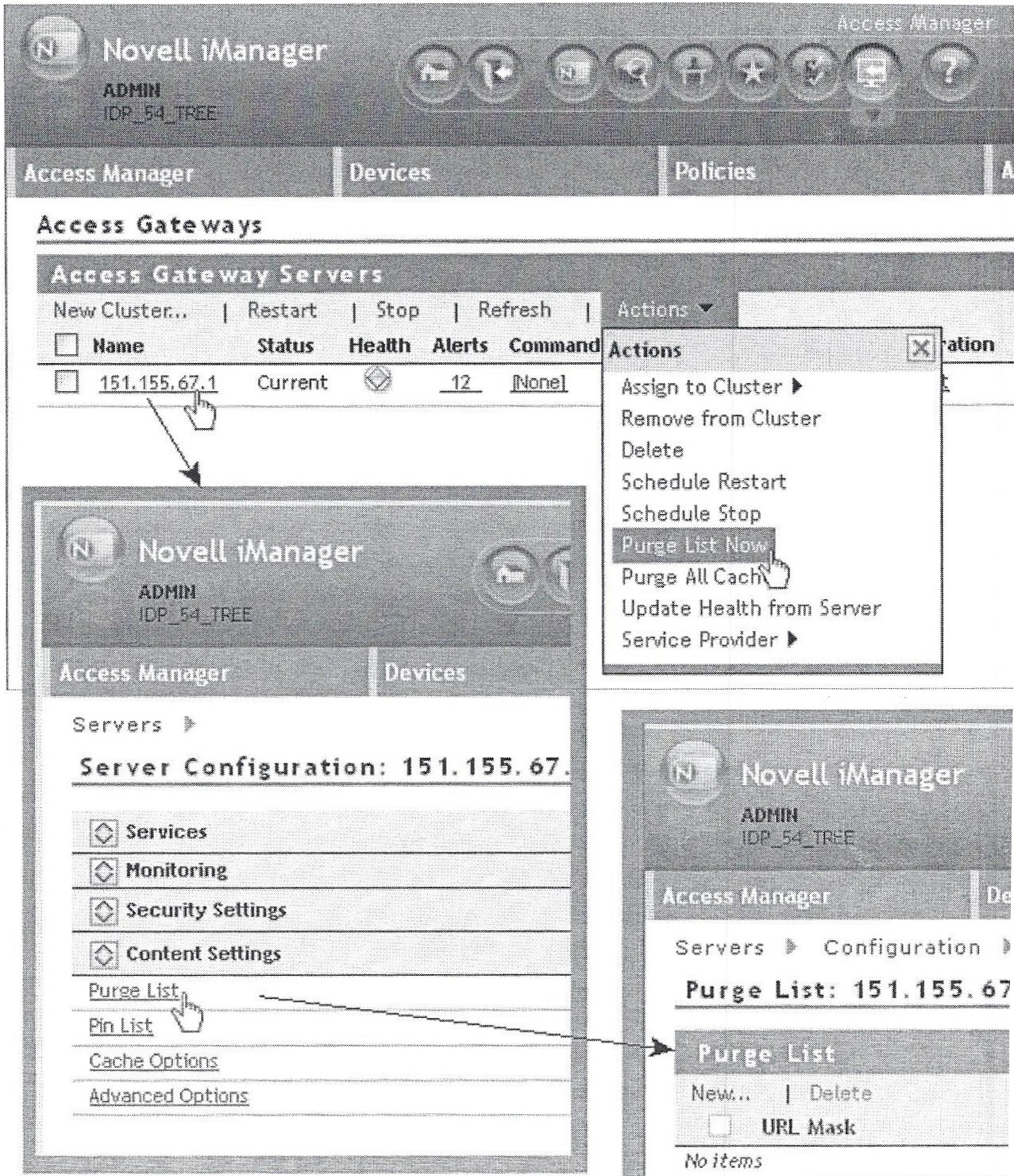
Figure 8 includes portions of several screen shots from Novell Access Manager® that I helped to design almost a decade ago (Access Manager is a plug-in to the Novell iManager® console).
(black & white reproduction)
The upper image shows the Actions menu of a table that includes a list of expressions that are only verbs, including the items on the pop-out menu (not shown) of the last item, Service Provider. It’s logical that a menu of “Actions” would contain only verbs. The lower left image is a panel that is invoked when a particular server on the previous panel is selected. Note that there is a group of configuration items that are all nouns.
The most interesting part of this example is the fact that some of the nouns could be mistakenly interpreted as verbs, which is why the grouping is so important. The Purge List item in the lower left could be confused with the Purge List Now action at the upper right. Gratefully, the lexicon ensured that the word “Now” was included to help distinguish between the two, instead of using the exact same expression for two different concepts. Looking at these panels out of context makes it easier to see that the lower left panel probably could have been improved with a more descriptive expression such as “List of Items to Purge” or something similar. A more careful analysis of the lexicon might have resulted in this type of change.
KEY DESIGN POINTS
- Create a lexicon of all expressions that will be used throughout your GUI and carefully analyze similarities.
- Never mix nouns and verbs in the same group of items.
- Don’t use more than one expression for the same concept, and don’t use the same expression for more than one concept.