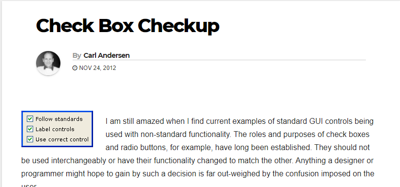
Check Box Checkup — GUI Design
I generally like to look at the way history may have influenced design decisions, so I took a look back…
Notes on user-centered UI/UX design
I generally like to look at the way history may have influenced design decisions, so I took a look back…

Don’t make secondary buttons look disabled. Don’t break up groupings (unless a certain button chosen by mistake would be very…
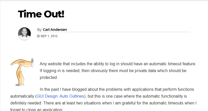
Always have an automatic timeout on any site that gives the option to log in. Give a warning before automatically…

Error messages need to mean something to the average user; don’t use tech talk. Error messages should be inline; don’t…
Mobile apps are especially good at showing a standard spinner or some other indication that data for a list are…

Buttons are normally used for actions, while links are normally used for launching web pages. Menus and tables have their…
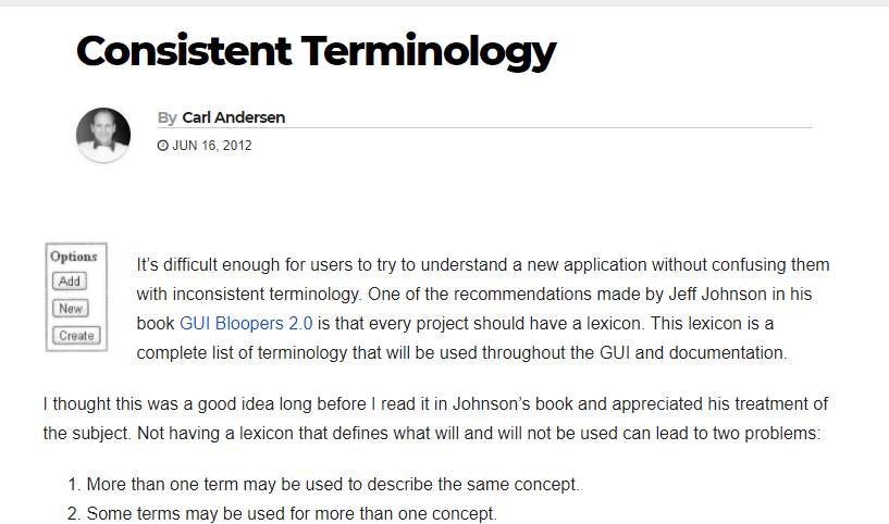
It’s difficult enough for users to try to understand a new application without confusing them with inconsistent terminology. One of…
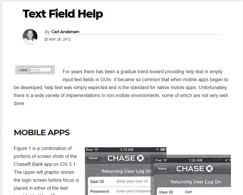
Most empty text fields can benefit from help text. Users expect help text to not interfere with the text field…
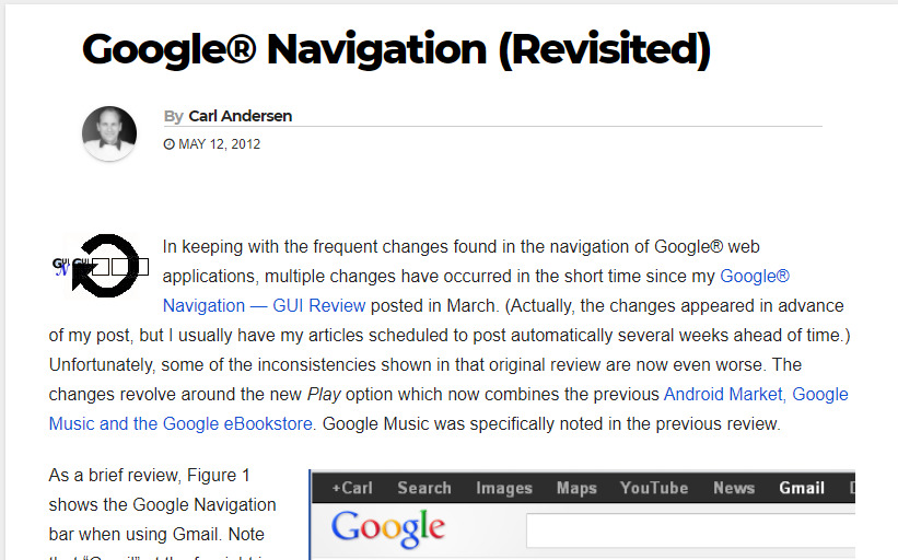
In keeping with the frequent changes found in the navigation of Google® web applications, multiple changes have occurred in the…
Gmail is constantly being updated with new features, and I’m sure this is part of their strategy to get attention…