The last time I reviewed the WordPress® GUI there was only one remaining major complaint on my list.
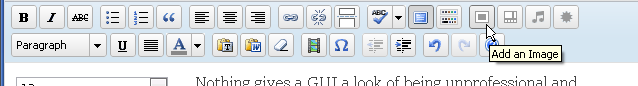
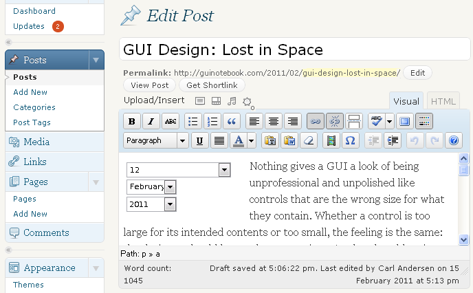
Figure 1 is a screen shot of the Edit Post panel of WordPress 3.0. The display includes multiple rows of icons; some are common and familiar, but many are not. When switching from this display to the fullscreen mode, the left side navigation goes away and the four Upload/Insert icons get moved to the end of the row of icons just below (see the Add an Image tooltip in Figure 2).
with Add Block Dropdown Selected
My previous complaint was the fact that the lack of text with these icons meant that when I was first learning this interface I repeatedly needed to rely on mouse hover tooltips as I was trying to find what I was looking for.
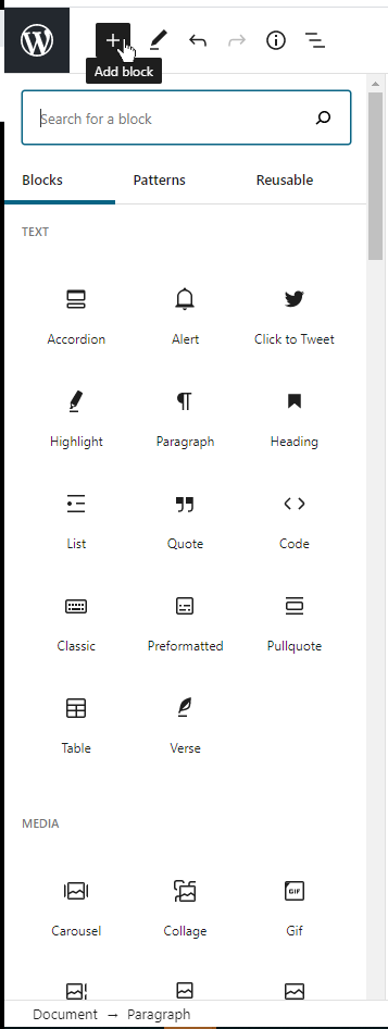
Fast forward to 2020. Figure 3 is the left portion of a screenshot of WordPress 5.6 Edit panel with the Add block dropdown menu displayed. Many options have been added. Gratefully the designers had the sense not to keep adding more and more icons to the display in Figures 1 and 2. Instead, the options are now shown when the  icon is selected in the upper left corner of the display. (Note that the icon is blue before it’s selected, changing to black when the menu is displayed.)
The best part about this display is that fact that the GUI now provides text along with the icons, so that users can find what they are looking for in the way that works best for them, whether that be icon or text. Most users are much quicker with icons, but only if the images are well known and/or unambiguous. See Icons or Text? — GUI Design. That takes care of the last major problem in my previous review.  Good.
Good.
Of course it would be better if the user had the option to choose icon, text, or both, but having both is always the correct default. One reason it would be nice to select one or the other is the huge amount of space that is used by this display. Notice the long vertical scroll bar along the right side of Figure 3. If the user repeatedly needs to access controls in the lower 80% of the Add block dropdown, then the repeated scrolling can become annoying — and time consuming. Also, it would be nice to have the option of leaving the Add block options constantly visible when desired. Sometimes I’m just typing and like to have a clean, uncluttered display. But on other occasions I’m doing a lot of editing with controls and would much prefer not to need to click and scroll each time I want to access something from this long list.
NAVIGATION
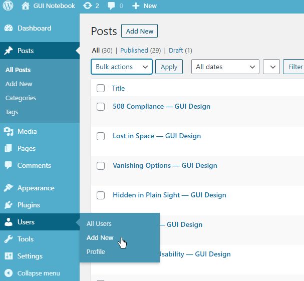
I was positive in my previous review of the WordPress navigation, and it’s improved somewhat in the current version. Figure 4 is a screen shot of the left side navigation options. The part that I like better is the fact that the background of the content area now has pointer indicating the current navigation location (see the Posts option with the darker blue background). This is much easier to interpret than the previous incarnation (Figure 1) that had the pointer on the left side of the navigation area and the content area had no direct attachment to the current selection.
Hovering over other navigation options highlights the option and also pops out any associated submenu items. See Users in Figure 4. Unfortunately, hovering over submenu options isn’t nearly as clear. The Add New option is currently under the mouse cursor and text displays only slightly brighter/thicker than the other options; in fact it’s barely noticeable.
CONSISTENCY
Consistency increases readability, understanding, and polish in a GUI.
I mentioned some good things about the Add block option in Figure 3, but let’s now take a look at consistency with capitalization. GUIs used to be almost exclusively displayed with Title Capitalization, but for many years now most have switched to Sentence Capitalization (see CAPITAL Idea — GUI Design). Notice that Add block uses Sentence Capitalization. Everything in this editor is built around blocks and since “Blocks” is the title of one of the types that can be added, it would be understandable if “Add Block” used Title Capitalization. (Because “Block” might be considered a named element.) I mention this because of my efforts to understand why certain words in the GUI are capitalized and others are not.
Figure 5 is a screen shot of the WordPress 5.6 Posts panel with my arrows and notes superimposed to show inconsistencies.
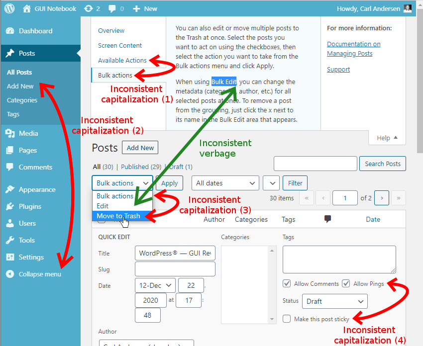
The four curved, red arrows in Figure 5 highlight areas with inconsistent capitalization.
- Help sections
- Title caps: Screen Content, and Available Actions
- Sentence caps: Bulk actions
- The sloppiness is blatant with the two “actions” right next to each other. (These “actions” are really two different things, but the subtlety will be lost on most users: Bulk actions is a menu title for options when multiple posts are selected, whereas the Available Actions are the options which are displayed when the mouse hovers over a single post.)
- Left navigation
- Title caps: All Posts and Add New
- Sentence caps: Collapse menu
- Posts might be a named element (therefore requiring capitalization), but Add New and Collapse menu are both actions, so why are they different from each other? Perhaps because Add New is really short for Add New Post? Hhm.
- Bulk actions menu
- Title caps: Move to Trash
- Sentence caps: Bulk actions
- At least the menu title is consistent with the help section above that refers to it.
- Checkbox labels
- Title caps: Allow Comments and Allow Pings
- Sentence caps: Make this post sticky
- All three are actions; so then are Comments and Pings considered named elements? Then what about post in the last one?
The only explanation is sloppiness. Sad, because so much else here has been done well.
There is a bit of good news: under the Add block menu (that actually lets you add Blocks, Patterns, and Reusable Blocks), I found about 100 options, all of which use Title Capitalization. (See Figure 3.) That’s extremely consistent! Thanks for that one.
There’s one more capitalization inconsistency in Figure 4 that I have highlighted with the straight, green arrow. The term Bulk Edit is used in the help section, but it’s referring to the Edit option on the Bulk actions menu. This is the type of inconsistency that can easily confuse and frustrate a new user. The help text really should be written as “Bulk actions | Edit” or something similar.
KEYBOARD ACCESS
A mouse or trackpad is standard for most users. But not all of the time. And not for everyone. This is often out of the user’s control, so why would you deliberately limit what they can do? For me, one of the most telling features of a GUI’s completeness is the level of keyboard access. Low budget products just don’t take the time to help out this subset of potential users.
Here is a summary of what I found while trying to use the WordPress 5.6 GUI via keyboard only.
- From anywhere in the GUI
- [Tab] or [Shift]+[Tab] – Moves thru the top-level options.
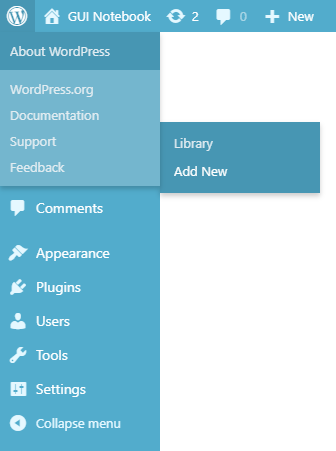
 WordPress menu from main panel (upper left of Figure 6)
- [Enter] – Selects the option and displays the WordPress dropdown menu.
- [Left/Right] arrows – Nothing.
 Some of the menu options on this dropdown popout to the right, so that would be a logical use for these keys.
 - [Up/Down] arrows – Scroll the content area, regardless of current focus on the menu. Hhm.
- [Space] or [Shift]+[Space] – Pages up/down thru the content area, again irrespective of the current menu focus.
- [Tab] or [Shift]+[Tab] – Increments each of the menu and submenu items. I’m required to [Tab] thru every submenu option before moving to the next top-level menu item. Not nice. Again, if the [Left/Right] arrows were used for this, navigation could be much quicker. What’s even worse, as seen in Figure 6, there’s a bug where the top level dropdown options (About WordPress, WordPress.org, etc.) stay visible so the menu option behind it that actually has the focus is hidden. The popup with Library, and Add New options (to the right in Figure 6) actually belong to the hidden Media option.
- [Enter] – Selects the current option. (Even if you can’t see it!)
- [Left/Right] arrows – Nothing.
- [Space bar] – Nothing. Ugh. Should be the same as [Enter].
- [Enter] – Selects the option and displays the WordPress dropdown menu.
 WordPress icon on Edit Post panel (upper left of Figure 2) or the Edit Page panel (not shown)
- [Enter] – Selects the option and displays the WordPress All Posts option (see Figure 4).
- So it’s like moving up a level in the navigation and then everything acts as described above. This icon reminds me of a breadcrumb trail. I can find no other panels that behave this way. (But this is a different type of inconsistency.)
- Add block menu (Figure 3)
- [Tab] or [Shift]+[Tab] – Moves thru the GUI to the upper left menu options.
- [Left/Right] arrows – Move left/right between this icon and the other five to the right, including wrapping at each end. Nice.
- [Up/Down] arrows – Do nothing.
- [Enter] or [Space bar] – Expands the Add block menu.
- [Left/Right] arrows – Move left/right including to the previous or next row when reaching the end or beginning of a row. Perfect.
- [Up/Down] arrows – Identical to Left/Right arrows. Why? This makes them useless. It also means I have to hit three times as many arrow keys to get back and forth between rows. (This functionality would probably make sense for the previous level, because there are no up/down options.)
- [Tab] or [Shift]+[Tab] – Jump between sections. Good.
- [Space] or [Enter] – Select and insert item. Also closes the menu. Good.
- [Left/Right] arrows – Move left/right including to the previous or next row when reaching the end or beginning of a row.
- [Esc] – Closes the menu (if nothing was selected first).
- Media Library panel (whether accessed from Figure 4 navigation or through Figure 3 Add block option)
- Left/Right arrows – Move left/right including to the previous or next row when reaching the end or beginning of a row. Identical to Add block (above).
- Up/Down arrows – Move up & down! Yay!
- [Space] or [Enter]- Toggle highlight and then do nothing. Wait. On the Add block display, these keys will select and use the selection. Why didn’t that happen here also?
- [Tab] or [Shift]+[Tab] – Identical to Left/Right arrows. What? Why? I’ve highlighted the image I want and now I need to hit the Select button at the bottom right of the screen, so how do I get there?? Ugh.
- There is no way I can find to use the keyboard to actually use the selected image(s). Worse than useless. Very frustrating.
- Left/Right arrows – Move left/right including to the previous or next row when reaching the end or beginning of a row.
Designers: please take the mouse away from your testers once in a while and listen to their feedback.
SWITCHING MODES
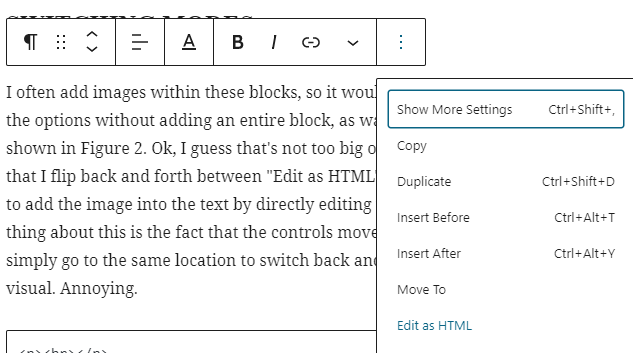
I often add images within these blocks, so it would be nice to have that in the options without adding an entire block, as was previously available as shown in Figure 2. Ok, I guess that’s not too big of a deal. That just means that I flip back and forth between Edit as HTML and Edit visually modes to add the image into the text by directly editing the HTML. The annoying thing about this is the fact that the controls move around, so I cannot simply go to the same location to switch back and forth between HTML and visual. (BTW, in the previous section I ignored the fact that there is no keyboard method to get to these context menus, though the keyboard can be used for navigation and selection once the menu is invoked.)
Figure 7 is a screen shot of the block editing options that appear at the top of a block when editing in visual mode. Note the  dropdown menu expanded at the right side, showing the Edit as HTML option.
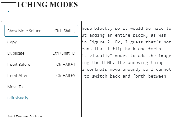
Figure 8 is a screen shot of the same block now in HTML mode with the dropdown menu at the left side as the only top-level editing option. I would prefer to have the dropdown menu at the left side in both cases, so that I can consistently go there as I switch back and forth. This was certainly much easier in previous versions. Notice the Visual and HTML tabs at the upper right in Figure 1. That was much more convenient.
Incidentally, after my diatribe above regarding capitalization you might have noticed that Edit visually (Figure 8) is the only menu option in either Figure 7 or Figure 8 that uses Sentence Capitalization, while all other multi-word options in those menus use Title Capitalization. (Well, not really even that. As prepositions would not be capitalized in a title, the options should really be Insert before, Insert after, and Move to. [Sigh.])
CONCLUSION
 This GUI was fantastic before, and has made good improvements. But it needs some attention to detail! I still give it a solid 4 out of 5 GNs. I’m quite pleased by the one improvement, though not everything about it is ideal. Oh, and of course I still use WordPress for multiple websites.