I do as much online as I possibly can these days. I won’t even consider having an account for anything anymore unless there is online access. This means that every single day I am logging in with a username and password to any number of web sites. I know many of you are the same way.
And by now most of us are well familiar with the “Remember Me” feature. This is intended to make it so that a user on a known, safe computer does not need to type in a username each time, but allow the browser’s cookies to store the username and automatically insert it into the correct location whenever the user browses to that login page. If you check the “Remember Me” box, your username will be remembered; don’t check it and it won’t. It’s a fine feature. Sometimes I use it, sometimes I don’t.
Recently, a web site that I frequent added the “Remember Me” feature. It makes me crazy.
The problem is that the new checkbox was added in between the username and password fields. But it’s not just physically in between, but also in the [TAB] order. That means that when I type <username> [TAB] <password> [ENTER], as I have been doing for years with this particular site, I get an annoying error asking me if I have forgotten my password. This is because the single [TAB] now takes me to the “Remember Me” checkbox instead of the password field where it used to take me. So I must try again. And they didn’t have the decency to just display an error on the existing panel without popping up a dialog, so I must dismiss the dialog before anything else and then type one more [TAB] to move from the new “Remember Me” checkbox to the password field before typing in my apparently “forgotten” password once again. What a pain.
I found four web sites where I log in regularly that have the “Remember Me” feature. Each has used a different implementation.
“Remember Me” Design
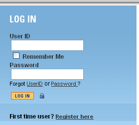
BAD “Remember Me” DESIGN
Figure 1 shows the new “Remember Me” checkbox in between the “User ID” and “Password” fields (from the web site described above). Since the only thing being remembered is the User ID, you could argue that it makes sense to put the checkbox here. The problem is that the [TAB] order is the same: User ID » Remember Me » Password. This means you must [TAB] past the checkbox to get to the password field.
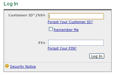
A LITTLE BETTER “Remember Me” DESIGN
“Remember Me” Design
Figure 2 shows the “Remember Me” features still located in between the “Customer ID” and “PIN” features, but the [TAB] order puts the checkbox at the end. It’s obvious from the layout that “Remember Me” goes with the first input field and then typing the typical <username> [TAB] <password> [ENTER] works just fine. This is definitely a little better than the first example. However, placing items out of order is not something I think should be done very often. There should be a flow to the controls and there is an expectation by users that [TAB] order will be consistent with the layout.
Here is the [TAB] order for Figure 2: Customer ID*/SSN » PIN » Log in » Forgot Your Customer ID » Remember Me » Forgot Your PIN » Security Notice. It’s a little strange as you [TAB] through it, but for most users it gets them to the three most important places first. Better.
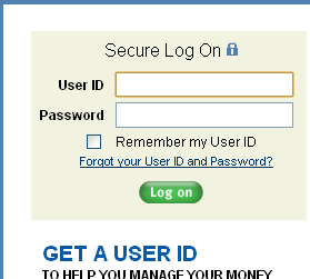
A LOT BETTER “Remember Me” DESIGN
“Remember Me” Design
Figure 3 shows another implementation of the concept with a “Remember my User ID”
checkbox below the password. I have no idea how long this feature has been here…because it never got in the way! If I want the feature, it’s easy to find. The text is helpful because it makes it clear that even though the checkbox is below the password field, the only thing being remembered is “my User ID.”
Also, the “Forgot your User ID and Password?” feature is below and out of the way. These features are not used by most users most of the time; it’s appropriate to have them easy to find, yet out of the way for most common situations. They also had the sense to realize that one link for both problems was sufficient, instead of cluttering up the login area with multiple links as shown in Illustrations 1 and 2. The only thing that would have made this better would have been to get all the unneeded controls below the [Log on] button.
“Remember Me” Design
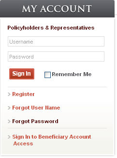
GREAT “Remember Me” DESIGN
Figure 4 shows a great implementation of the “Remember Me” feature. This designer got it right: the important features are all together and not cluttered by other controls, either in layout or in [TAB] order. All the other controls (that are needed far less often) are down below where they are easy to find when required, but out of the way as appropriate for most situations.
Well done!
KEY DESIGN POINTS
- Don’t make users deal with items out of logical order, either visually or sequentially.
- Don’t clutter up the display with every possible option.
- Don’t ever insert a new control in a way that disrupts a user’s accustomed operations.
Spot on. You would think that people would have enough experience with something that is as common as a Log On dialog not to make these mistakes. I also find it annoying when you make a mistake on a log on screen and they give you a pop up message or window to tell you that something was incorrect. I think I suffer from window-phobia. I am already taking up my ENTIRE screen with one of your windows (even if it is only 13 in.), just tell me what I need to know there! Maybe you could outline whatever was incorrect in red and/or add one word next to the input box like . . . “incorrect”. I like how when you log on a mac computer and you enter your password wrong, the windows just give a little shudder and lets you try again, it feels a little like the bumper bowling of log on screens. “Boing! try again.”
LOL. I like the bumper bowling analogy!
The other thing I like about the Mac login is I can hit [Enter] from the username field and it just takes me to the password field if there’s nothing there yet. Hitting [Enter] after typing the password then attempts the login. Thanks.
Another thing I find excellent about some log in sites is that they remind you when your ALL CAPS is on. This saves me from using up my 3 tries at a password BEFORE I use them up thinking I am just too tired first thing in the morning to type correctly. Now that I have experienced sites with and without this feature I think EVERY site should include this function, especially at companies with very tight security. It will save a lot of phone calls to the help desk and a lot of frustrations at the work place for more appropriate issues like “why does the coke machine steal my money with no way to contact anyone?”…. you know important stuff. Great articles overall, thanks.
lol. Thanks.
[…] first post I ever made for this blog (Remember Me?) was inspired by a frustrating web site form. Such is the case with this post. In an attempt to be […]
[…] Auto Advance – GUI Notebook on Remember Me? — GUI Design […]
[…] very first article I posted for this blog was entitled Remember Me? — GUI Design in reference to a web site that inserted a new Remember Me? control into the login of their web […]