More vs. Less
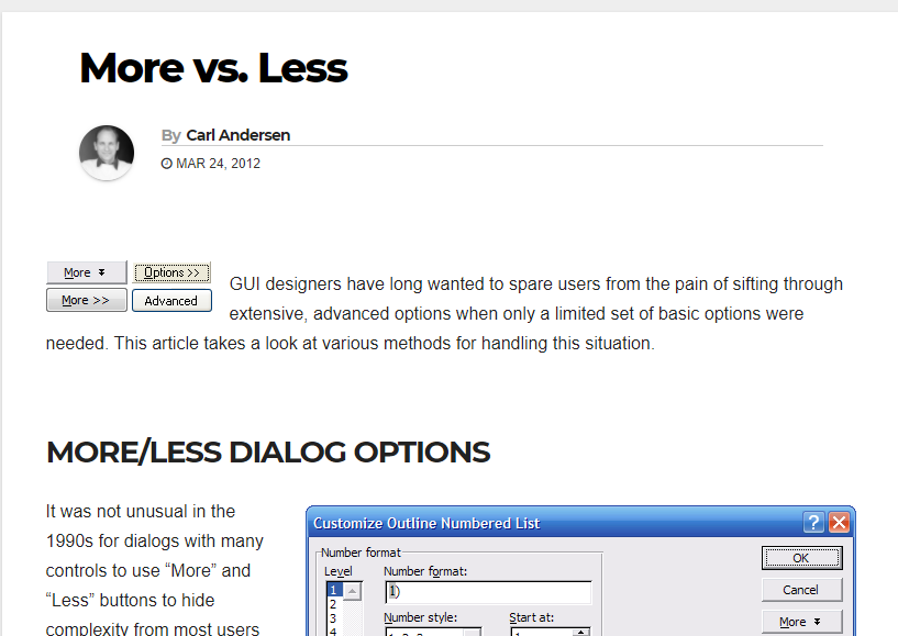
Make sure your method for hiding/showing complexity is clear enough that it doesn’t frustrate the user who cannot find the…
Notes on user-centered UI/UX design
Make sure your method for hiding/showing complexity is clear enough that it doesn’t frustrate the user who cannot find the…
Google is constantly changing the way it displays the current option in its navigation bar. Following are a series of…
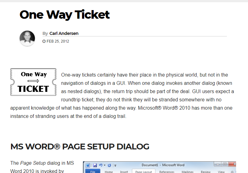
One-way tickets certainly have their place in the physical world, but not in the navigation of dialogs in a GUI.…
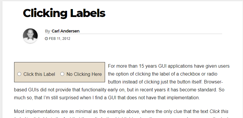
Labels for checkboxes and radio buttons should always be clickable. (Other controls should have clickable labels also, when it makes…
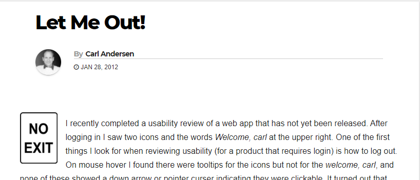
Some weeks ago I received an e-mail from a GUI Notebook reader who was frustrated trying to figure out how…
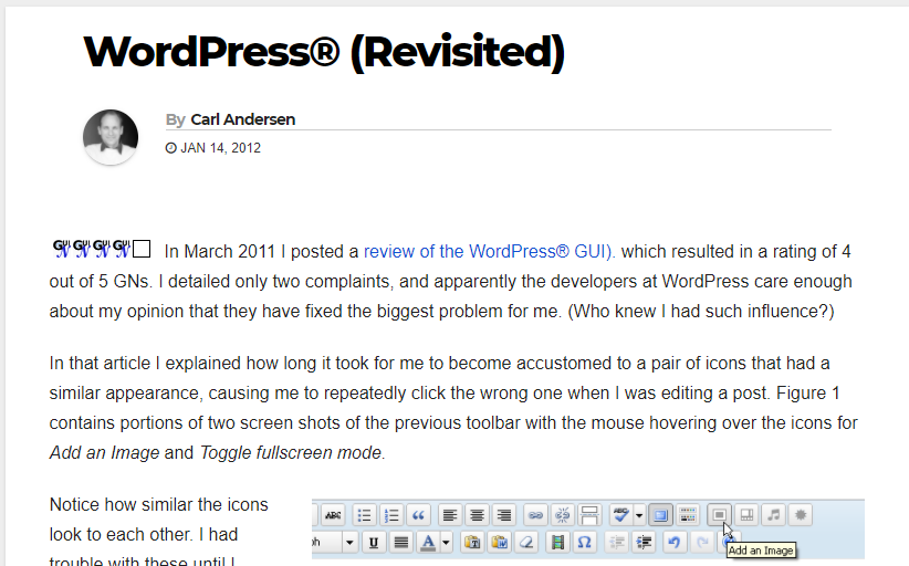
This GUI is fantastic. I still give it a solid 4 out of 5 GNs. I’m quite pleased by the…
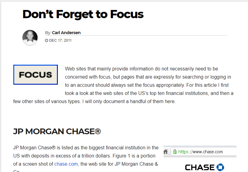
Every display in your GUI should have the focus specifically set. Set the focus at the most likely control that…
It’s great that Google is willing to keep making improvements. Of the twenty problems with the previous GUI that were…
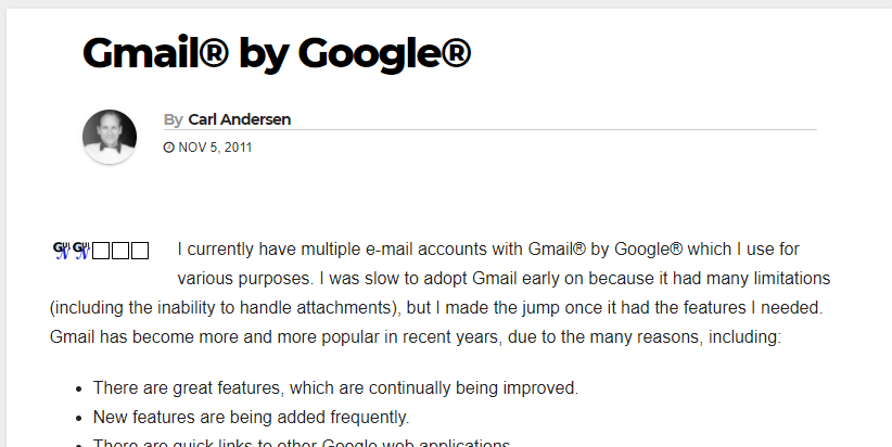
There are only two navigation options in Gmail: Mail and Contacts. Everything else is either 1) a filter or option…
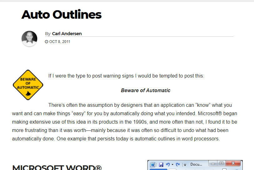
Beware of Automatic! If you’re doing something automatically for the user, then you’d better make it easy for them to…