The first post I ever made for this blog (Remember Me? — GUI Design) was inspired by a frustrating web site form. Such is the case with this post. In an attempt to be “smart” and “helpful” some web forms automatically advance from one numeric text field to the next when the correct number of digits have been entered. The frustration comes when an error needs to be corrected. Errors are of two types:
- Incorrect data was entered.
- The focus ends up in the wrong text field because automatic advance happened unexpectedly.
PERSONAL INFORMATION FORMS
Figure 1 is a portion of a screen shot from a form that I was filling out as I was opening a new account. (For the purposes of this screen shot, I simply entered digits in numerical order until the form automatically advanced to the next field.)
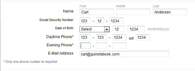
I had two problems when I was filling out this form. First, when entering my name, it was necessary to press [Tab] to move to the next field, so I naturally did the same thing as I started entering my Social Security Number. Unfortunately, because the form automatically advanced the focus after I entered the first three digits, my next digits ended up in the third segment instead of the second. I had to hit [Shift]+[Tab] to correct the error.
On this form the automatic advances occur for each segment of the Social Security Number, the Date of Birth Day (if two digits are entered) and Year, and each segment of the Datetime Phone and Evening Phone numbers. Once I figured out that the form was advancing automatically, everything was fine until I made an error. Partway through one of the phone number entries, I decided to use a different number. When I hit [Shift]+[Tab] to go back the previous field, the focus immediately advanced again, because it detected that I already had the correct number of digits. It felt like a game show where I knew I had given the wrong answer, but was not allowed to correct it! Someone wasn’t thinking too carefully when they designed this form.
I tried two or three times to hit [Shift]+[Tab] followed as quickly as possible by [Delete] before I managed to clear the previous field and the caret remained in place, allowing me to enter a new value. This couldn’t possibly be what was really intended, could it? If had been working on a laptop with a trackpad I probably would have tried that sooner, but since I was entering data using a standard keyboard, the thought did not initially occur to me to reach for my mouse. After a moment I finally clicked into a field that already had the maximum number of digits and found (to my relief) that the caret remained where I had clicked and I could then use the [Delete] or [Backspace] keys to edit the current value. Yeah, that works, but it’s poor usability to require your user to move from the keyboard to the mouse when they really should not need to.
(This form has a couple of other usability problems, too, that aren’t related to the current topic, but are nonetheless worth mentioning. First, the phone extension is assumed to be a maximum of four digits. Bad assumption: five-digit extensions are not uncommon. And second, asterisks are used on the Daytime Phone and Evening Phone labels for the footnote stating Only one phone number is required. Using an asterisk for a footnote is certainly appropriate in some settings, but on a web form an asterisk nearly always indicates a required input field, which means the impression given in this case is quite different from the reality.)
I started digging around on other sites that required similar information. Most forms I came across didn’t have any automatic advancing, which avoided the frustration I encountered, but most also didn’t even bother to keep me from entering a 25-digit zip code or phone number, either. (At least the first designers made an attempt to be helpful in that regard.)
MOBILE ALERTS FORMS
I found various web sites where users could register phone numbers for Mobile Alerts and which had varying implementations of automatic advance. I have included links to these web sites for your investigation. (As an aside, I don’t understand why these forms even exist. It’s much better practice to sign up for a text message alert by simply sending a text message from the device in question, thus guaranteeing that the holder of the device intends to receive messages. Otherwise, any random phone number, or a wrong phone number, could be entered.)
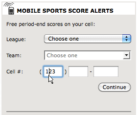
Figure 2 is a portion of a screen shot of a Mobile Alerts form found at courant.com®. This form is similar to the first in that:
- The focus automatically advances to the next field when the correct number of digits is detected.
- Pressing [Shift]+[Tab] returns to the previous text field, but immediately advances again when the correct number of digits is detected.
- Clicking into the field leaves the caret there, but only the [Delete] or [Backspace] keys may be used, because any other key (including arrow keys) result in an immediate advance to the next field.
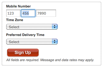
Figure 3 is a portion of a screen shot of a Text Alerts form found at Target.com®. It has the same functionality as the form in Figure 2 with one improvement: [Shift]+[Tab] actually highlights the entry in the previous text field and leaves the focus there! Much better! It does have the same problem that if any key other than [Delete] or [Backspace] is pressed, then it advances again, but hey, at least we can use the keyboard to easily get back there.
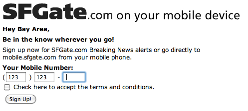
Figure 4 is a portion of a screen shot from the sfgate.com® Mobile Alerts form. This form, like the previous one, highlights the entry in the previous text field when [Shift]+[Tab] is pressed, but has the additional feature of allowing the arrow keys to function without advancing while in a text field that has the maximum number of digits. Of course, this also works if the focus was moved to the text field by clicking. Very, very nice.
THE NATURAL IMPLEMENTATION
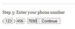
Figure 5 shows a portion of the mobile alerts form of the local Dallas-Fort Worth web site for NBC.com®. (All the NBC® web sites appear to use this same form for mobile alerts.) Of all the forms I found, this one has the most natural implementation: the [Backspace] key actually moves from one text field to the previous text field. The reason this is the most natural is because if the digits were typed without tabbing or clicking to get to the next segment of the number, then the [Backspace] key should delete those same digits without any extra key strokes or mouse clicks; it shouldn’t matter how the form is arranged. However, this form does have the same problem as the first two forms when [Shift]+[Tab] is pressed (immediately advancing again, instead of highlighting and remaining in place). Nonetheless, if I can only have one or the other, then I vote for the [Backspace] key! (Even better would be the left arrow key moving through those same digits.)
Maybe I will find a form someday that actually implements all of these good features in one. For now, though, most of these implementations of this supposedly “helpful” feature actually just get in the way by requiring the user to think far too much about the form instead of just being able to input the data.
THE CORRECT IMPLEMENTATION
It’s really silly to assume that as soon as the correct number of digits is entered, then the user must be done. The correct time to automatically advance is not when the correct number of digits is entered, but rather when the next digit is entered. This allows the user to press [Tab] to advance, especially on a form where tab has already been used between previous entries. This also allows a user to enter a dash or hyphen in between segments of a phone number, which should be detected as the cue to advance to the text field. But in each case, if the user simply enters the all the correct digits in the correct sequence, then they would automatically appear correctly on the form. This implementation would eliminate the need for the user to know about the automatic advance and would simply allow the user to enter data in whichever fashion is most convenient.
KEY DESIGN POINTS
- If your form is going to automatically advance during keyboard entry, then allow keystrokes to get back, including [Backspace] and arrow keys.
- Simply not allowing more digits than are valid would be much better than a poor implementation of automatic advance.
- Your form should only advance when the user’s entry makes it clear that it is time to advance, such as detecting that a fourth digit key was just pressed in a field that allows only three, or a [Tab] key, or [Enter] key, or other common delimiters (dash or hyphen).
[…] I blogged about Auto Advance in June, I concluded with some theoretical examples of good implementations, but for this post I […]